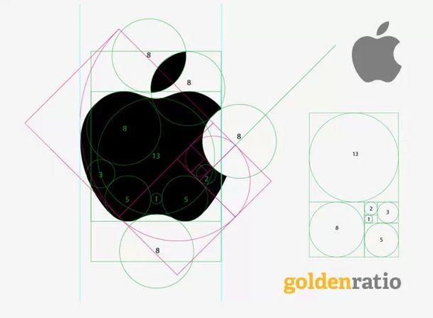
Apple is well-known for its love of the so-called golden ratio, an “extreme and mean” mathematical ratio that designers as far back as the third-century B.C. identified as most likely to lead to harmonious design. The iCloud logo, for example, is designed with the golden ratio in mind … and it’s widely believed that the iconic Apple logo is also designed using the golden ratio.
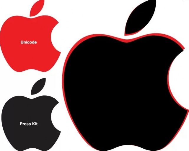
It’s a nice thought, isn’t it? That Apple’s logo is constructed out of mathematically perfect circles and partial circles? Unfortunately, not only is it not true, but Apple has different logos it uses even in its own official materials: the Apple icon etched into the back of your iPad is very different than, say, the official Unicode symbol.
The Apple logo and the golden ratio
In a fascinating but technical post over at Quora, David Cole — Quora’s own product designer — debunks the notion that the Apple logo comes from the golden ratio.
The whole post is a little too in-depth to summarize here, but essentially, Apple’s logo only satisfies the criterion of the golden ratio if you essentially change the definition of the golden ratio to be so vague as to be worthless. It’s well worth a read, though I think the aspect I find most interesting is how different the Apple logo has been over the years, and even across different media. The actual geometry of the Apple logo is fluid and changes depending on the medium it’s used in.

Source: Quora


