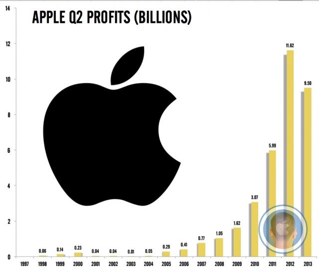
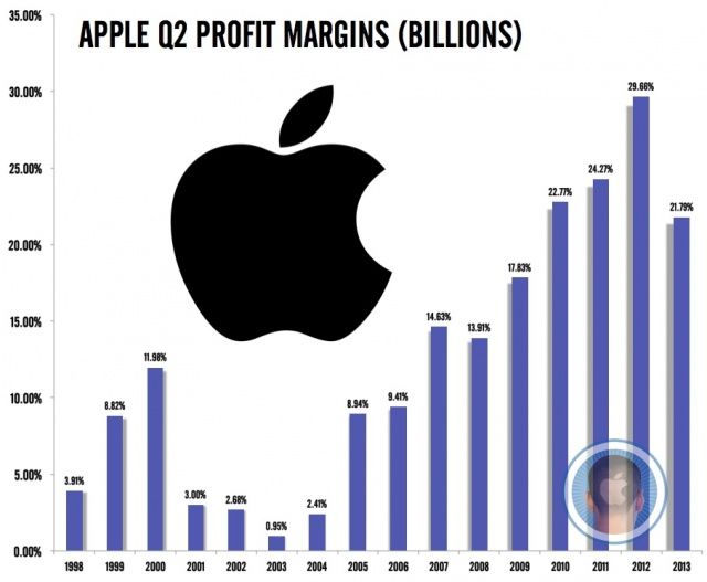
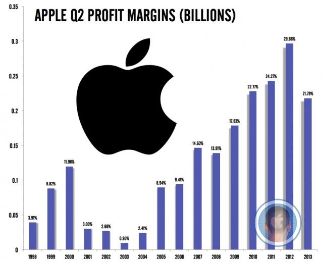
Apple has just announced the numbers for a quarter that most on Wall Street have declared to be doom. Apple has comfortably beat Street estimates, but still posted their first decline in year-over-year profit margins since 2008. What does it mean?
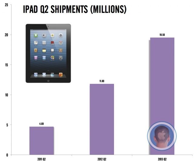
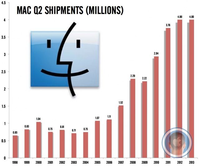
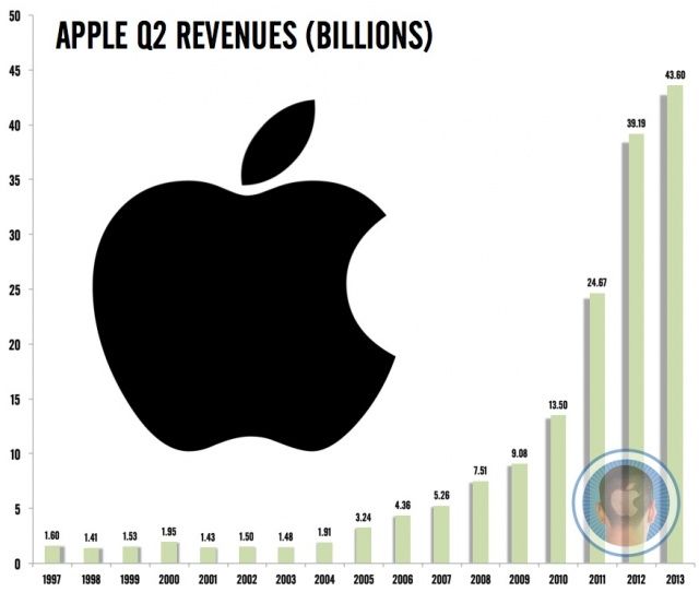
To help you make sense of Cupertino’s business this quarter, here’s a breakdown in easy-to-read chart form of everything from the growth of Apple’s revenues, profit and profit margins, to the rise and fall of Cupertino’s various product empires.
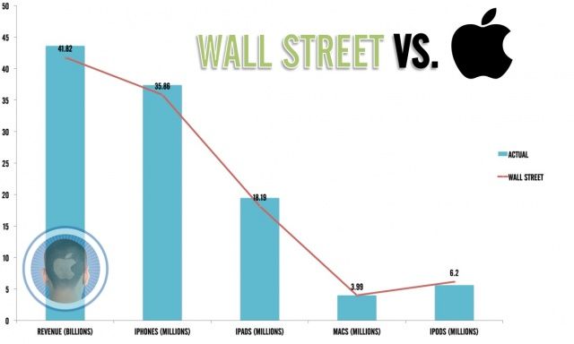
We even have a comparison of how Apple did this quarter compared to how Wall Street prediced Apple would do.
Just a word of explanation. To make these charts as clear as possible, we are only comparing Apple’s Q2 2013 data with their historic Q2 data. In other words, if we’re comparing how many iPhones Apple sold last quarter, we’re comparing it against how many iPhones sold in the same quarter a year ago, two years ago, etc. It’s the easiest way to show year-over-year growth at a glance.
Our Wall Street vs. Apple chart uses the average predictions of Cupertino’s Q2 2013 performance put forward by some of the most well-known analysts on the Street compared to Apple’s actual performance.
With that all said, here are the charts:
![Apple’s Q2 2013 Earnings At A Glance [Charts] bythenumbers](https://www.cultofmac.com/wp-content/uploads/2013/04/bythenumbers.jpg)
