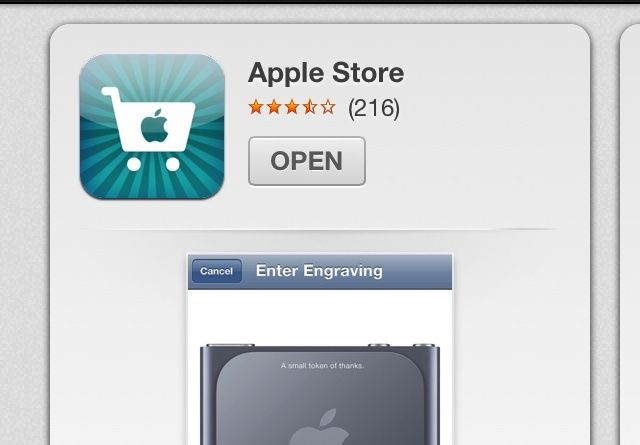
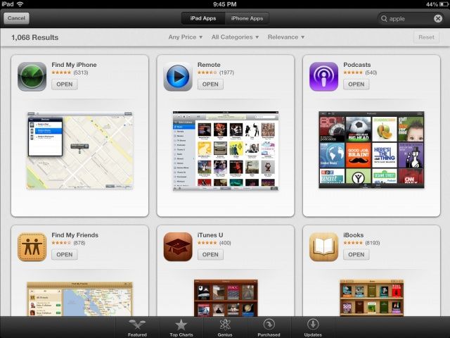
As part of Apple’s App Store redesign in iOS 6, thanks in part to their acquisition of Chomp, a new search result interface has been rolling out tonight for both the iPad and iPhone. The redesign, which brings a new cards-style interface to searches, replaces the old list format of results. As you can see from below, the design is consistent across both the iPhone and iPad user interface.
The new design not only shows the application icon, price, and rating as it used to, it also now displays an application screenshot as well. While this certainly provides a much more robust and detailed interface for viewing application previews, it seems as if this will decrease visibility for applications with a lower rank. The new interface requires a lot more swiping just to view what could be previously seen all in one page. Whether the more attractive search results will result in more application downloads will only be seen with time.
Also of interest is the revival of Genius for apps. (Thanks Darnell) Previously in iOS 6, the feature was completely disabled, but now it appears as if the service is back for iOS 6 users, although it doesn’t appear to be fully functional for us at the moment.
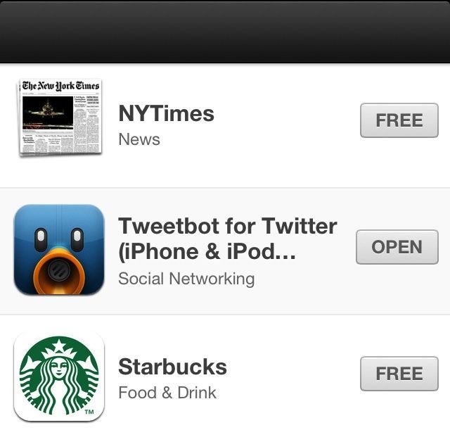
Additionally, upon clicking the App Store link within the Passbook application, a new section is also now visible in the App Store for some iOS 6 users at this time. The section does include some notable titles such as Starbucks, Yelp, MLB At Bat and others, but also features some random and seemingly unrelated apps as well, including Instagram, Tweetbot, and Pandora. This section also bears no title, leading us to believe that this may be more of a bug than a definitive section.
Finally, Apple has also returned the ability to search for Podcasts in the iTunes Store.
These changes all come in the last few weeks leading up to the final released of iOS 6, which was first debuted at WWDC, sometime this fall.
Here’s what the new layout looks like on the iPad:
Thanks: Daniel
