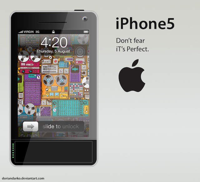
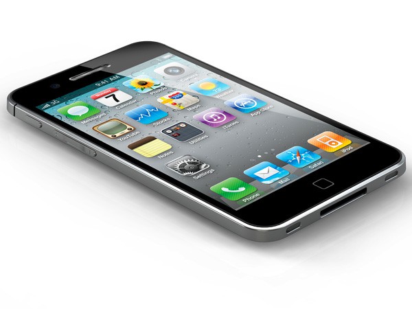
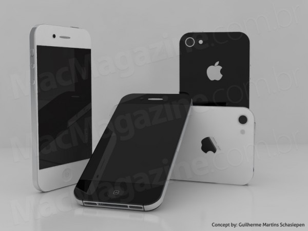
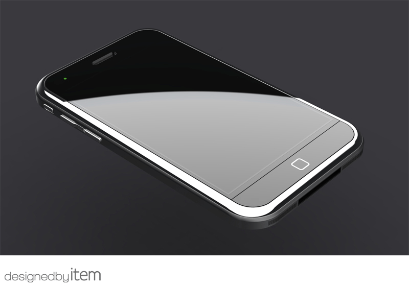
If the rumors are anything to go by, the next iPhone will be unveiled sometime in the next month. We don’t know anything for sure about the iPhone 5 yet, but it seems likely at this point that the iPhone 5 will have an A5 chip, a larger display, a thinner design and (possibly) a capacitive home button for gestures.
That tells us a lot about what the iPhone 5 might be like, but not a lot about what it looks like. So for your perusal this weekend, we’ve put together a gallery of ten of the best iPhone 5 concept designs out there. Let us know which one is your favorite in the comments.
By Dorian Darko
By MacMagazine
By Item


80 responses to “These Are The 10 Coolest iPhone 5 Concept Designs [Gallery]”
… i like : This is my next / T.J Kohi and Michal Bonikowski
#1 = Page 1 #3
#2 = Page 1 #5
#3 = Page 2 #5
#4 = Page 2 #2
#5 = Page 1 #4
#6 = Page 2 #4
#7 = Page 2 #1
#8 = Page 2 #3
#9 = Page 1 #1
#10 = Page 1 #2
Please stop with these multi-page articles…
NAK Studio N9ish looks great, and T.J. Kohl is very clean, nice design
I think it is a safe guess that it is like the Michal Bonikowski
First four are welcome but if its thelast one by item, i’ll not buy untill iphone 6.
if you call the second one “cool” you have some serious brain damage
I believe I’ve seen mock-up #6 (aka “tear-drop profile”) used most often with suspected iPhone 5 shape rumors. While there are a few phones on the market that are dubbed “ultra-thin,” I’ve seen nothing coming close to that thin and would imagine that such a form factor would pose obstacles (beginning with battery life).
WARNING: extremely flowery language ahead!
I find myself gravitating to mock-ups #8 and #9, with #9 taking the blue ribbon in the contest for Most Drool Inducing. As someone that grew up on a healthy daily dose of Japanese cartoons involving intergalactic space battles (ex. Robotech), the powder-coated exterior of #8 by ADR Studios harkens back to those shows and expresses a real sense of modernity and uniqueness.
However, #9, T.J. Kohl’s iPhone 5 concept, seems to be the only one that generates that undefinable je ne sais quoi that nobody but Apple can consistently create. It has Apple’s commitment to simplicity while almost immediately stirring that feeling of being connected to your device on an emotional level. The glow of the home button (which appears to no long be an actual button that collapses and is more in line with Steve Jobs’ dislike of traditional buttons than on the current iPhones) is a soft white light, one I could see that pulses slowly for notifications in a very zen fashion (again, very Steve Jobs). The power indicator is unobtrusive, though I’d want it to only be active at: 1) power up of the device, 2) to indicate when the battery is beginning to run low, 3) indicate when plugged into or disconnected from a power source, 4) and user prompted to determine current charge. I’ve never stood in line for an iPhone launch, but if that was iPhone 5, I probably would.
Bravo!
#3 is the most probable one for the next iPhone.
Whatever mistakes were made in the past, most likely won’t be made this time around, Steve Jobs is to much of a lunatic to allow mistakes to go unchecked :) but that’s a good thing right?
i dunno. they all look bad to me.
If i have to choose, #4 by Michal Bonikowski would be it.
All i want for iphone 5 is, a LARGER edge to edge screen, a brand new home-button that doesn’t suck like the old one, a A5 dual core chip
and BETTER antenna!!! Also it must be thinner.
I like the ADR, and the This Is My Next nano colored ones. They looks sharp. I don’t exactly know how I feel about the iPhone Pro one. Kinda cool, it just needs cleaned up..and to drop the standard USB..30 pin Forever!!
first image is my best.
i realy like it.
I totally agree!!!
tinyurl.com/2df4ccp
These aren’t “cool”. You googled “iphone 5 concepts” then threw together what you call a post and dumped the first ten pictures you found in it.
http://tinyurl.com/4skyaqr
I agree with everything you said, except for I don’t have a problem with the home button, and also add a LED Light for notifications similar to the 5th iPhone on page 1
tinyurl.com/2df4ccp
http://tinyurl.com/4skyaqr
tinyurl.com/2df4ccp
tinyurl.com/2df4ccp
tinyurl.com/2df4ccp
Apple need to produce something more impressive then these concepts if it wants to take back market share from samsung.
I like the ones that look like giant nanos.
Ah, yeah. That’s what blogs do. Welcome to the internet.
Number 1 and 8. I would like a more grip texture to the back of the phone and I like black and grey.
I like the 3rd one By Michal Bonikowski! It looks like the screen is bigger and thinner than iPhone 4.
I just paiid $ 22.89 for an iP a d 2-64GB and my girlfriend loves her Panasonic Lumix GF 1 Camera that we got for $ 38.76 there arriving tomorrow by UPS. I will never pay such expensive retail prices in stores again. Especially when I also sold a 40 inch LED TV to my boss for $ 657 which only cost me $ 62.81 to buy. Here is the website we use to get it all from, http://bit.ly/r8qxL7
The 2nd is ok (Bonikowski concept), but i think next iPhone should have a design like the existing iPod touch.
I agree completely with the 9th one by T.J Kohl. It seems, by looking at the image, very Apple-esque, and kind of reminds me of the MacBook Pro’s screen merged with its Aluminium unibody. A unibody iPhone like that one wold be perfect. The subtle glow of the home button makes it look as if it were almost touch sensitive, which looks nice, but wouldn’t especially be practical. I am however liking the green charge lights, as they could possible glow a different colour to also indicate messages or missed calls. Very nice touch. And the whole phone simply looks like what Apple would create if it were moving ahead. My bets are actually on this one (no.9), although I don’t really see it coming in September, although i could be wrong…
I totally forgot to mention the bezel-less screen. Nice catch, Max.
Totally agree on the charge lights changing colors to indicate different things. Genius! Never would have thought of that since I have never seen a charge indicator serving any other purpose. Since there are more than one, you could have one green light indicating new voicemail, a red indicating new text messages, a blue light indicating new email, etc.
Also, maybe a user option to have the white home button light pulse the number of times equal to the number of new messages and separated by short pause. In other words, if you had two voicemails, one email, and one text, the home button would pulse rapidly four times, pause, pulse rapidly four times, pause, and so on.
tinyurl.com/2df4ccp
tinyurl.com/2df4ccp
Somebody stop this Spam!!!!
tinyurl.com/2df4ccp
tinyurl.com/4skyaqr
The antenna in the iPhone 4 works just fine.
I really like 2 and 9 concepts they look sweeeet.. oh to see one of these concepts used would be nice
No matter that it will never happen, I am in LOVE with TJ Kohl’s concept. Simple and gorgeous.
iPhone 5 should be out in october thats what i have heard and i hope it looks the same..
Well what i think is that iPhone 5 will be released October 6th of this year, 2011 I really cant say where i am getting t his info from, but there will be MAJOR players coming up to bat for the iPhone,
I guess now we know Sprint must be the MAJOR player coming up to bat, Im glad they finally got the right idea
I have iphone 4.. And love it.. And next would be iPhone 5. :P
if its would be like first one then i would surely buy it :P
Thanks for a great Review
iphone 5
Love the iphone … its aewsome…