The App Store has spawned some pretty good looking applications for iOS devices; apps for iPhone and iPad are largely renowned for their simplicity and alluring design. With that said, you’d think iOS applications that have an Android sibling – from the same developer – would be just as pretty, right? Wrong.
Here’s a gallery of screenshots that compares iOS apps with their Android versions and highlights some of the differences:
Facebook – (Free) – Social Networking
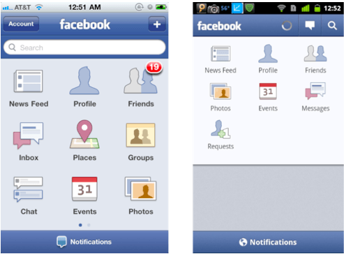
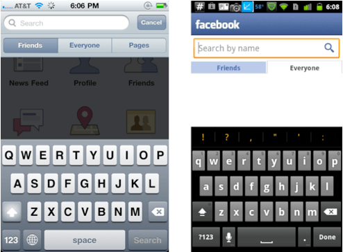
The main menu within the official Facebook application is surprisingly different on each OS. In Android, the icons don’t seem to be aligned properly, and there’s big grey area at the bottom that looks to be a complete waste of screen space.
Meebo – (Free) – Social Networking
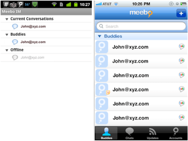
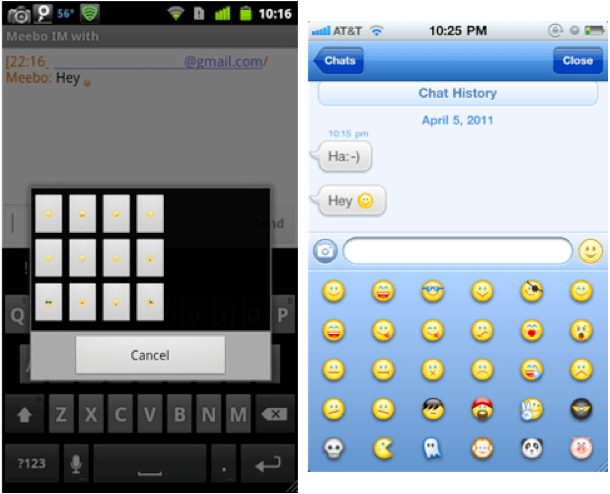
The difference between these two is pretty clear; the iOS user interface is vibrant, clear and looks a lot easier to use. Your contact list is bigger and better suited to a touchscreen, and your conversation window features a nice stream of speech bubbles, as opposed to just a list of text.
LinkedIn – (Free) – Social Networking
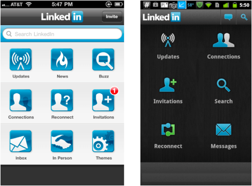
The LinkedIn application looks to be much easier to navigate on iOS, with a lot more options from the main menu. Admittedly, I quite like the darker theme on the Android device here, and I don’t think the icons look too bad, but the iOS version allows you to customize your theme to suit your preference.
Speedtest.net – (Free) – Utilities
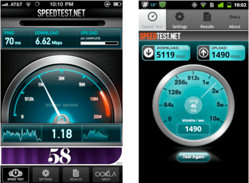
Speedtest.net have clearly put a lot more effort into the design of their iOS app than they have their Android version. The only downside I can see from the iOS version is that damn iAd at the bottom.
CNBC Real-Time – (Free) – Finance
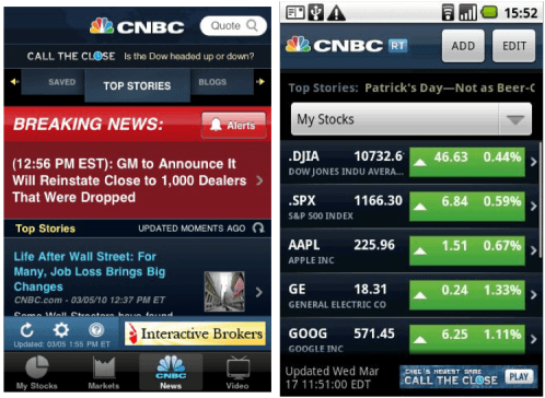
There is a clear difference with CNBC app here: on iOS you have tabs to access your stories, markets, news, and videos. On Android you just get a list of stocks, which many users have criticized on the Android Market as being nothing more than a web app.
That’s just a small sample of some of the applications that look vastly different between each platform. There are plenty of other examples out there, and I’ll happily include more if you make some suggestions in the comments.
It’s clear there’s sometimes a big different between iOS and Android applications when it comes to design and user experience, but why is that? Is it due to the limitations of the Android OS, or do developers simply put more effort into iOS applications because they think it will be more successful, or that iOS users care about the way an application is designed more than Android users do?
Let us know your thoughts in the comments!
Screenshots above are courtesy of Android Gripes.

35 responses to “In the Battle of Beautiful Applications, iPhone Beats Android Every Time”
Standards.
For example, that Android version of the Meebo app would never be approved by Apple. There’s no way those rows are 44 pixels high (the width of a finger).
Developers are a lazy bunch. If you don’t give them enforceable rules they must follow, they’ll do the least necessary to get the functionality out the door. Design to them is just making pretty pixels.
“Some of the screenshots above are courtesy of Android Gripes” – I think you’ll find that the majority of the article came from them as well. Not cool.
Four examples hardly constitutes “every time.” Just two quick counter examples are Twitter and Angry Birds. Twitter I guess could be subjective for the operation screens (although I like the android version better) but the animated login screen on Android wins hands down on the pretty factor.
Angry Birds is an interesting example mainly because for Android they have to work as vectors in order to deal with all the different platforms. The end result is that even though the user interface is technically the same, AB looks a ton better on my wife’s Nexus S as compared to my iPhone 3GS.
I’m sure there are a ton more counter examples if you go looking, especially if you expand your research beyond an Android complaint page.
I think a lot of it probably comes from the UI builder and other tools included in the iOS sdk. Apple gives the devs good, well designed tools to work with, which makes it more likely they’ll get a better result.
If only you could use swype. I really miss that when I’m using my iPad 2. I have and android Phone.
For iOS there is Interface Builder tool for creating UI design. The drag n drop, features for aligning UI elements etc is very neat and makes it easy to create beautiful UI.
With Android there is no drag and drop UI editor, everything has to be done in XML file. This is most of the times painful n frustrating.
great article. the CNBC one might be a wash though, because its so darn ugly on both platforms.
you get the point though. app devs need to step it up on the android platform. they also need an incentive to do so, but WP7 has many apps with gorgeous UIs.
hmmmm….
is this true Killian?
word.
Of course it didn’t. The idea came from them, sure, but none of the writing did.
The Facebook Android app screenshot you provided is not current. Nor is the Speedtest. I’m not suggesting that all aspects of the UI are the same — better or worse, but at least be up-to-date. The major difference with the Android Facebook app is a space for a recent image slider. I do find it odd that you cannot search pages, but I’m sure that will be addressed (or maybe not). It’s really up to the developers to port the experience from one platform to the other. Personally, I think a lot of devs are taking the lazy way out when porting apps to Android. They are not making the apps feature rich, but that’s not an inherent flaw with the platform. Finally, is the “my shiny object is better than your shiny object” getting a little old? I use both Apple and Android devices, and find both platforms compelling and occasionally vexing.
Agreed. I replaced my iPhone 3G with an HTC Wildfire, and while I love the multitasking, it bothers me how ugly most apps are. Even stock Android itself is ugly – what’s up with all the black? And then some devs still use green and blue on top of the black background-terrible!
I plan to get a webOS device when the Pre 3 comes out as I reckon it will have the UI beauty of iOS with the true multitasking.
Nice outdated screens you have there. In the Battle of Beautiful home screens and customization, good luck Apple.
The gray area at the bottom of Facebook for Android isn’t a waste of space. It shows the latest pictures and videos posted by your friends. I guess the person taking that screenshot doesn’t have any friends?
Also, Speedtest just updated their Android app in the last few days. The new one seems to pretty much mirror the iPhone version.
Those are the only two of the above apps that I use, but the fact that the author is batting 0 for 2 doesn’t lend much credibility to his writing.
“gray area…complete waste of space” …. yeah that provides a slide show of recent pictures and other media posted by your friends. If you’re going to compare things, especially as a journalist, it might help to actually use both devices yourself rather than making assumptions based on google image searches.
I couldn’t have said it better myself. I started following Cult of Mac because i got a new macbook pro but their articles are haphazardly written and usually contain misleading “facts” or simply incorrect information. It’s really a shame but they are the poster child for the stereotypical, ill-informed, fanboy.