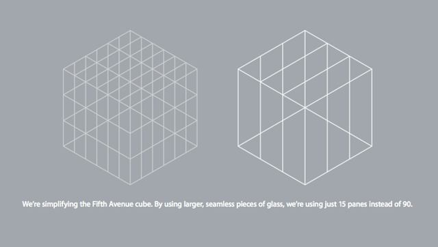
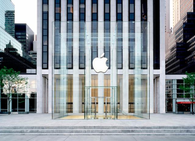
After Apple’s plans for its flagship Fifth Avenue store in New York City where show off yesterday, Apple has released a rendering of what the final design of the store’s glass cube will look like.
“The company has now revealed the plan on their temporary facade, and they sent us over this new rendering and plant. Though it turns out nothing is wrong with the old cube, they want to simplify it, and “by using larger, seamless pieces of glass, we’re using just 15 panes instead of 90.”

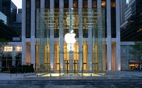
Here’s the current cube design, for comparison:

Who knew that removing 75 panes of glass would make the cube look so good. At least Apple will have some extra glass to put in its mothership campus now.
What do you think? Does this make Apple’s most iconic retail location look better or worse? I like it, but CoM’s news editor John Brownlee prefers the old design. What say you?


38 responses to “A Look at the Redesigned Fifth Avenue Apple Store in New York City”
Cleaner, yes, but I prefer the old which seems to be more aesthetic as it shows off its glass by having the joints. This is just too clean, and becomes invisible.
I like the older design, all of the fixtures gave it some depth.
Agreed. The cube nearly disappears.
Whats the point? What a waste of time/money/effort. Someone in Apple retail has way too much time on their hands, and the result is less impressive than the old one. Strange…
Simpler is better… ;)
New.
i dont give a damn
You gave enough of one to post a comment.
The first design was a statement. This design is an object. Or wait…maybe it’s the other way around. Anyway – much cleaner without all the “floating” hardware.
Without voicing a preference for either design, I do notice that in the rendering of the new store the vertical glass panels seem to blend more cleanly with the vertical white marble (?) columns of the adjacent building. And add a touch of parallelism.
But in the rendering, the Apple Store also appears almost transparent. Maybe too transparent?
I just paiid $ for $23.87 an iPad 2 32-GB and my girlfriend loves her Panasonic Lumix GF 1 Camera that we got for $ 38.76 there arriving tomorrow by UPS. I will never pay such expensive retail prices in stores again. Especially when I also sold a 40 inch LED TV to my boss for $ 657 which only cost me $ 62.81 to buy. Here is the website we use to get it al from, http://to.ly/aUxz
Yo Liam, please post your scam ads elsewhere. Thanks.
Like the concept of the new one. Let’s just wait and see then. :)
Charlie, mom wants you off the computer sweetheart.
powned.
It’s almost invisible. I like it. Wouldn’t it be cool though, if Spiderman crashed into it because he oversees it as he hunts down baddies?
my cock is bulbous
I LOVE IT!
Until the day they make it with only one glass…
I’ve got to go here when it’s complete. I have to at least once in my life…….
It looks great but I was hoping that instead of spending money on something like this, which isn’t really that much of an improvement, Apple could work on expanding their retail stores to towns with at least say 150K or more. I live 2.5 hours from the nearest Apple store and I’m sure this isn’t even that bad compared to most. I would be willing to drive an hour so it befuddles me when I see this sort of spending on such a miniscule improvement.