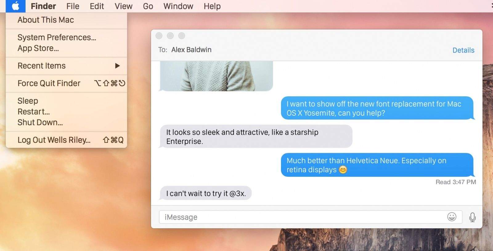
Apple took the wraps of WatchKit yesterday and revealed an entirely new font created just for Apple Watch called San Francisco. Designers are heaping praise on the sexy new typeface that condenses at larger sizes to take up less space, and becomes easier to read at smaller sizes, but we can’t help but wish it was coming to OS X soon.
For those that can’t wait to interact with San Francisco on the Apple Watch there’s good news though: A developer named Wells Riley has released a bundle on GitHub that swaps Yosemite Helvetica Neue system font for Apple’s new Sans Serif creation.
To make San Francisco your Mac’s system font, follow these steps:
- Download the zipped font files here.
- Copy the 6 font files to /Library/Fonts on your Mac.
- Open Terminal and enter the command “sudo chown root:wheel /Library/Fonts/System\ San\ Francisco*”
- Repair Disk Permissions by entering ‘diskutil repairPermissions /’
- Log out and log back in to apply the changes.
If you want to go back to Yosemite’s default font, go to /Library/Fonts and delete the 6 files, starting with System San Francisco. Log out and log back in to see the changes applied.


22 responses to “How to make Apple Watch’s custom font the default on your Mac”
The instructions don’t work, when running the command it fails. You don’t actually need the command, you just need to copy them to your /Library/Fonts location and then repair the disk permissions using disk util and it works fine after logging out and back in.
The font is awesome, much more crisp than the original system font. Hopefully they switch to this font in OS X.
I followed your suggestions and the fonts installed with no problem. Thanks
I did it!! But now I want to delete it, but the fonts aren’t in the folder?
Please help me !
The zip file contains 5 font files not 6, The command, sudo chown root:wheel…., does not work–“No such file or directory.”
Reminds me of Meta from the ’90s … Even “digital agency of record” materials were *printed* in that shit. No, keep Helvetica. It’s nicely retro to a finer age.
It is not very sharp unfortunately…. the font in this article is very nice on the eyes…
I miss Lucida Grande as the system font.
I want to try it, but I’d like the directions to go back to the original before I start mucking about in the system.
“If you want to go back to Yosemite’s default font, go to /Library/Fonts and delete the 6 files, starting with System San Francisco. Log out and log back in to see the changes applied.”
I do!
I got it to work. It’s great!
OMG, this is way better. My font isn’t blurry anymore. Even in Safari favourites. I wouldn’t mind my font a bit bolder though. I’m still hunting for a fix for that. I still think Apple should fix the font smoothing for non-retina displays. After all, Apple does specifically say the new font (and UI) is made for retina displays and the rest of us are SOL. Now, I just need to get a darker grey menu bar and, no Apple, your dark mode sucks. Just like it does in iOS.
Update: had to delete the font patch. My system fonts became too faint/light. Why can’t Apple fix this font mess!
Not bad. In my opinion it’s more readable than Helvetica Neue in non-retina displays.
Why bother with all of these steps (or the manual copying method ChrisC mentions)?
This should do the trick on any recent OS, should it not?
ruby -e “$(curl -fsSL https://raw.githubusercontent.com/wellsriley/YosemiteSanFranciscoFont/master/install)”
this is the result on my mac, driving me nuts, will go back to original
Same. I also had alignment issues with the new font inside Chrome. Reverting. Nice font but it’s not consistent for system use imho.
Agreed….inconsistent and damn garbagy on some web sites.
I don’t like it either the default yosemite one was much better. What is the command to change it back?
i think helvetica is much better. i hate this font. this is the biggest dissapointment of apple watch i thinl. i still angry them. it looks like android.
Simply deleting the fonts and rebooting did not completely correct the problem. Any instructions on going back to the original font?
San Francisco fonts are pre-release and full of problems by now.
The display set, which is installed by the procedure described on the article, uses proportional figures as default, what disrupts alignment on date or size columns (and also on some menubar apps). There are errors on dollar sign, Œ, breve accent, grave/acute positioning and poor tilde design. The fonts also support only Latin extended, without Cyrillic, Greek and phonetic sets.
If you still want to use San Francisco, try the text set instead of the display one. There is no need to follow the steps described above: simply install it through the regular way in OS. The system immediately recognizes it as the new system font. To go back, remove then and restart.
This is a fantastic font! One small thing though, and I know this is going to sound a bit OCD on my part, but the numerals are not all the same width. I used this font in a clock app and, every second, the time display would move slightly side to side as the numbers changed. Usually this happens with the ‘1’ which is often narrower in most fonts, but with this font, every digit seems to HAVE ITS OWN WIDTH. I find this odd for a font that was designed for a watch.