With the Apple Watch release still months away, plenty of details — like the timepiece’s price and battery life — remain unknown. But the release of WatchKit this morning sheds new light on Apple’s most personal product ever.
We dug through the new WatchKit programming guide and Apple Watch human interface guidelines this afternoon and found a few details that weren’t mentioned in the keynote, such as a special new font designed to look good at any size on the Apple Watch’s tiny face.
Here are five new Apple Watch details buried in the WatchKit SDK:
It has two different resolutions
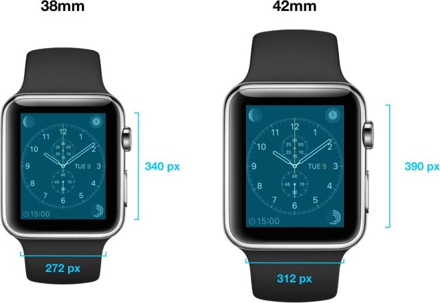
We already knew Apple would sell its timepiece in two different physical sizes, but WatchKit reveals that the two sizes also have different screen resolutions: 312 x 390 for the 42mm model, and 272 x 340 for the 38mm model. Apple claims both resolutions are Retina, but developers will have to build UI elements to support both screen sizes.
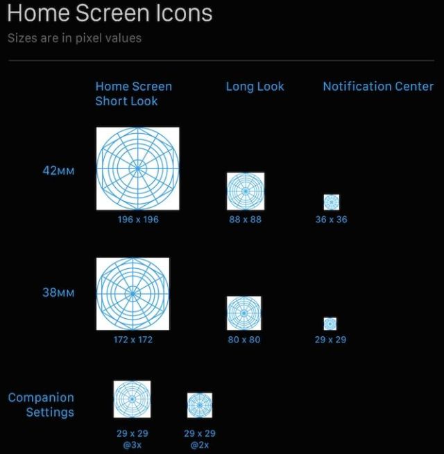
Developers still have to make square app icons
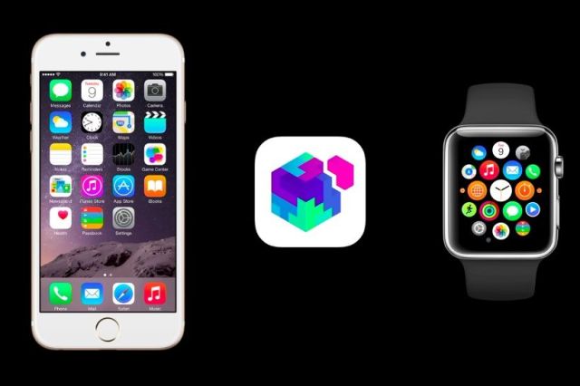
The Apple Watch home screen sports an array of circular app icons, but Apple’s guidelines tell developers to create icons as full-bleed square images. The system applies the circular mask automatically. When the functionality of an Apple Watch app is very similar to its sibling iOS app, the icon remains virtually the same. But when the Watch app acts as a complement or controller to an iOS app, the icon design differs accordingly.
Fully native third-party apps won’t be supported at launch
You won’t have to worry about apps eating up your storage and battery life when Apple Watch launches, because instead of letting apps run natively, it will toss all the processing duties over to your iPhone.
When an app is launched on Apple Watch, the WatchKit extension on iPhone runs in the background to update the user interface and respond to user interactions. Apple says developers will be able to create fully native apps “starting later next year.”
There are only two interface styles
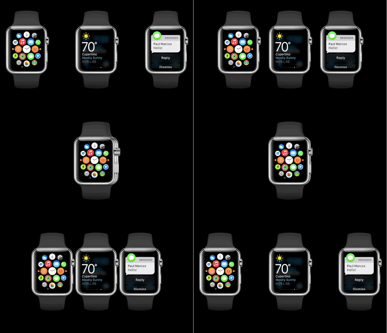
Thousands of apps will be available on Apple Watch at launch, but all of them will basically use one of two types of layouts: Hierarchal (kind of like how Mail.app works), and Page Based (similar to the Weather.app). In a hierarchical app, users navigate by making one choice per screen until they reach their destination. A paginated interface lets the user navigate between pages of content by swiping horizontally.
The system font is an ode to the original Macintosh
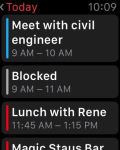
The system font is called “San Francisco,” an homage to one of the Macintosh’s original bitmap typefaces created by Susan Kare that imitated the style of ransom notes. Apple created the font specifically for legibility on Apple Watch. Letters condense slightly at large sizes to take up less space. At small sizes they’re loosely spaces and “have bigger apertures in glyphs like ‘a’ and ‘e’ to make these easier to read at a glance.”
Apple Watch has its own icon grid
Developers still have to make square app icons for the Apple Watch, but they’ll need to make 8 different variants to support the two two screen sizes with options for short looks, long looks, and a tiny 29 x 29 pixel dot for Notification Center.
