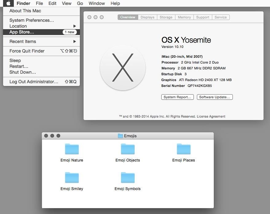
With its candy-like icons, gradients, and transparencies, OS X Yosemite is a major departure from the look and feel of the Macintosh operating system. But if you don’t like that look and feel, here’s a few things you can do to make OS X look less candy-like, hearkening it back to the design language of OS 9.
As pointed out by WonderHowTo, the process of reverting OS X Yosemite to a classic look is fairly easy.
First, go to System Preferences > Accessibility > Display and check the box next to Increase Contrast. This setting creates a border around on screen elements like windows, buttons, icons, and other UI elements, making them easier to distinguish.
Next, under System Preferences > Display,, select the Graphite theme for both Appearance and Highlight color, changing the color of your buttons, manus, windows, and the text you select to dark gray.
Finally, you want to right click on your desktop background, click on Change Desktop Background, and select the “Dark Gray Medium” under Solid Colors as your wallpaper of choice.
There’s some other things you can do if you really want to go whole hog, like switch over to a greyscale and turn off the Finder toolbar, but I think the first three steps above are enough to give Yosemite a much more classic look. What do you think?
Source: WonderHowTo


11 responses to “Hate OS X Yosemite’s look? Here’s how to give it a classic makeover”
More like a makeunder than a makeover.
graphite theme is under general not displays…
It would be nice to make Yosemite look more like the previous versions of OS X.
This brings back memories…
What boll0cks.
Yes, and tiny helvetica STILL sucks.
Final touch: replace the folder icons with OS 3.2 style. :)
I installed the beta of Yosemite on my laptop and detested the new look so much that I reinstalled Mavericks. Yosemite’s new look is dull, flat and uninspiring. I have no idea what problem the UI guys were trying to solve. OS X since Tiger have looked essentially the same: gorgeous icons, elegant general look and feel, colorful but not garish, etc.
The look of the Finder icon looks like it was designed for 5 year olds by the Hasbro company. So much for elegance. Sorry but I don’t want a cartoon computer interface. The changes brought by Yosemite go in the direction of hiding standard features, and I have no idea why. iTunes is maddeningly more difficult to use and even feels like a pre-beta version. There are lots of solutions in place for problems that didn’t exist.
I’ve loved OS X since its original release years ago. Yosemite is a step backwards in so many ways, including design, ease of use, intuitiveness and elegance. What the heck were the UI guys at Apple thinking! I intend to stick with Mavericks until the next version of OS X come out. Yuck!
Your ideas are intriguing to me and I wish to subscribe to your newsletter
iow – couldn’t agree more
Good luck with that! The next version of OS X will look much the same! Us normal people actually like the clean looking UI.
It’s certainly normal to appreciate an appearance, a user experience that was refined, fine-tuned over more than two decades. Some cross-cultural reactions to the fresh, new appearance of Yosemite: http://tinyurl.com/1010uglystick