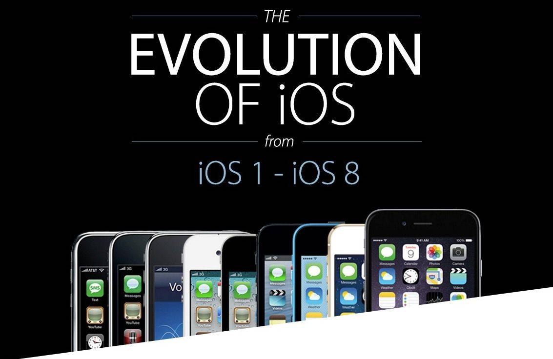
We don’t usually post infographics on Cult of Mac — far too many of them are just poorly designed info dumps, without any real focus or design chops — but we’re making an exception for this one showing the evolution of iOS over the last seven years.
Created by the folks at 7 Day Shop, this infographic doesn’t just examine the evolution of the iOS home screen (something we here at Cult of Mac have been known to chart from time to time), but the evolution of individual icons, and the addition of features to Apple’s mobile operating system.
It’s very thorough, and a great primer on how far we’ve come since 2007. Check it out in full after the jump.


5 responses to “From iPhone OS to iOS 8, we’ve come a long way since 2007”
i don’t see hardly much difference in the home screen or icons since launch in 2007. They changed a couple things but I think a refresh is in order. Home screen and icons basically the exact same layout and look since launch. I don’t know how everyone thinks it’s changed so much.
You’re blind dude
Long way? More like ‘same, but different’, at least when it comes to the visual first impression.
Yeah, not much difference. Icons actually clearly degraded on ios7
I hope iOS8 will allow more colour changes. Quite sick seeing black and white all the time.