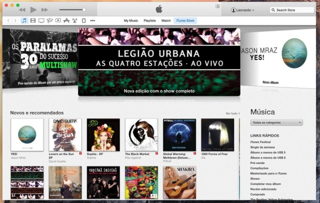
Apple has included iTunes 12 in the newest OS X Yosemite beta released today. It’s a pretty clean redesign that focuses on de-chromifying a lot of the interface elements and introducing new icons.
The iconic iTunes icon has also been changed from blue to a reddish pink. Here’s more of what iTunes 12 looks like:
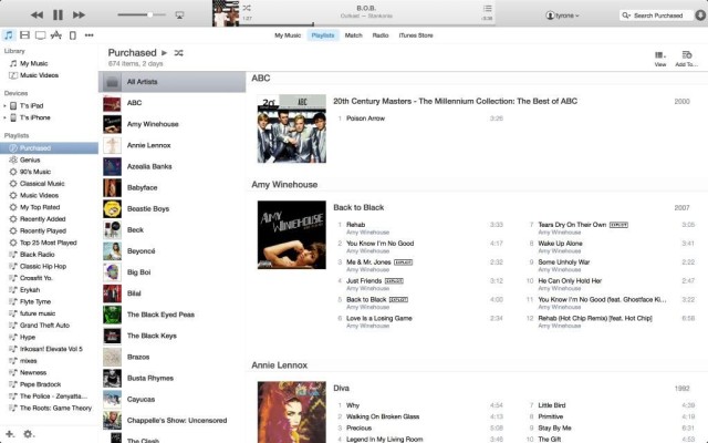
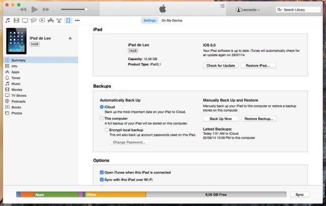
As you can see, Apple had added the ability to quickly access your iTunes account in the right of the app’s top bar.

OS X Yosemite will launch for the public in the fall alongside the release of iOS 8, which also entered its fourth beta today.



11 responses to “A look at the redesigned iTunes 12 in OS X Yosemite beta”
Where is the translucency? iTunes would look great if the album art went through the title bar…
I think, they didn’t make it translucent because iTunes 12 will be available for others OS X versions.
ugly design… :(
iTunes 11 had an overwhelming interface change. iTunes 12 has an overwhelming logo color change.
I can’t believe Apple designed this POS
Where are the round edges?… :|
What rounded edges are you missing?
I really miss cover flow :(
iTunes looked and worked so much better 5 years ago!
So did everything, including me lol. God bless Snow Leopard.
is there a fullscreen mode? Can’t find it anywhere
its now the green button in the top left corner