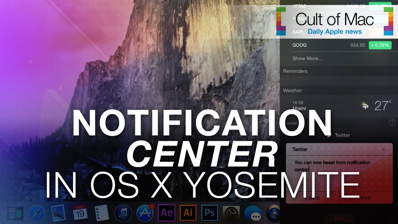
Yosemite is one of the biggest updates to OS X we’ve seen in recent years, bringing fresh looks and a slew of new features. This video takes a look at how Notification Center looks and works in OS X Yosemite, which is resembling iOS 8 more and more.
Subscribe to Cult of Mac TV on YouTube to catch all our latest videos.


7 responses to “See how Notification Center looks and works in OS X Yosemite”
Errr, weren’t you always able to send tweets from NC, at least going back to Mountain Lion? That share sheet is ugly though, rest looks good though.
You are correct Swanny, I know they took it out of iOS after beta-ing it which I missed more, since flipping to the app was a pain when I was writing something and wanted to tweet.
Yeah, not sure why it was removed in iOS 7, probably didn’t make much sense being in the “new” Notification Centre, it would have been a good fit slotting it into Control Centre.
First you need to learn how to say Yosemite Englander
it’s called an accident
Well, you Yanks had centuries to learn how to speak English, yet you failed miserably. Now you’re splitting hairs over a word such as Yosemite?
glad it slides over instead of pushing the whole damned screen.