Apple released iOS 7.1 beta 3 to developers today, and like always, many have already combed through the new software to find what’s new. The second beta of 7.1 brought a few additions and UI tweaks, and beta 3 also includes several noticeable changes.
Here are 8 design changes Apple made in the latest iOS 7.1 beta today:
New Call Dialer
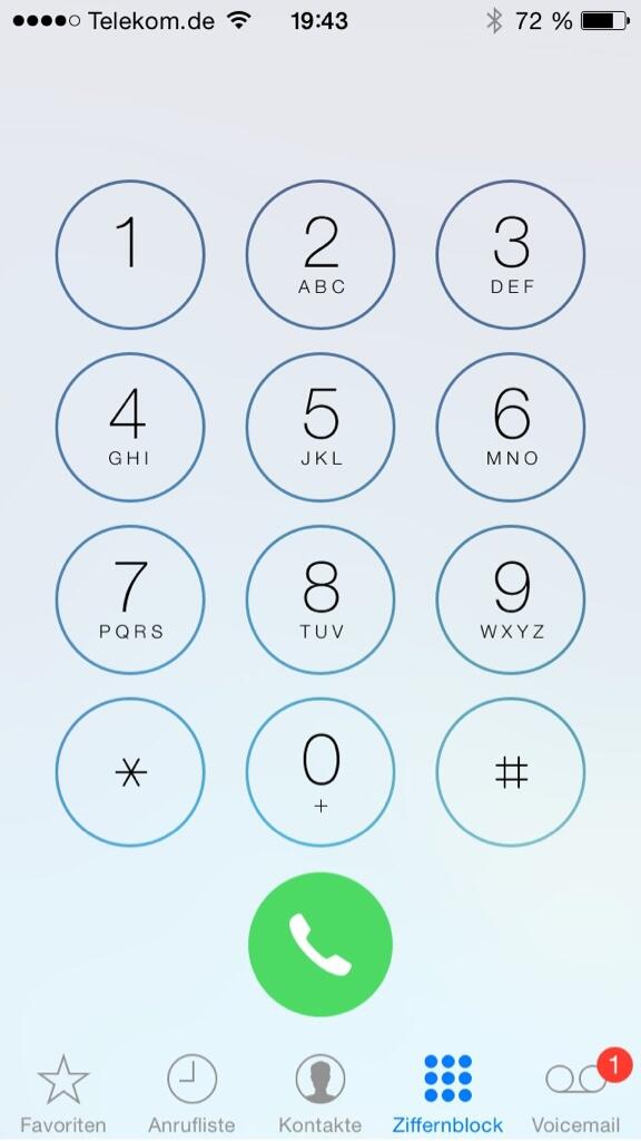
(thanks Peter)
New Phone Buttons
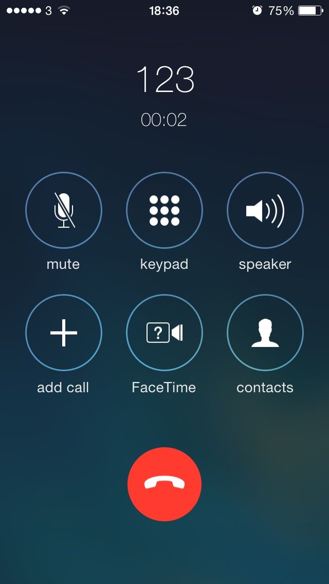
(thanks snappyfool)
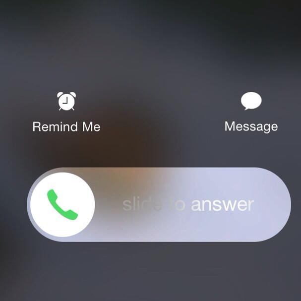
(thanks Nicholas)
Disable Parallax On Lock Or Home Screen
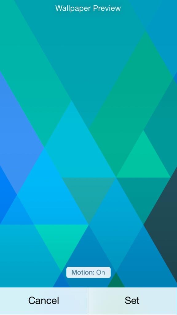
(thanks Nicholas)
Tweaked Keyboard Design
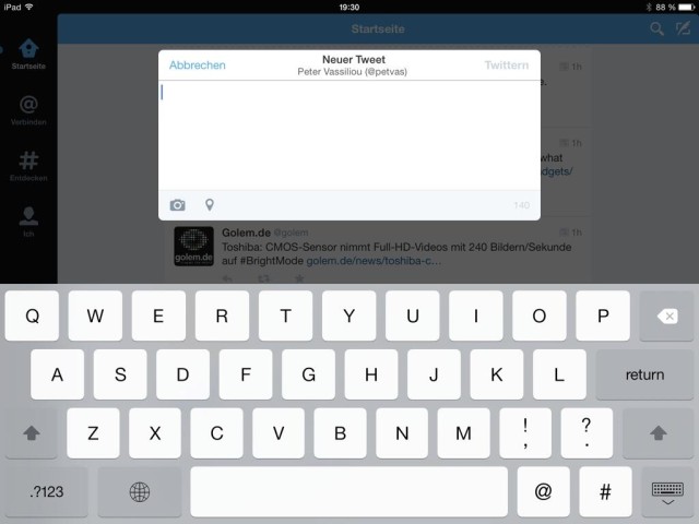
Heavier contrast. The delete and shift keys have different highlights too.
(thanks Peter)
New Power Off UI
@cultofmac the screen gets darker as you slide to only have the circle power button visible before it shuts off. Kind of awesome.
— Jordan Benkelman (@jbenkelman) January 7, 2014
(thanks Jordan)
Darker Icons
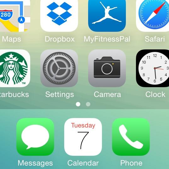
Apple’s green icons (Messages, Phone, FaceTime) have been made a little darker.
(thanks Jordan)
New Buttons In Music App

(thanks Peter)
“Reduce White Point” In Accessibility
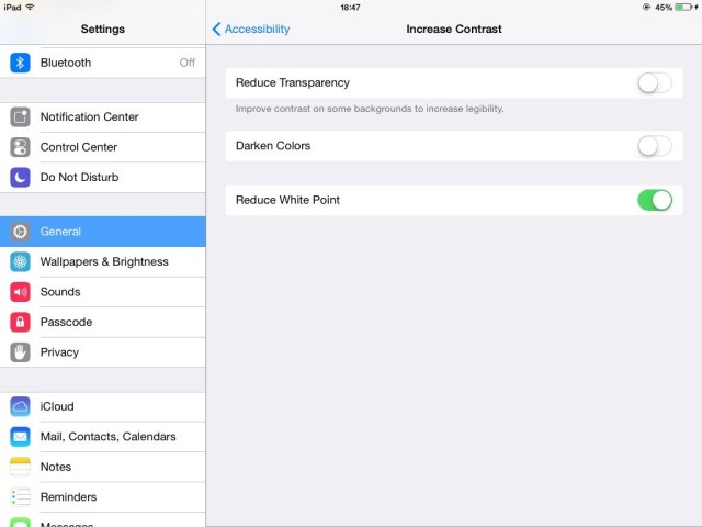
The setting makes the general whiteness of iOS 7 a little duller.
(thanks daveo82)
11 responses to “8 Design Changes Apple Made In The New iOS 7.1 Beta Today”
I like all these changes
Backpedaling, Backpedaling, Backpedaling…. Just bring back Scott Forstall.
Obviously giving the entire iOS to Ive was a huge mistake, he got over excited. All the color changes should have been obvious to the first person to touch iOS, which means that people are either afraid to go against Ive, or he has too much power. This is what happens when you have a business man (Tim Cook) as the captain.
The changes are nice though, but the jailbreak has already been burned…
A smaller dial/hang up button? Come on! I don’t care if it looks slightly better, it is now harder to use.
“General whiteness”.
Jony is an awesome hardware designer, but his Microsoftification of the iOS is just ugly. Who the heck thought the bright white background everywhere was a good idea? Thumbing through photos with the glare is awful, and having to touch the screen to go black, then have it
Pop back to white again after a photo edit?
The “general whiteness” sucks. Bring back Scott Forstall! Please!
When are they going to fix the keyboard?! The keys should be representative of the case that they will type in. Why did someone think it was smart to always have all caps?!
Some other changes not posted here:
New flash icon in the Camera app that appears in dark environments
Control Center and Notification Center have more of a bounce when they appear
There’s a bug in the Notes app that prevents text from blurring behind menus.
You can see screenshots of these here:
http://iosguides.net/whats-ios-7-1-beta-3-iphone-ipad/
thanks for all the photos. the new design looks very refreshing!
You have to be kidding, monstermasten. You don’t like iOS 6, and that’s perfectly valid. iOS 6 had some features I enjoyed more (I liked when you’re on the lock screen, and a notification comes up, you just slid the it aside. If felt like a physical switch for me, which I enjoyed) but that’s not saying that I don’t like what iOS 7 brings as well.
As I said, you may not like iOS 7, but to extend your dislike into a power struggle at Apple is more that nonsense (especially since you have nothing to base it on) but borderline paranoid.
I followed your article in ORIZUME from Japan.
http://www.orizume.com/?p=17647
Thank you.
I’m just waiting more innovation by Mr. Ive, may be which is in June.
Selling UDID activations for $5! Email your UDID to me at [email protected] OR iMessage me at the same email!
GET IOS 8 BETA 1 NOW!
FAST ACTIVATION LESS THAN 15 MINUTES!
PayPal is accepted only!!