Mobile menu toggle

Apple Gives iCloud.com Beta A Complete iOS 7 Redesign [Gallery]

By

icloudbetasignin2


With less a month to go until Apple unveils its new iPhones and the release date of iOS 7, the iCloud beta site just received a redesign to bring it more in-line with iOS 7’s UI.

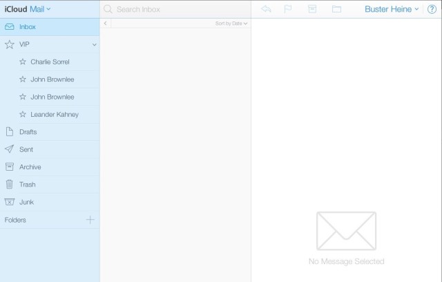
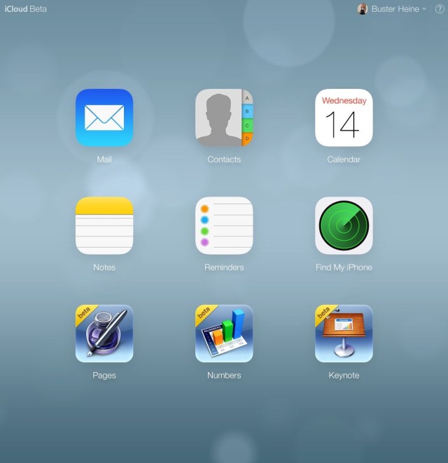
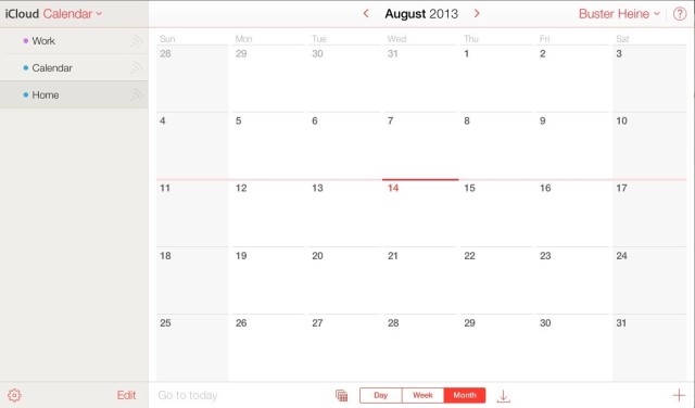
Apple has replaced the old iCloud app icons for Mail, Contacts, Calendar, Notes, Reminders, and Find My iPhone with their counterparts from iOS 7. Along with the new icons, Apple has redesigned the UI of each app with the updated look of iOS 7 as well.

Take a look:

Homescreen

icloudbetasignin

iCloud Mailicloudmail
Calendar

icloudbetacalendar
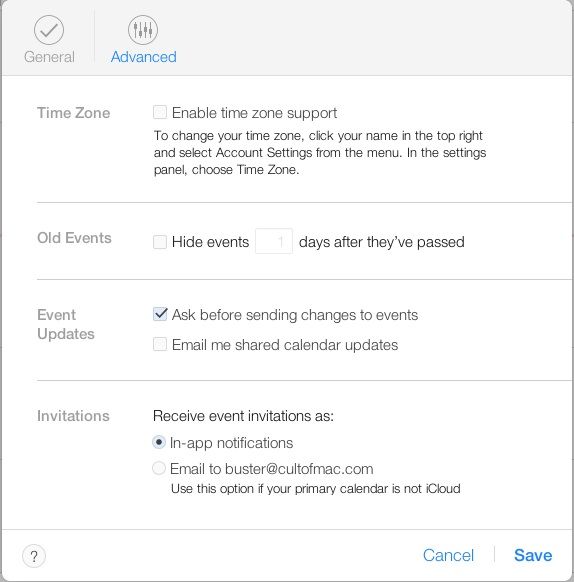
icloudcalendarsettings

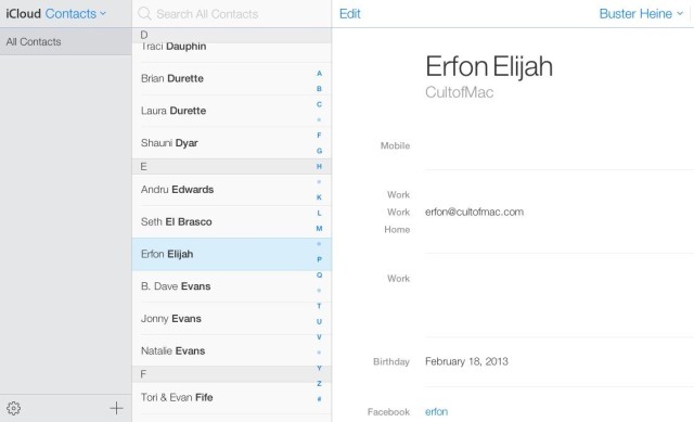
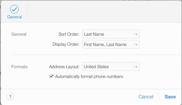
Contacts

contactsappbeta
contactsicloudbetasettings

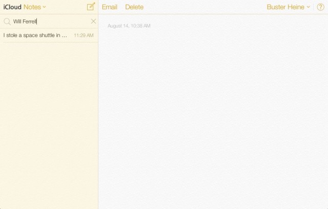
 Notes

notesbetaicloud

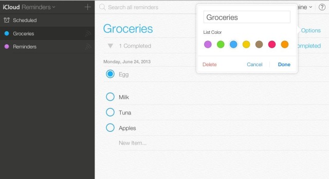
Reminders

remindersicloudbeta

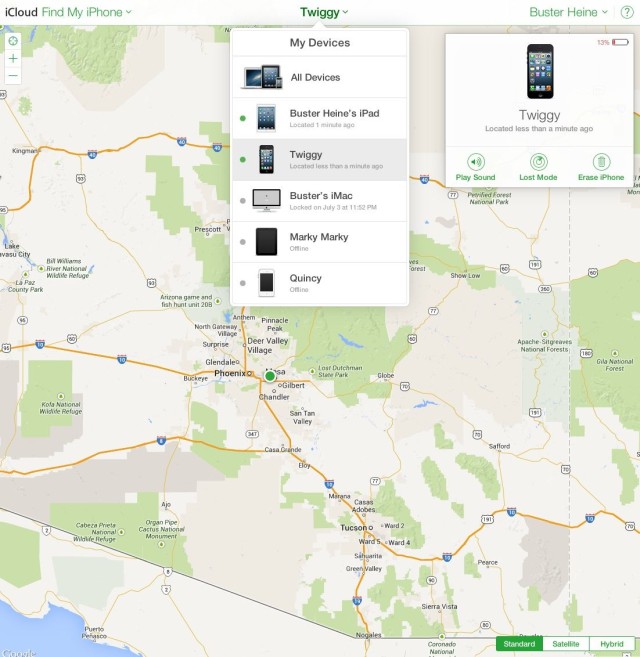
Find My iPhone

findmyiphoneicloudbeta3

Source: Apple

  • Subscribe to the Newsletter

    Our daily roundup of Apple news, reviews and how-tos. Plus the best Apple tweets, fun polls and inspiring Steve Jobs bons mots. Our readers say: "Love what you do" -- Christi Cardenas. "Absolutely love the content!" -- Harshita Arora. "Genuinely one of the highlights of my inbox" -- Lee Barnett.

9 responses to “Apple Gives iCloud.com Beta A Complete iOS 7 Redesign [Gallery]”

  1. austin_b16 says:

    dang! new icloud looks gorgeous!

  2. DevCookie says:

    This actually looks better than iOS 7.

  3. joewaylo says:

    Guess you have to be a Developer to actually see it. I still see the old style.

  4. misterlib says:

    @joewaylo try beta.icloud.com. It worked for me. The iWork icons look really really really out of place.

  5. thegraphicmac says:

    …The iWork icons look really really really out of place.

    They always looked fairly ugly, if you ask me. The iWork icons could easily be iOS7-ified – so I’m sure Apple will be updating them soon.

  6. Lee Scott says:

    @joewaylo, like mister said, beta.icloud.com gets you there!

  7. artofid says:

    The shit design has come to icloud, nightmare!

  8. trudderham says:

    In a way this is a sneak peak of how the next release of Mac OS (after Mavericks) might look.
    Anyway there’s a few more screenshots of the app switcher and more here: http://iosguides.net/icloud-website-updated-ios-7-design-style/

  9. jimmygranlund says:

    IOS 7s visual style is The Never ending Story in real life.
    In the movie “The never ending story” there is the beautiful world of Fantasia which is made of dreams, imagination and beautiful things. This however is being engulfed by this horrible entity “the nothingness” which completely erases all these things, and leaves an empty void in its place.

    The exact thing is happening in IOS 7, an entity consisting of nothing is taking over everything beautiful, from the skillfully crafted icons to the carefully selected fonts and stylish effects. Everything we know and love is being replaced by “nothing”, vast empty white space, icons and symbols become lifeless words.

    This is were we used to shine among the dull and namless pc machines, we on the apple side would take pride in that our machines and systems were not only good tools, but also looked good and had style. With this change “focus on the content” we are loosing all that was apple.

    Apple to me was about beauty, attention to detail and imagination.
    IOS 7 is a wast nothingness, that sadly is a huge leap in the direction of becoming just another pc maker.

    Here´s to the crazy ones, i miss you Steve.

Leave a Reply