Apple released the third beta of iOS 7 to developers this morning, and even though it doesn’t come with any big new features, the new update has plenty of small fixes and encouraging UI refinements.
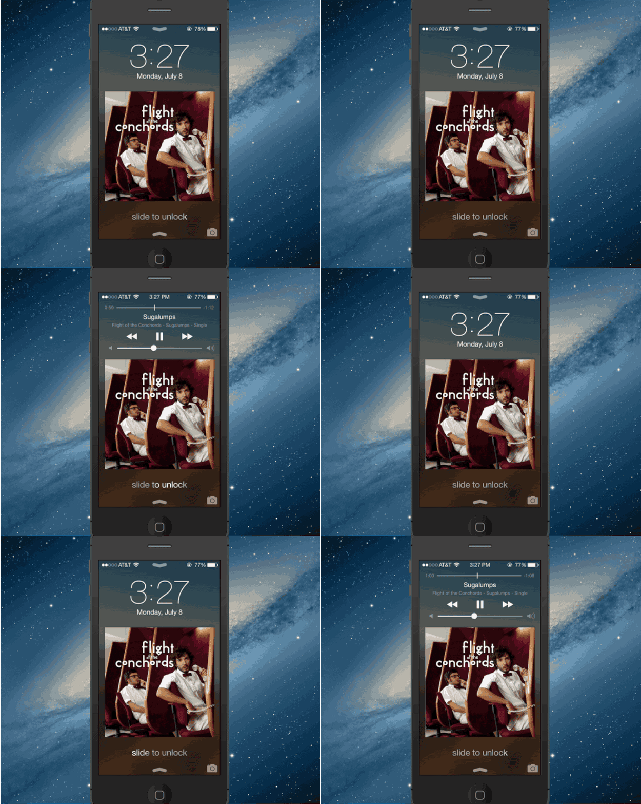
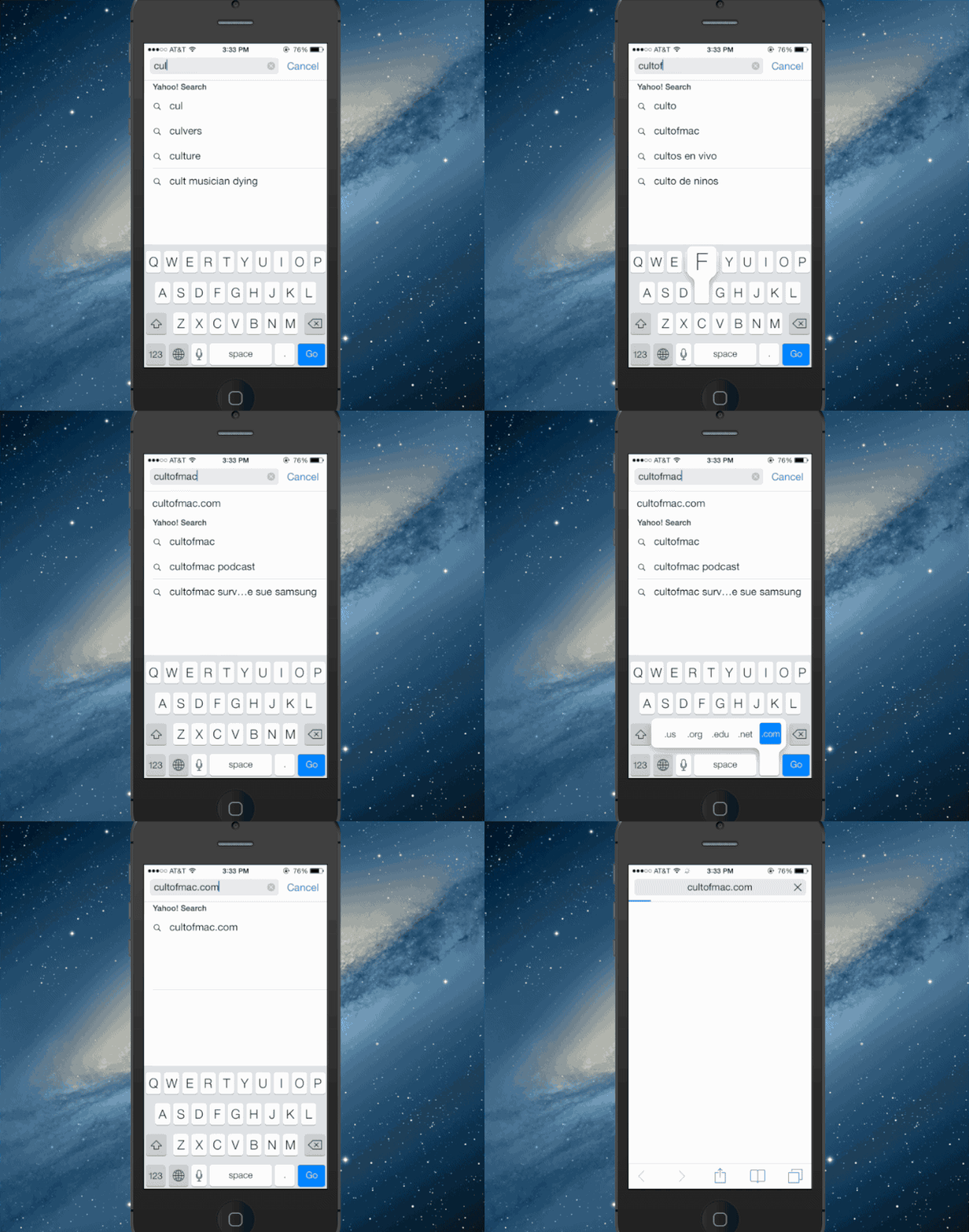
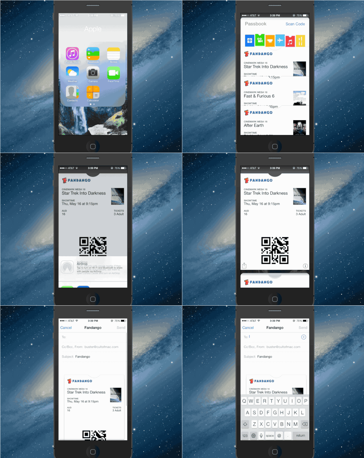
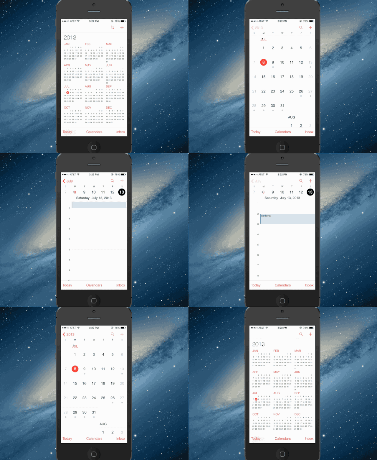
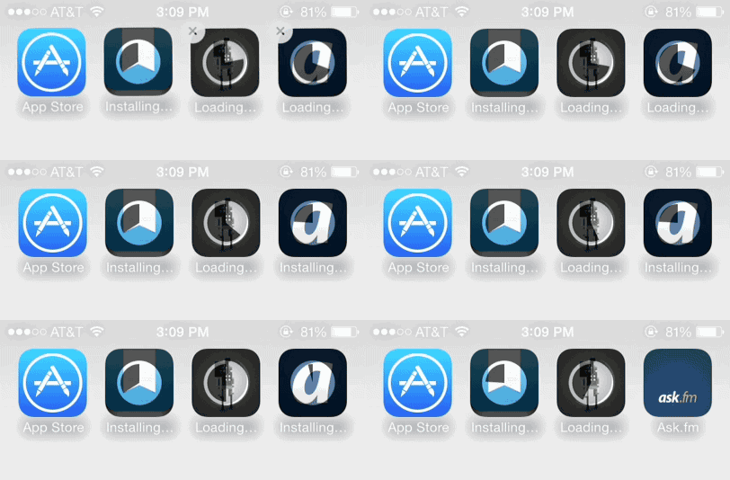
Here are six GIFS of the biggest UI tweaks Apple made in the new beta:
The lockscreen now displays the time while playing music.
Safari keyboard ditches the “.com” button
Passbook passes appear as passes when attached to emails.
Calendars updated with a grey dot indicator for days with events.
New animations for app downloads
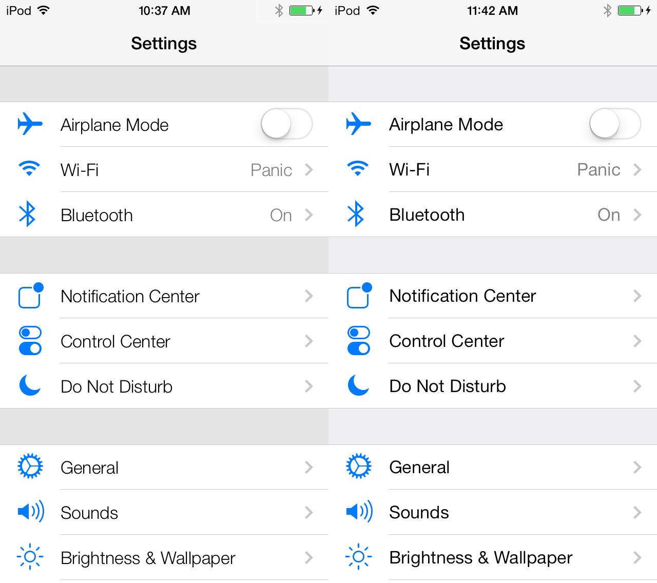
The font has been changed to Helvetica Neue Regular instead of Ultra Light
GIF via Twitter
17 responses to “Here Are Six Of The Biggest Changes Apple Added In The iOS 7 Beta 3”
Thank god they got rid of the .com button! The dang thing drove me nuts!
I was hoping for a little more stability when launching the camera on my 4S test device… Oh well, v4 maybe…
I want to see some stability when multi tasking. The damn thing crashes half of the time.
I like the 1st font they had, the thicker font just doesn’t look as good.
I know it sounds small, but dropping the .com button was the best part of this update. I used to hit it accidentally EVERY time I tried to enter a web address. Thank god.
They got rid of transparencies on Notification Center, Control Center, volume indicator and the keyboard. Looks cleaner but I kinda miss transparency on the keyboard.
I whole heartedly agree with this statement. It was such a pain since I have larger fingers. Glad it’s gone. I think the unified search and url bar in iOS 7 was such a great improvement and ditching the .com button was welcomed.
As would I. Nothing like saying, let me take a picture to my 3 and 5 year old and then the camera crashes. Haven’t tested it much yet since b3 came out, but I will be this week.
this is NOT ios 7 BETA 3 .. Digitimes states it will be officially renamed IOS MLP when released.. please get this straight..
Seriously, that .com button was just poorly placed. I’m glad they re-thought that.
I don’t understand all the comments about lack of stability. This is not a final release, it’s a preview for developers. You people don’t sound like developers you sound like someone who just bought an iPhone and expect a fully functional product.
wrong
There’s a tonne of other small changes too:
The brightness slider has new icons: http://iosguides.net/wp-content/uploads/2013/07/ios-7-beta-3-slider-control.jpg
The loading bar in Safari is thicker: http://iosguides.net/wp-content/uploads/2013/07/ios-7-thicker-safari-loading-bar.jpg
There’s lots more here: http://iosguides.net/ios-7-beta-3/
Judging from the early betas I’ve always thought it was Helvetica Neue Light (not ultra light).
.com isn’t that useful of a button regardless if they update the url pane above to automatically detect .com/.net/.org/etc in search parameters.
Just about every site you have in fact is actually .com.
Honestly I preferred Helvetica Neue Ultra Light, it really showed off the retina text capabilities. It’d be nice to have the option to switch.
Why not put a grey circle around the date number instead of under it? Similar to the red circle around the current date but grey.