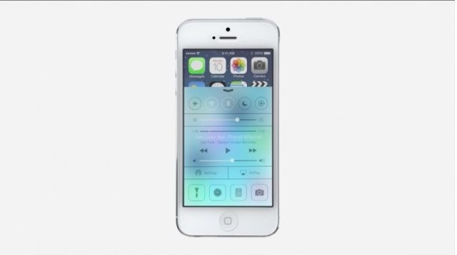
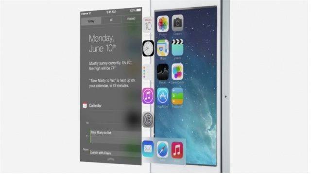
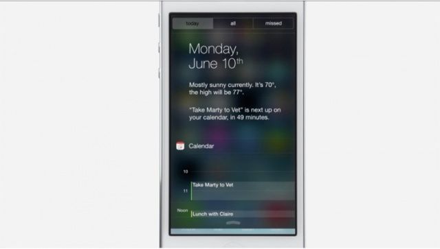
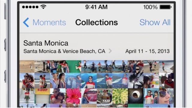
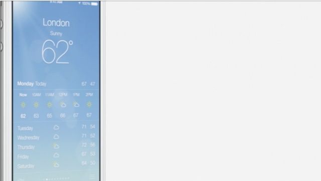
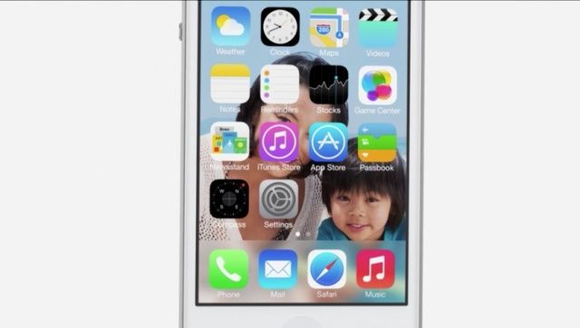
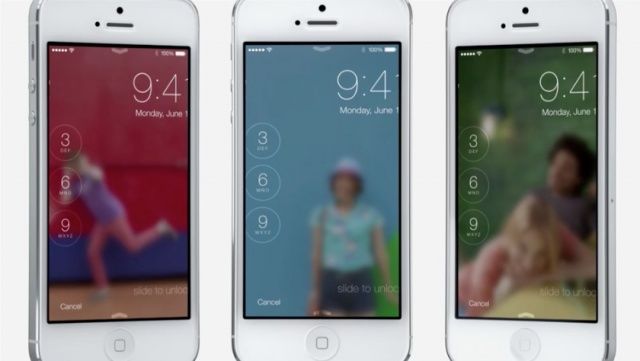
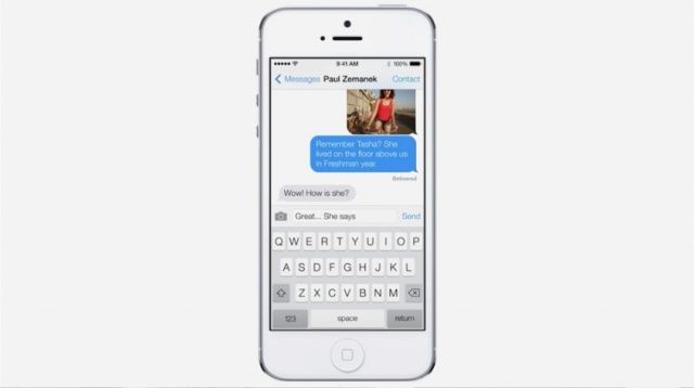
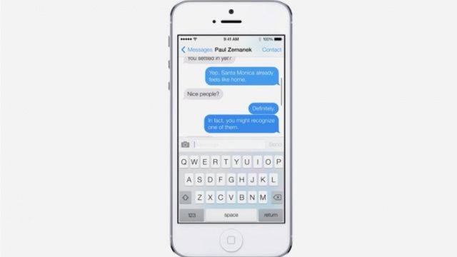
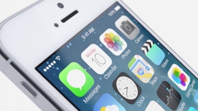
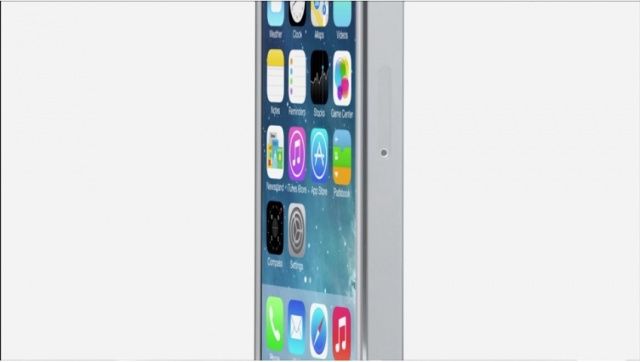
Tim Cook just took the stage to unveil the latest version of iOS, the world’s best-loved mobile operating system. It’s iOS 7, a redesigned operating system for a new generation of mobile users who already take the iPhone for granted. And it’s a radical redesign: “the biggest change to iOS 7 since the iPhone.”
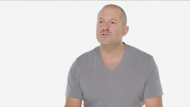
There are way too many changes to count here. Jony Ive has made a point that this is a vast simplification and clarification of iOS that was only made possible by a radical collaboration across all departments at Apple.
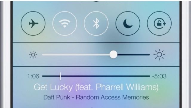
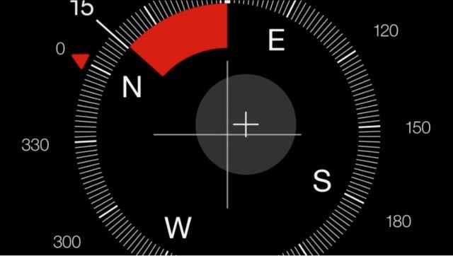
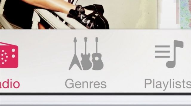
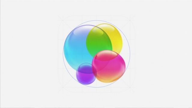
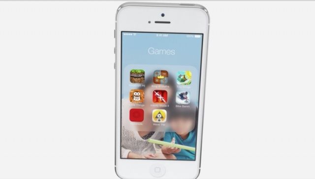
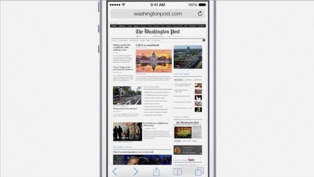
We’ll delve into more features soon. For right now, enjoy this gallery of iOS 7.
![This Is What iOS 7 Looks Like [Gallery] Screen Shot 2013-06-10 at 2.20.11 PM](https://www.cultofmac.com/wp-content/uploads/2013/06/Screen-Shot-2013-06-10-at-2.20.11-PM.jpg)







4 responses to “This Is What iOS 7 Looks Like [Gallery]”
Hmm looks very close to Windows phone screens.
Nice-looking stuff, but so far nothing that’s not available via jailbreak. Curious to know if Apple has partnered with the jailbreak community, or just ripped them off.
There was nothing about the WWDC that screamed WOW… I think the new icons are a little childish, and it looks as though they took all their ideas from Android and WebOS. The calendar app looks almost identical to Google’s. The iWork app looks nice though.
y’all are idiots.. this is going to be a great UI improvement to those of us who don’t have their head up their ass.