The current Internet scuttlebutt has it that when Tim Cook takes the stage on Monday for the WWDC keynote, he will not only unveil iOS 7, but a new, flatter ‘look’ for the entire mobile operating system spearheaded by Jony Ive. This would bring the look of iOS closer to modern design principles employed by the likes of Google and Microsoft, and finally flush Scott Forstall’s skeuomorphism turd.
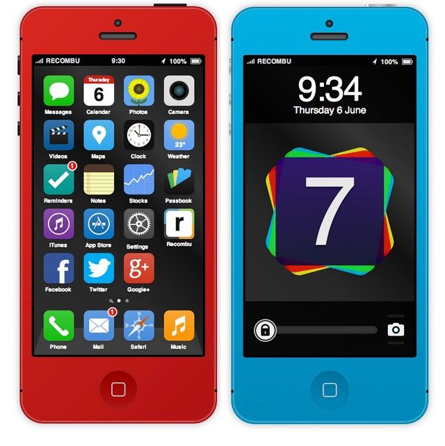
Developer Steve King wanted to give people an idea what a redesigned iOS 7 with flatter, less skeuomorphic design elements would really look like, so he mocked up a flatter iOS 7. But what makes King’s mock-up even more existing is it’s all done in HTML, CSS and Javascript (no images!), meaning it’s fully interactive in any browser.
You can find the interactive iOS7 concept here. King explains his thinking when designing the OS:
Based on a combination of leaked photos and the new WWDC app highlighted in our iOS 7 rumour round-up, changes to the OS will likely consist of a flatter aesthetic and less gradients.
Skeuomorphic elements will also be taking a back-seat. For anyone not au fait with the term, skeuomorphism refers to elements imitating reality. This means we can expect the Notes app to look less like a notepad for example, instead, providing a simple, clean, text ready canvas.
This should result in a consistent feel throughout each of Apple’s proprietary apps; with a black headers and tab bars as well as colour-coded accents on buttons and details helping differentiate from one app to the next.
This concept is intended to be a fun way for people to interact with an idea. From a technical point of view, the challenge was to build this entire concept without using any images and instead, building the iPhone, icons and apps solely out of CSS and HTML code.
Personally, I think a lot of people expecting this sort of overhaul of iOS come Monday are in for a pretty big let down. So far, Ive — as Apple’s new head of digital design — has largely contented himself to just turn down the volume on some of the most obviously skeuomorphic design decisions Apple has made recently, like the faux-reel-to-reel in the official Podcasts app. I imagine Jony Ive will continue to work this way, tightening things up rather than throwing them out. That might mean the end of, say, that hideous ‘Marker’ font in the note app, or the pukesome fake Corinthian leather in Calendar, but it’s probably still going to be subtle. What do you think?
Source: Recombu
12 responses to “Play With Jony Ive’s Redesigned iOS 7 Ahead Of WWDC With This Interactive HTML5 Mock-Up”
“What do you think?”
I think you should give it a rest and stop cluttering CultOfMac every couple of days with “same article different wording.”
I had this long, eloquent comment ready to post but the comment login killed it. Will “boo hiss” suffice to adequately describe my feeling of the mockup (left)?
I think this would be not a step but a marathon in the wrong direction. The icons look like something a 3 years old child would draw in 10 minutes. This is not modern or minimalistic. This is plain ugly stuff. Not to mention how hideously horrible green on black is.
Also, adding clutter to the notification center and not fixing it’s worst shortcomings (that damned small x and that you can’t collapse groups) would not fly.
At is NOT IOS7 and it would be nice to see that hit whoring bit struck from the headline
As for the concept. I think that it is the closest viable concept to how apple might go flatter in terms of the icons. But I don’t agree with the toggles in the NC. Task bar seems like the more likely spot for me
Is a Flatter OS design really going to address iOS’s lack of features to catch up with Android?
Doubt it
Wow what a horrible article title. This should be called “Steven King’s vision of iOS7”. Its not Johnny Ive’s. Give me a break.
Too bad it’s only 1/4 functional. No App Store, no iTunes Store, no settings, stocks, weather, photos, maps, clock …
I hope they don’t change the whole UI, rather just give it a fresh look. Most of the time, users don’t really know what they want. They say overhaul, when actually, all they really need is a change in design to give it a newer look and refined design.
I know iOS 7 will look nothing like this garbage and thank god because this is awful. It looks very child like and elementary. Good work as an artist for personal preference use but there is no way this will be shipped out to the masses as the stock look.
I would rather have Scott Forstall’s skuimorphic “disaster” then this Win8 Metro design.
This isn’t Jony Ive’s. It’s just some guy’s awful design of what he thinks iOS7 will be like. You’re just trying to fool people on Google searching for Ive’s redesign of iOS7…and I don’t know why people bother because they’ll never find anything ahead of WWDC.
How about you create content rather than link bait?
I agree with dcdevito, the look of the OS doesn’t really matter.
Lipstick on a pig makes not a supermodel.
iOS needs drastic changes and I don’t think Ive’s had enough time to make the kind of changes that iOS needs but we’ll see what he has up his sleeve come Monday.
I’m keeping my expectations low as I think everyone — as usual with most Apple events — has expectations that are impossible to match.