Skeuomorphism, or the tendency to deliberately make something new look like something old and familiar. Some people love it, some people hate it and think it’s tacky.
No matter how you feel, his love for skeuomorphism is one of many reasons that former iOS chief Scott Forstall was fired yesterday. Replacing him is Apple’s Senior VP of Design, Jonathan Ive, who will lead a new Human Interface Group in Apple… and whom reportedly loathes skeuomorphism with every fiber of his being.
All that fake leather stitching, those hideous textures, those bizarre font choices in iOS’s stock apps? If Ive gets his way — and we think he will — they’re all about to change.
Here are the eight skeuomorphic apps in iOS 6 we hope Jony Ive is going to change in iOS 7, along with some third-party apps we hope he takes inspiration from.
Calendar
The default Calendar app in iOS 6 is widely considered to be an eyesore, namely for using a tan patent-leather texture which makes it look like a sweaty, late 70s datebook. Calendars can, and should, be better looking than this. There are a number of alternative calendars on iOS 6 that look great, like Calvetica, but we would like to see something bolder from Ive in iOS 7: maybe something like Day, a gorgeous calendar concept design by Toby Negele.
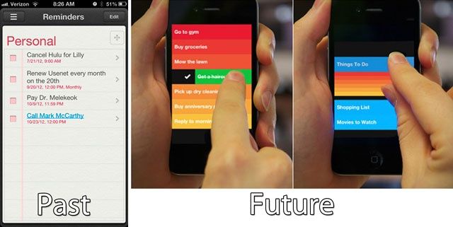
Reminders
Of all the skeuomorphic travesties in iOS 6, Reminders is one of the least offensive, but it’s still trying to look like a leather physical reminder pad when a 21st century touch interface opens so many more opportunities. One of the boldest and most satisfying to use Reminders alternative is RealMac Software’s Clear, which is the way a ToDo app should work when it’s not trapped by expectations from the past.
Game Center
With its faux casino table design, Game Center tries to channel a feeling of whimsy and fun using skeuomorphism, but instead just comes across as a cheap Vegas craps table. Blecch. There are better ways to appeal to gamers without being eyesores, as evidenced by Microsoft’s Xbox Live design, notably incarnated under iOS in the My XBOX Live app.
Voice Memos
As an example of skeuomorphic design done right, the default Voice Memos app in iOS 6 actually isn’t bad. It’s simple, it’s not fiddly, it doesn’t look obnoxious and it conveys a lot of information at a glance. What could be more obvious an interface for recording than a microphone? Even so, if you use voice memos a lot, the advantages of skeuomorphism quickly erode into annoyances: this is not an interface for anything resembling a power user. We’d say the Voice Memos design is one of the least likely ones that Ive will change outright, but if he does, we hope he will supplement it with some of the advanced functionality found in voice recording apps like Audio Memos Pro.
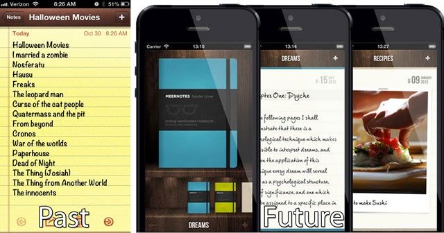
Notes
We’ve hated Apple’s skeuomorphic interpretation of Notes since the early days of OS X when it first appeared in the form of Stickies, and boy, do we still hate it on IOS. Part of it’s the ugly, fuzzy yellow texture; the other is the choice of the hideous font, which is now Noteworthy and was previously Marker Felt. Either way, it’s gross, and makes one of the most useful features on the iPhone and iPad a hideous abomination to use. We want Ive to kill this version of Notes in favor of pretty much any other interpretation. There are a million great note taking apps like Catch Notes, Drafts and Notefile, but is it sacrilege to say that we hope Ive actually sticks with a more tasteful skeuomorphism and adopts an approach to Notes in iOS 7 more like that embraced by the absolutely gorgeous Meernotes app?
Contacts
On the iPhone, the Contacts app isn’t that bad, but on the iPad, the Contacts app has to go: it’s channeling a physical book when there are so many more interesting and useful things to be done. We’d like something like Smartr Contacts adopted across the board, featuring deep social networking integration, frequency charts, and more… all wrapped up in a beautiful, useful design.
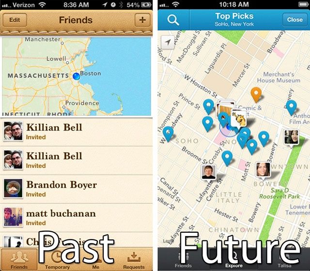
Find My Friends
Even if you don’t hate skeuomorphism, it’s hard to imagine an Apple app design that would make as many people want to puke all over it as that of Find My Friends. Gross leather, gross stitching… it’s just a total horfcake. Pretty much anything would be better, as exemplified by the official Foursquare app, which may not be on the cutting edge of design but doesn’t want you to gouge your eyes out, either.
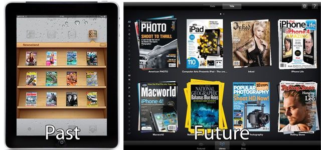
iBooks & Newsstand
It’s hardly the most egregious skeuomorphi-sin in the design world, but we’re not a big fan of Apple’s fake shelving for iBooks and Newsstand. We get the point: Apple wants to show off covers. But come on: in a few years, people aren’t going to even be buying books or magazines off of wooden shelves anymore; they are just going to pluck them from the digital ether. It’s totally unnecessary. As such, how about handling magazines and books not as digital versions of real-life products, but as the digital-first media they will be? By all means, show off covers, but if you’re going to, do it like Zinio.
![8 Tacky Design Crimes That Jonathan Ive Should Set Right In iOS 7 [Feature] crime](https://www.cultofmac.com/wp-content/uploads/2012/10/crime.jpg)
