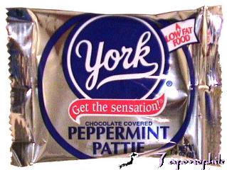

Apple’s alliance with American Idol has caused me some discomfort this year, so I always do my best to mock the entire enterprise. As eagle-eyed reader Scott noticed, the recent iTunes and Idol charity event Idol Gives Back tends to, ahem, “borrow” the design language of a York Peppermint Patty. I’m sure this was Fox’s designers rather than Apple, but still…


14 responses to “Quickie: American Idol on iTunes Gives Back, Takes First”
please say your kidding. It’s blue and red, and the blue one is roundish. Whatever Scott noticed was overblown and meaningless. Now jTunes is a ripoff. A heck of a lot of things are rip-offs, but this one is not.
Thats it? Is that all you have to say?
The red ribbon design you mention is as old as christmas so its hardly original to any brand anymore. What is your “discomfort” about Apple teaming up to do charity with Idol, anyway?
Seriously, do you even know wtf you made this blog about?
I can spot at least nine differences in the two logos:
1. Oblong vs Circular
2. Different Font for brand name
3. Different Font for subtitle
4. Light Blue Text vs. White Text (In the oval)
5. Ribbon has stripes
6. Ribbon has a lighting effect
7. Absent second white ribbon coming from blue oval
8. Absent outer enclosing circle
9. Light blue oval trim vs white circle trim.
In fact, the only thing that is really the same is the choice of color!
You can make the case that they are similar, but it definitely is not remotely close to trademark infringement.
Wow thats great! That looks so similar you might have to call the trademark lawyers on this one! LOLOLOLOL. Oh wow I need a life :( “Honey where are you?”
Sorry… this was one of the worst entries… ever. Almost as bad as that entry a little while ago regarding some other company also used an apple as their logo. *sigh*
I would think a blue circle and a red banner underneath is a pretty common design scheme…
Looks like some people’s sarcasm detectors are on the fritz today. ;)
That being said, I think this just proves there are no new ideas in marketing than anything else. Either that, or the folks at American Idol are huge fans of peppermint patties. :D