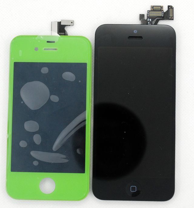
When rumors hit that Apple was going to make the display of the iPhone 5 taller, but not wider, people were kind of upset that their iPhone was going to be a lot longer. However, some new images of the iPhone 5 front panel show that even though the display will be larger, the device itself won’t be that much taller than the iPhone 4S because Apple is reducing the size of the bezel around the display.
Chinese parts distributor SINOCET published these images of the new display, as well as the video at the bottom of this post, that compare the size of the iPhone 5 display with that of an iPhone 4S.
What do you think? Are you glad Apple’s keeping the iPhone almost the same size by reducing the bezel area? Let us hear your thoughts in the comments.
Source: Sinocet
Via: NoWhereElse

10 responses to “New Images Show The iPhone 5 Front Panel Won’t Be Much Taller Than The iPhone 4S”
Imho, the home button needs to disappear to further shrink the bezel. But watevs I’ll still love the new iPhone.
The exact dimensions have been known for some time now. This is hardly “news.”
I hope that the new iPhone has a 4in screen. I also would love to see a step up in processor speed, and a NFC chip, along with changes to Airplay, which were discussed in another article. The SGIII is very nice, and I have thought of looking into it as my next phone. But I believe the next iPhone will be a big step up, and put them ahead of WP8, and Android.
Apple needs to copy Google’s incredible intuitive and smart button-less design.
What do you base this on?
I think he bases it on the fact that if you actually understood why the home button is there, you wouldn’t be asking for it’s removal.
The very question reveals a stunning lack of knowledge about design in general and the design of the iPhone specifically.
I really don’t understand why they moved the front facing camera to above the earpiece. I neve had any issues with having it to the side, and they could have kept the height almost the same if they had just left it where it’s was, especially as they moved the headphone jack. Maybe they needed the extra room for internals or the battery but it seems like bad design and wasted. I feel like they are trying to lock in the size going forward and that the next gen or one after will be just about all screen while maintaining the size of the iPhone 5.
Can you please enlighten us mr bee
the new design looks pretty retarded, they got the design right with the 4 and 4s
Actually, it is more intuitive to have the power button on the side of the device, rather than on the top. Which is what i know Samsung does with the galaxy. Although this, and what you are talking about, has nothing to do with Google, it is the manufacturer.
I will be getting the new iphone, but i am sick of the fanboy/biased comments and articles on this site.