When you open up your MacBook, MacBook Air, or MacBook Pro, the glowing Apple logo on its hood sits upright so that everyone in Starbucks knows that you’re using a Mac. However, it hasn’t always been that way. There was a time when Apple logos were upside down on the lid of Apple notebooks, until Steve Jobs realized his mistake.
Joe Moreno, a former Apple employee, has taken to his blog to explain the story behind that upside down Apple logo on late Apple notebooks.
About a dozen years ago we had some discussions at Apple about the placement of the logo on the back of Apple’s laptops. […]
Apple has an internal system called Can We Talk? where any employee can raise questions on most any subject. So we asked, “Why is the Apple logo upside down on laptops when the lid is open?”
The answer, of course, is because Steve Jobs wanted it that way. We’re well aware of Steve’s attention to detail and how much he obsessed over the littlest things, and this was one of them. Steve wanted to make sure that when a user sat down in front of their Mac, the Apple logo was facing towards them; he didn’t care how an onlooker saw it.
Why was upside down from the user’s perspective an issue? Because the design group noticed that users constantly tried to open the laptop from the wrong end. Steve Jobs always focuses on providing the best possible user experience and believed that it was more important to satisfy the user than the onlooker.
But years later, Steve reversed his decision and turned the Apple logo around. Moreno concludes that “opening a laptop from the wrong end is a self-correcting problem that only lasts for a few seconds. However, viewing the upside logo is a problem that lasts indefinitely.”
Which was more important — to make the logo look right to the owner before the PowerBook was opened, or to have it look right to the rest of the world when the machine was in use?
Look around today and the answer is pretty obvious. Every laptop on earth has a logo that’s right-side up when the machine is opened. Back then, it wasn’t so obvious, probably because laptops were not yet ubiquitous.
Segall concludes:
Looking back, it borders on the unbelievable that something so wrong could ever have seemed right. That Steve Jobs ever wrestled with this decision only proves one thing: being right in retrospect is much easier (sic) being right in real time.
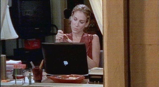
According to a recent Bloomberg report, the upside down Apple logo was a big issue for Hollywood studios. Apple famously loans its products to Hollywood studios to have them featured onscreen, and some filmmakers used stickers to make the logo appear the correct way up on camera.
Source: Reddit
Via: The Next Web, Bloomberg


12 responses to “The Upside Down Apple Logo: A Steve Jobs Mistake”
A but I thought Steve was a genius who could never do wrong.
Hindsight is 20/20, but I always felt like it was weird that those logos were upside down. It never seemed to make sense, even when I was 15.
Hindsight is 20/20, but I always felt like it was weird that those logos were upside down. It never seemed to make sense, even when I was 15.
No, that’s just something trolls say.
Steve probably got more things right than he did wrong so I forgive him, rest his soul. An upside-down logo should have been the least of his worries.
This is a bit of a misrepresentation. It isn’t Steve Jobs’ “mistake” he was just doing it the way everyone else did it. You might say it’s something he didn’t see right away, but it’s hardly a “mistake” when every other laptop that existed was the same.
The logo on my Powerbook 1400 is upside down, too. So, it didn’t start with Steve Jobs.
Why can’t I see this post? It just says embeddedDiscussionFormat? Sorry a newbie to the forum
let’s just take that as a smart and sarcastic transgression and pretend steve jobs didn’t make mistakes.
I still try to open my MBP the wrong way all the time, because I put the apple logo right side up with the . You’d think I’d eventually get it right…
what John implied I didnt even know that someone able to earn $4182 in four weeks on the internet. did you look at this web link(Click on menu Home more information) http://goo.gl/LtYN2
Wait, the Apple logo was upside-down on earlier notebooks. I have a 1993 PowerBook 165c that has an upside-down Apple logo. Sure it’s small but when it’s open it’s just as upside-down.