It’s our own fault. We all asked Apple to dramatically change the look and feel of the iOS operating system, which, until yesterday, remained largely unchanged since the introduction of the original iPhone back in 2007. And we all complained when it didn’t do that with iOS 6 this time last year.
But I can’t help but feel the Cupertino company is now punishing us for all those requests, and all that complaining we did before about its skeuomorphic designs.
When it comes to design, iOS 7 is vastly different to its predecessors. It still functions in much the same way — though there are some new features you’ll need to get used to — but it looks completely different. As soon as you power it up for the first time the minimalistic feel is staring back at you, but it isn’t until you’ve completed the setup process and arrived at your home screen that you want to vomit in your own lap.
I’d be happy if it weren’t for the icon designs.
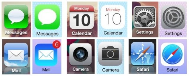
The majority of Apple’s own app icons in iOS 7 are completely different to those from iOS 6. Apple has now adopted the “flat” design we’ve all been hearing so much about, doing away with the funky reflections that previously made icons look like they were almost sat on top of the display.
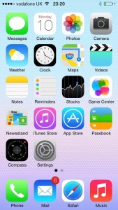
And I’d be happy with that if it weren’t for the icon designs. There are a couple that look good. The Clock icon is great — maybe because it’s one of the few that haven’t changed dramatically — and it now shows the actual time (finally!). And the Music, App Store, and iTunes icons are… okay, too.
But then there’s Game Center, Weather, Newsstand, Reminders, Safari, Camera, Mail, and Settings. Oh, Settings… what happened there?
These icons look amateur — like someone installed Photoshop on Jony Ive’s Mac for the first time, and he knocked them up in 30 minutes before he went out to dinner. They’re inconsistent, and many just look out of place.
The Game Center icons looks completely different to everything else, as does the Maps icon, and the Weather icon looks like it was designed for a toddler’s play phone. Some icons have gradients, some don’t, and others others just have too much white space.
When you mix them all together, they look like a mismatched mess — a jumble of colors and textures that don’t belong together. If Apple had followed some kind of theme, then it wouldn’t have been so bad. But as I noted on Twitter last night after installing the iOS 7 beta, it’s like every Apple executive (or intern?) was allowed to design one app icon each, but they weren’t allowed to see each others’ before they were all thrown together.
iOS devs, please don’t ruin your app icons just because Apple did.
— Killian Bell (@killianbell) June 10, 2013
Although I didn’t mind the skeuomorphic look in previous iOS releases, I can understand why some people didn’t like it. But trust me, this is worse. At least the previous icons looked like someone painstakingly agonized over the designs and spent hours perfecting every little detail.
But there are no details to perfect with these ones; they’re just blobs of color with what looks like bad clipart stuck on top.
Then there’s Control Center, which provides you with quick settings toggles, a brightness slider, music playback controls, buttons for AirDrop and AirPlay, and shortcuts to a flashlight, the Clock, the Calculator, and the Camera.
There’s no sense of organization in Control Center.
There’s hardly any color here; there’s a slightly transparent background with dark grey text and icons on top of it, and sliders and active settings are white. There’s also no sense of organization, and again, no consistency. For example, the Clock and Calculator icons looks nothing like their actual app icons.
The Control Center isn’t customizable, either, so you can’t replace shortcuts you don’t use with others that might be more helpful to you, which is a shame.
Fortunately, it’s not all bad news. In places, iOS 7 looks great.
Fortunately, it’s not all bad news. In places, iOS 7 looks great, and actually very impressive.
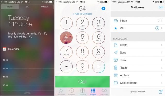
The Notification Center has lost the linen background in favor of a dark transparent panel, and it looks nice and modern. It also displays the date, a brief weather forecast for the day, and your upcoming appointments. Notifications are split into two sections now — “all” and “missed.”
I’m also a big fan of the new dialer inside the Phone app. Like Notification Center, it’s modern and simplistic, and it has a really nice touch — when you press a digit, your wallpaper shows through, and it looks really nice.
The Mail app also looks fantastic, and it kind of reminds me of Windows Phone.
iOS 7 isn’t a complete shambles, then, but I’m really disappointed in some of the changes Apple has made. Although iOS 6 and its predecessors weren’t perfect, they were at least beautiful.
