icons

Read Cult of Mac’s latest posts on icons:

iPhone Home screen modders go crazy with iOS 14

By

MS Paint
Wait a second, that doesn't look quite right!
Photo: Thomas Reisenegger

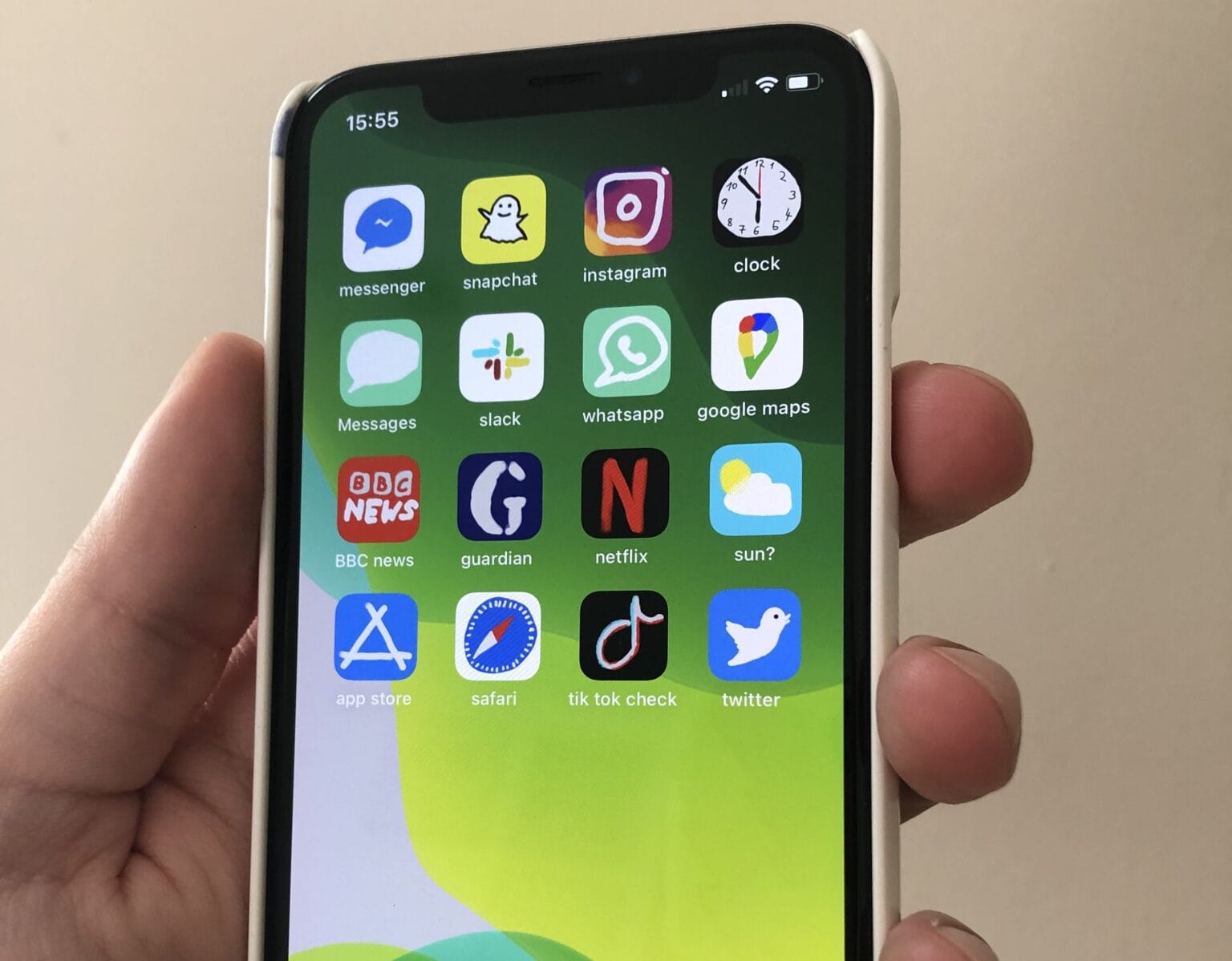
Ever wanted to make your brand-new iPhone look like it’s running Windows 95? That’s the outrageously novel idea that sprang into the mind of Ashley, an 18-year-old from Indiana who wants to work as a graphic designer, after she upgraded to iOS 14 last week.

Taking advantage of iOS 14’s new Home screen widgets feature, and a clunky workaround that employs the built-in Shortcuts app, she gave her iPhone 11 a vintage Microsoft-style makeover that screams retro cool and picked up 4.4 million views and 664,000 likes on TikTok.

“As someone who wasn’t even alive in the ’90s, other operating systems, such as Windows XP, are more nostalgic to me, but I went with Windows 95 because it furthered the contrast between old and new,” Ashley, who did not want her last name revealed, told Cult of Mac.
Score a massive library of royalty-free icons and stock images

By

The Ultimate Design Assets Bundle
Bolster any design project with thousands of royalty-free and licensed flat icons, stock images, and more.
Photo: Cult of Mac Deals

For digital designers, assets are everything. They put flesh on the framework of your site, application or other design projects. So access to a massive library of royalty-free icons, stock images and other assets is an invaluable resource. The Ultimate Design Assets bundle includes three libraries, with lifetime access to thousands of assets.

Why Samsung will probably get away with ‘borrowing’ Face ID icon

By

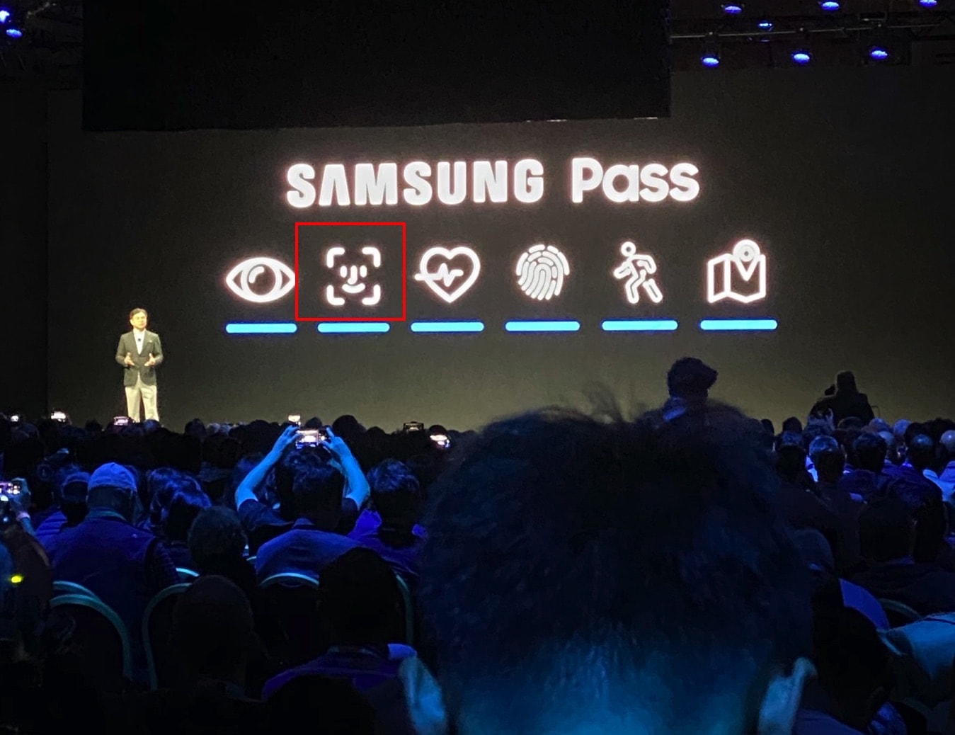
Samsung Pass logo
That logo certainly looks familiar.
Photo: Parker Ortolani/Twitter

Eagle-eyed viewers spotted something oddly familiar during Samsung’s CES keynote Monday. On a slide regarding Samsung Pass, its new biometric “identity management as-a-service” product, Samsung included a logo that looks (to be polite) “borrowed” from Apple’s Face ID.

Yes, this not-quite-identical logo is the latest chapter in Samsung being, err, inspired by Apple designs. But should Apple be firing up its on-call lawyers for an easy win over Samsung? Legally speaking, things might be a bit more complicated than they initially seem.

How to change the Slack logo back on your Mac

By

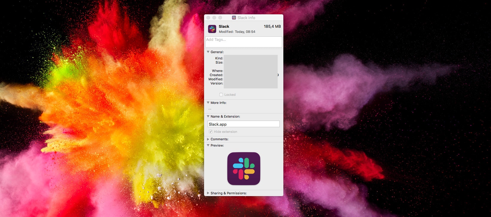
Oh man, what were they thinking?
Photo: Cult of Mac

Slack is everybody’s favorite way to waste time when they’re supposed to be working. And today, the biggest conversation in Slack chats everywhere is Slack’s hideous new logo.

It’s dull. It’s ugly. It has none of the personality of the original logo, and it doesn’t look like the Slack hashtag even if you squint at it hard.

If you’re on iOS, tough. You’re stuck with this awful new corporate abomination. But if you’re on the Mac, there’s good news: You can keep the old Slack app icon.

Step one is DON’T UPDATE THE SLACK APP YET!

The most popular colors for App Store icons explained

By

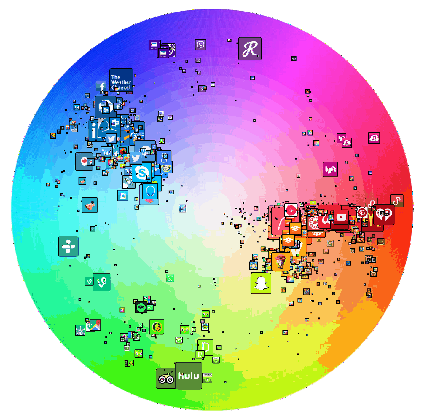
The Top 200 iOS app icons, charted to a color wheel.
Photo: Stuart Hall / Medium

There are thousands of colors an App Store icon can be … so why does it so often look like developers only had half a box of crayons to choose from when we look at our iPhones?

But App Store iconography may be more colorful than it seems at first. Don’t believe me? These color wheels show exactly how dominant certain colors are in the icons of the most successful apps.

Awesome iOS Easter egg discovered after two years, hiding in plain sight

By

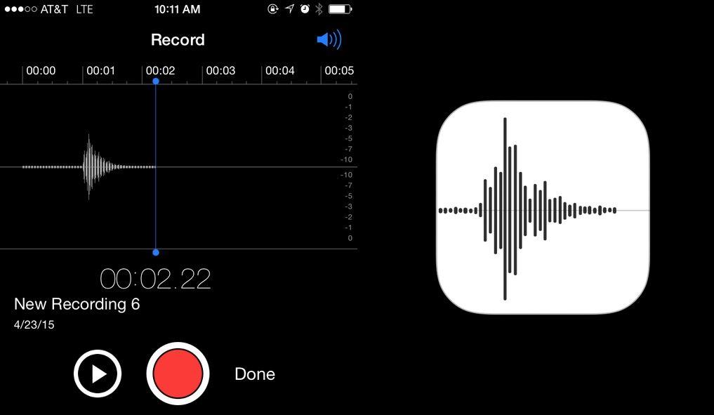
Say Apple into Voice Memos and you get its logo. Photo: Mike Rundle
Say "Apple" into Voice Memos and you get its logo. Photo: Mike Rundle

Apple is known for placing its fair share of Easter eggs into iOS and OS X, but this is the coolest one we’ve seen in a while.

You know the new Voice Memos icon Apple introduced in iOS 7 Beta 2? It turns out the icon is designed after the waveform representation of someone saying “Apple.”

App Watch: Stargazing, light-leaking and book-recommending

By

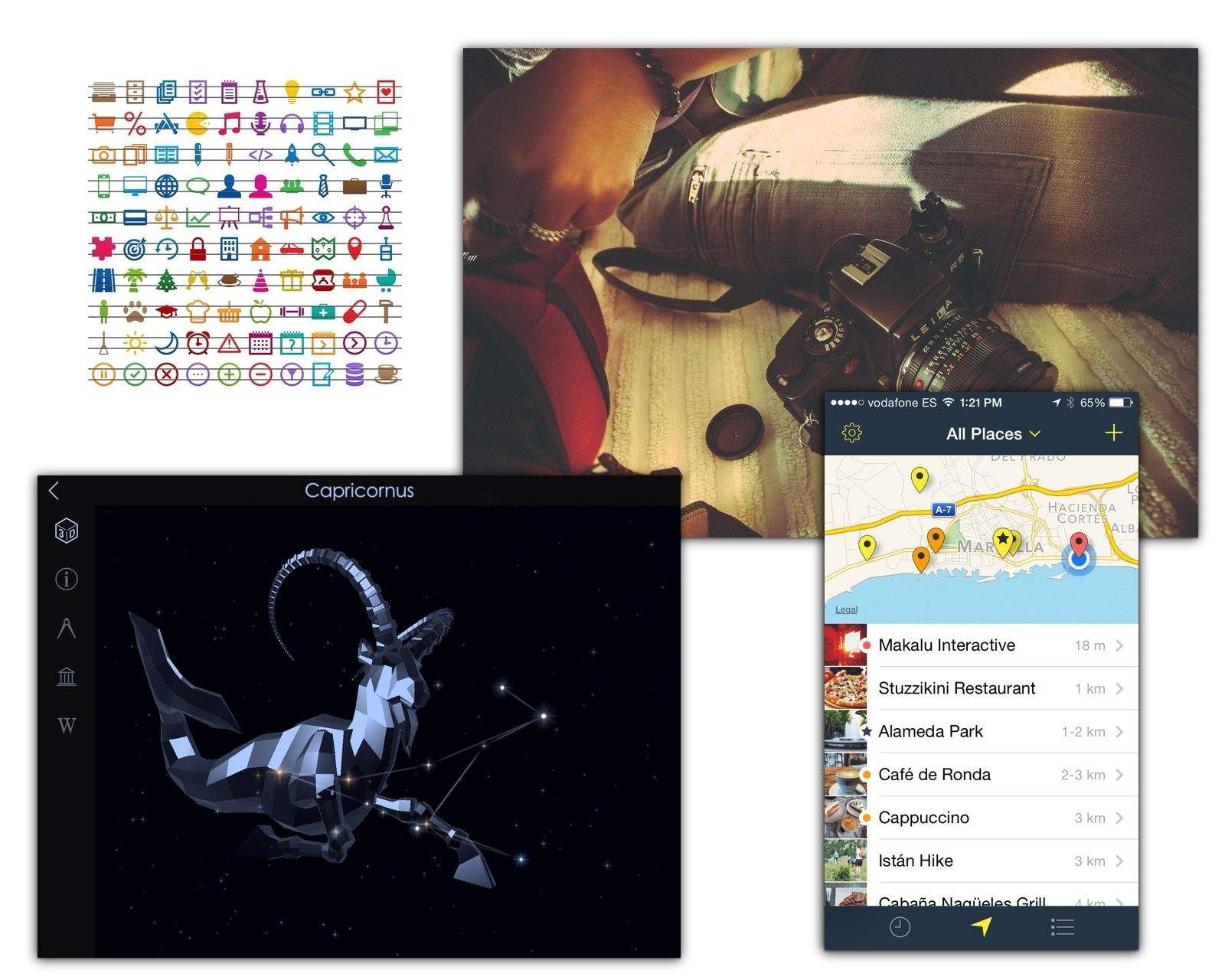
This Labor Day holiday we take things easy. Whether stargazing with Starwalk 2, taking a walk and remembering the hot spots along the way with Rego, getting a recommendation for a good read with Bookvibe, or adding so retro-style light leaks to our photos with a new set of Prolost Lightroom presets.

This Labor Day holiday we take things easy. Whether stargazing with Starwalk 2, taking a walk and remembering the hot spots along the way with Rego, getting a recommendation for a good read with Bookvibe, or adding so retro-style light leaks to our photos with a new set of Prolost Lightroom presets.


Give your computer a Yosemite-style makeover (even if it runs Windows)

By

post-283705-image-fd00261f5b107b2dd9a25abf32d49b78-jpg

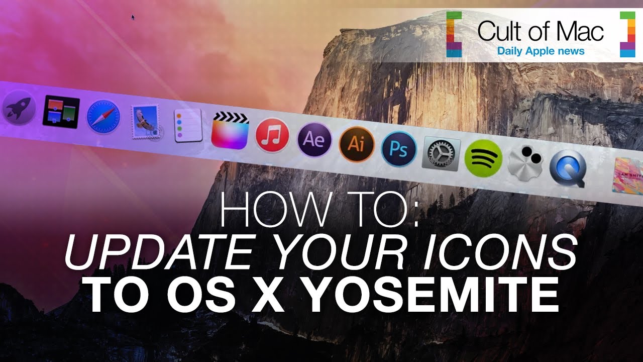
New icons in OS X Yosemite will bring the Mac operating system and iOS closer than ever visually. While Yosemite doesn’t come out until fall, you can get this cool, flat look now — without downloading Apple’s Developer Preview betas, which are buggy at best.

This short video will show you how to give your computer a Yosemite-style face-lift — even if you’re running Windows. Get the downloads mentioned in the video at the links below.

Quickly Hide All The Icons On Your Desktop [OS X Tips]

By

Look, ma! No icons!
Look, ma! No icons!

There are times when you just need to clear off the icons on your Desktop, like when you’re giving an important presentation at work. No one wants to see all the images you’ve saved from the internet, right?

I used to solve this problem with a Sort Me folder on the Desktop, just select all in a Finder window focused on the Desktop, and drag it all to the Sort Me folder.

There’s an even faster and easier way to hide all the icons on your Desktop, though, using the Terminal.

Switch Quickly To Big Finder Icons With AppleScript [OS X Tips]

By

Big icon view

One cool thing you can do in the Finder is set any window to view as large, 512X512 icons. You can do this by clicking on the icon button in the top left of any Finder window, then dragging the resizing slider in the lower right corner.

It’s fairly easy, but not super precise, and if you often use the Finder to quickly scroll through large photo icons to preview images you’ve taken or downloaded, it can be somewhat of a tedious chore.

Creating an AppleScript to do it for you is easy, and it will save you some serious time.

Rearrange And De-Clutter The Menubar With This Dock-Like Trick [OS X Tips]

By

Menubar rearranging

You know all those menubar items in the upper right hand corner of your Mac’s screen? The ones that–from the right–probably show the Notification Center, Spotlight, your user name, the date and time, your battery level, and so on?

Did you know you could move those things around (most of them, anyway)? Did you know you could even take some of them off of the menubar altogether? Here’s how.

iOS 7 Review Roundup

By

design_functional_gallery2

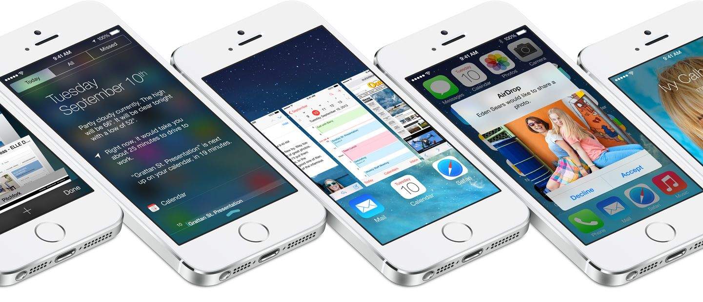
It’s been over three months since iOS 7 got its first unveiling at WWDC, and in just a couple of hours, it will be made available to the public. It’ll be completely free to download — no matter which iOS device you’re using — and Apple’s confident it will quickly become the world’s most popular mobile operating system.

iOS 7 is the biggest change to iOS since the original iPhone, introducing a colorful new design for the first time, and bringing lots of new features — including Control Center, improved multitasking and Notification Center, iTunes Radio, and AirDrop.

So should you be rushing to download and install it on your iOS devices as soon as it becomes available, or can you wait until all the fuss has died down? Well, we’ll be bringing your our review in stages over the course of the coming days, but to help make your decision super simple, we’ve trawled through the biggest and best iOS 7 reviews out this week and put together a helpful roundup.

Animated GIF Shows New iOS 7-Ready App Store Icons

By

ios7-6-ikony

If you’ve been running the iOS 7 beta, or have seen it up close, then you’ll be familiar with the ugly icon problem, in which some icons have janky edges thanks to a change of the corner radius in iOS 7. You can see the changes in this animated GIF from Czech site Letem Světem Applem (or something), which shows the design change as applied to the icons in the iTunes Store.

Find My iPhone Icon Gets Updated For iOS 7, Breaks App For Non-Developers

By

findmyiPhoneicon


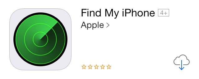
We’re a few weeks away from the final release of iOS 7, but it looks like Apple is starting to prep its non-stock apps with an iOS 7 update. This morning Apple released an update for Find My iPhone that comes with a new icon more fitting for iOS 7.

A few bug fixes were tossed in, but early reports claim the update has broken the app for non-developers, so we’d advise against updating right now. The new Find My iPhone icon was also added to the beta.iCloud.com homescreen, but hasn’t been updated on iCloud.com yet.

Change App Icons On Your iOS Homescreen With Iconical

By

iconical

As someone who has been testing iOS 7 for months, I can tell you that when it drops, some app icons are going to stick out like a sore thumb. Why? Because icon design that looked good in the house Scott Forstall built are going to look really out of place in the house Jony Ive knocked flat to the ground.

Unfortunately, unlike on OS X, there isn’t an easy way to swap out an app’s icon for a custom one of your choosing. That said, a new app called Iconical has figured out a workaround. The app lets you customize your homescreen, no jailbreak required, by taking advantage of the custom URL schemes of over 14,000 apps. This, my friends, is a clever idea.

Glyphish: Stock Icons That’ll Look Great On iOS 7

By

preview-glyphish6.jpg

If you thought the switch from the squat screen iPhone of the iPhones 1–4 to the tall and slim screen of the iPhone 5 was bad, then wait for iOS 7. I have the beta in daily use on my iPhone, and when I go back to my iOS 6-encumbered iPad mini, it feels like I’m visiting my grandmother’s house. Worse: any apps with a lot of heavy UI chrome start to seem as oppressive as a serial killer’s basement.

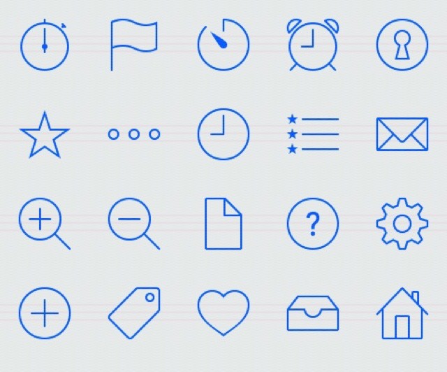
Thankfully, there’s an easy fix in the simple and clean shape of Glyphish, a set of beautiful icons, illustrations and (not so hot) backgrounds.

How Jony Ive’s iOS 7 Icon Grid Matches Up Against Real Apple Products [Image]

By

gqVkI26

With iOS 7, Jony Ive designed an icon grid that was meant to give developers some guidance on how to proportion their icons so they would look “harmonious” on the new iOS 7 homescreen.

As you can see above, though, Jony Ive has been using a similar mental grid to design Apple’s physical products for a long time. As Reddit user Kepano notes, however, Ive has probably not used this grid as a precise guide to design in the past.

“In my opinion as an industrial designer this image suggests that there are some intuitive similarities between all of Ive’s designs but that the iOS7 icon grid is probably the first time he’s defined those proportions so strictly. The fact that certain shapes match so closely (e.g. the width of the donut shape on the iPod) is probably not a coincidence but a matter of taste. What the image doesn’t show is that these products have radically different dimensions which is why the corner radii are very different from one another.”

Source: Reddit

How Jony Ive & iOS 7 Helped People Stop Hating The Purple Yahoo! Weather Icon

By

1672967-inline-750-yahoo

In late April, Yahoo released a gorgeously designed new Weather app for iOS. Pretty much everyone loved the new Yahoo! Weather app, except for one thing: the purple logo.

“Officially the ugliest icon ever,” said one Twitter user in response to the app’s announcement. “Its icon isn’t home page worthy,” said another. Some used their available Twitter character counts to criticize the icon with even more ruthless efficiency: “That icon is ass.”

The icon was such a bust that less than a month later, Yahoo made the extraordinary move of replacing the logo with one that was even uglier. Despite this, the new mark was widely hailed as an improvement. Yet just last week, Yahoo updated its official Weather app again, and surprise! The original logo is back, with not a whiff of controversy.

Here’s why everyone hated the Yahoo! Weather app icon… and why Jony Ive and iOS 7 might have helped the design eventually get accepted by iPhone users at large.

READ THE ENTIRE ARTICLE AT FAST COMPANY HERE.

Former Apple Designer Has A Great Idea Of What iOS 7 Icons Should Look Like [Concept]

By

Yes please.
Yes please.

Louie Mantia is a renowned icon and visual interface designer in Silicon Valley who has worked at big companies like Apple and Square. He was involved in designing many of Apple’s pre-iOS 7 app icons, like Trailers, Remote, Garageband, and iBooks. He even designed the Starbucks and Obama campaign app icons, for crying out loud.

The point is that this guy knows good icon design. He’s posted the above iOS 7 concept on his Dribbble, and I think it looks fantastic. He did the same thing last year for iOS 6. This time around, I think he’s nailed it better than Apple.

“Today, I revisited that original task and took about a day to understand the new style,” said Mantia. “Simpler, smoother, subtler. While I don’t employ the grid they created (and while I instead use the colors I chose), these feel interesting and balanced. Vibrant and bold, but not overbearing.”

Indeed. Please hire this guy back, Tim Cook. He gets it.

Source: Dribbble

Jony Ive Is So Obsessive He Gave iOS 7 Icons The Same Rounded Corners As The iMac

By

iOS7iCons

As the new Director of Human Interface, Jony Ive has gone from making beautifully beveled Macs, to redesigning iOS into a multi-layered Parallax operating system. By drawing from his deep well of hardware design brilliance, Jony brought a lot of his hardware philosophies to iOS, and the Messages app icon shows just how insanely detailed Jony can get.

As discovered by Brad Ellis, Jony made sure that the Messages icon’s corners have the same tapered edges which can be found on the iMac and other Apple products.

The difference is just a small number of pixels that most users would probably never notice, so Brad created his awesome comparison GIF so you can actually see the changes: 

Designers Set About Fixing The Mess Apple Made In iOS 7 [Gallery]

By

Redesign_iOS7_Big

Okay, so not everyone thinks Apple has ruined iOS with its newfound support of flat icons and whacky, eye-stinging colors. In fact, some iOS users love the new look. But many think it’s a gut-wrenching mess. In fact, some hate it so much that they’ve taken some time to fix it.

User interface designers have taken to Dribbble to showcase their own iOS 7 concepts, and I think you’ll agree that they’re a welcome improvement.

Quit Whining: iOS 7’s New Look Is Fantastic!

By

whitespace-2.jpg

You know what I’m hearing a lot of today? “Whine whine whine. Don’t like the icons. This really is kind of a mess.” And this, from our very own chatroom: “It hurts the eyes,” and “The hideousness of this is blowing my mind.”

It seems that a lot of people don’t like the look of iOS 7. But you know what? I love it. Sure, some of those icons are a little garish, but in iOS 6, all of the native Apple icons were hideous. And whatever you want to say about the new look, you have to admit that it is now way more consistent.