Jony Ive - page 14

Jony Ive: Why Experience Is More Important Than Megapixels

By

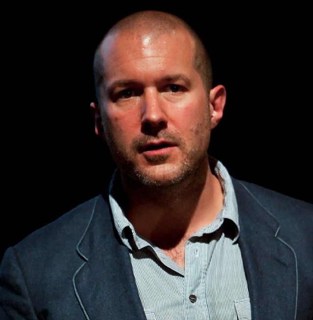
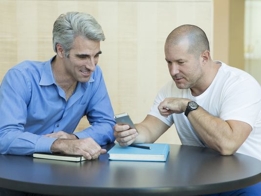
Jony Ive with Craig Federighi, Apple's senior vice president of software engineering. (Photo: Apple)
Jony Ive with Craig Federighi, Apple's senior vice president of software engineering.

With the launch of two new iPhones, Apple’s top designer Jonathan Ive granted very rare back-to-back interviews with USA Today and Bloomberg Businessweek.

Having read everything he’s ever said in preparation for my book about him (due mid-November), I recognized the usual Jony Ive talking points; the striving for simplicity, the importance of caring, and so on.

But there are a couple of paragraphs in the USA Today that especially gave me a strong sense of Deja vu.

This post contains affiliate links. Cult of Mac may earn a commission when you use our links to buy items.

Jony Ive And iOS 7 Just Ruined This Kid’s Day [Video]

By

post-246366-image-d8177a847b20f57e70ca6917edcba0c5-jpg

iOS 7 came out yesterday and if early adoption numbers are any indication, people love the hell out of it. Well, everyone except one young kid who hates that Jony Ive just changed everything. Check out the video Derek Colling posted to YouTube of his sons reaction to iOS 7.

Colling said he knew his son would be surprised, but a full-on mourning of Forstall’s fine green felts and leather stitchings came as a bit of a surprise. But hey, when you’re a kid and the smallest of changes feels colossal, is it too much to ask that your Angry Birds playing device have the same UI consistency throughout your tenure at pre-school? #firstworldproblems

Via: Twitter

Jony Ive Explains Why He Decided To Gut Skeuomorphism From iOS 7

By

jony

With the launch of iOS 7 yesterday Apple made some bold steps to ditch the rich textures, shadowing, and other skeuomorphic elements that have been a staple on the iPhone since 2007.

Thanks to the departure of iOS Software Chief Scott Forstall back in October, Sir Jony Ive was given a bigger role in iOS software development, so to hype up the launch of Jony’s first software masterpiece, he and Apple’s new SVP of Software Engineering, Craig Federighi, sat down with USA Today to give some details on what went into the creation of iOS 7.

According to Jony, the decision to strip iOS of all its shadows and physical references was pretty easy once they got Forstall out the door:

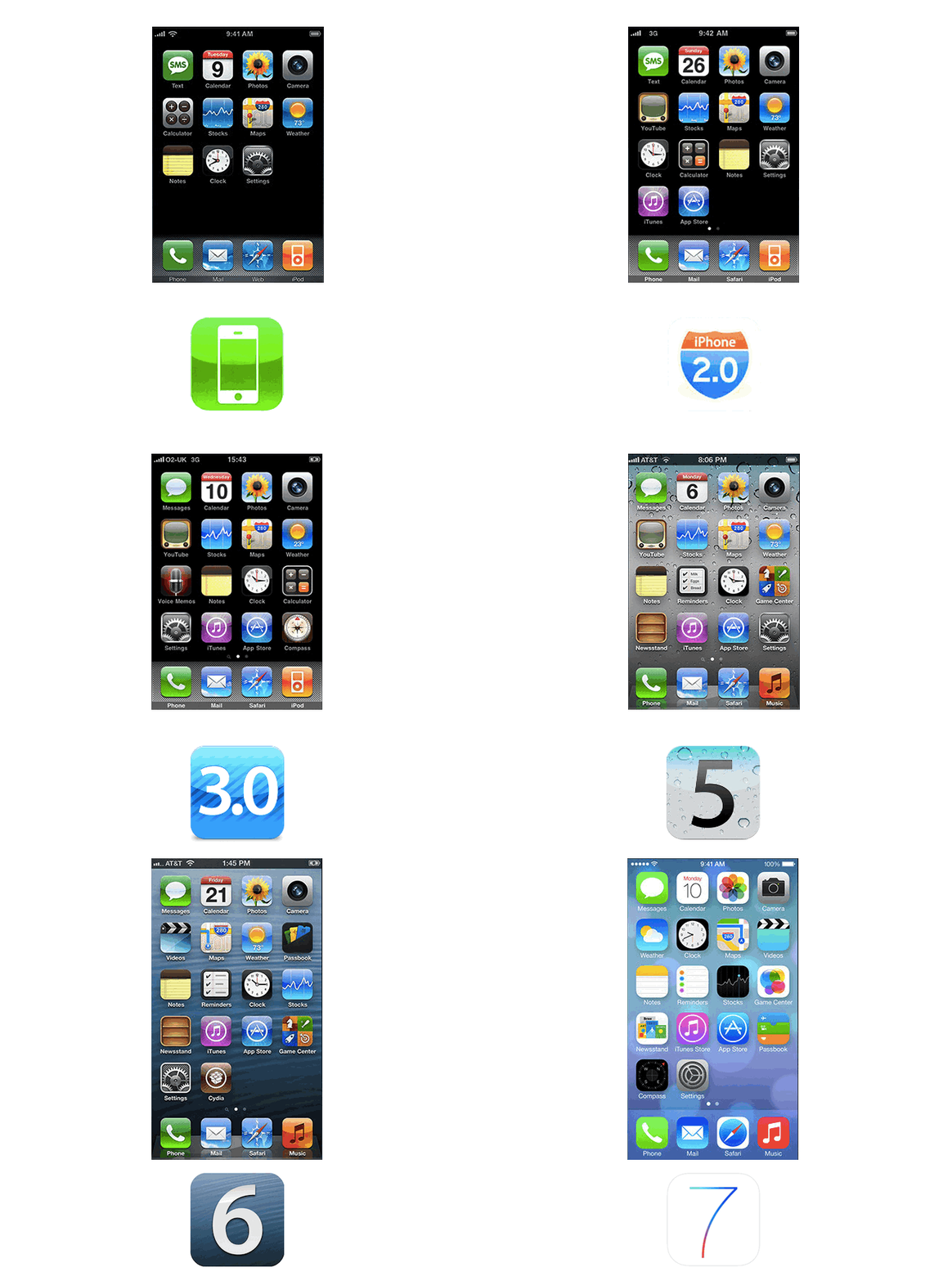
The Complete History Of The iOS Homescreen In One Simple GIF

By

iOS1toiOS7

Maybe this iOS comparison GIF isn’t  quite as mind-blowing as the one of Sir Jony Ive’s death stare devouring Forstall’s face, but pretty good nonetheless.

Some Apple detractors have bemoaned the release of iOS 7, claiming its not a big enough leap forward for Apple, but when you look at this GIF created by the Czech Apple blog LetemSvetemApplem, it’s pretty clear iOS 7 has the biggest UI changes of any previous version of iOS. Not to mention a slew of new features too.

Source: LetemSvetemApplem

Scott Forstall & iOS 6 Morph Into Jony Ive & His iOS 7 Masterpiece [GIF]

By

scotandjony

In just a few short days, everyone’s iPhone is going to look a hell of a lot different now that Scott Forstall’s felt and wood grain reign is coming to an end. To celebrate rise of Sir Jony Ive’s flat and parallax world, GadgetLove created one of the most incredible iOS 6 vs iOS 7 comparison GIFs we’ve ever seen. The best part is staring at Forstall’s shrinking smile as Jony’s designer scowl quickly morphs in and out.

Source: Gadget Love

Publisher’s Letter

By

striscia

When I was a kid, my dad had a book of record covers called “The Album Cover Album.” It was a big, glossy coffee table book of the classic LP covers from the 50s to the 70s.

My brothers and I spent hours copying the trippy Grateful Dead covers by artist Rick Griffin or making paper models of the San Francisco Victorians on Jefferson Airplane’s “After Bathing at Baxter’s.”

albumcover

Growing up in Britain in the 70s, at the height of Two Tone and punk, everyone was music mad. Music was everywhere. It determined how we dressed (as punks), where we went (punk concerts) and who our friends were (other punks). Culture rotated around music.

These days, culture is defined not by music, but technology. The bull’s-eye logo of The Who has been replaced by the Angry Birds icon. The cover of “London Calling” is the cosmic wallpaper on your iPhone.

Apple’s iOS 7 is a big step forward in that evolution. Gone forever are the vestiges of interfaces of old; the skeuomorphic references to desktops, trashcans, leather and wood. iOS 7 is another step towards interfaces of the future. And with 500 million almost-overnight downloads, it’s going to be everywhere.

For me, one of the most interesting things about iOS 7 will be watching it bleed out into the wider culture. Just as the iPod launched a million gadgets in white plastic, iOS 7 will inspire countless website redesigns and scores of apps with minimalist interfaces. We’ll see lots more of that fashionably slim Helvetica Neue font and transparent tickers on TV shows.

Earlier this year I talked to Professor Andrew Hargadon, a design and innovation professor at University of California at Davis. Hargadon told me that when the iPod came out, it showed everyone what a good MP3 player should look like. Likewise with the iPhone. Everyone hated their cell phones before the iPhone. Not any more.

“Nowadays, we expect many things to have better designs,” he told me. “Because of Apple, we got to compare crappy portable computers versus really nice ones, crappy phones versus really nice ones. We saw a before-and-after effect. Not over a generation, but within a few years. Suddenly 600 million people had a phone that put to shame the phone they used to have. That is a design education at work within our culture.”

I’m hoping that iOS 7 will also be a design education. I’m hoping it’ll inspire new DVR menus and the telemetrics system in my car. I’m hoping it’ll inspire my kids to make paper models of their favorite app icons.

They’re already fans of The Clash.

Leander’s new book about Jony Ive and the Apple design studio is out in November.
“Jony Ive: The Genius Behind Apple’s Greatest Products” is available for pre-order on Amazon.

This post contains affiliate links. Cult of Mac may earn a commission when you use our links to buy items.
Is The iPhone 5c’s Main Purpose To Make The iPhone 5s Look Better? [Opinion]

By

iPhone 5c might not get another iOS update.
Photo: Apple

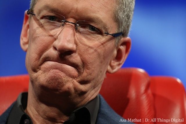
“In the past, when we’ve announced a new iPhone, we’ve lowered the price of the current iPhone making it even more accessible to more people. But this year, we’re not going to do that,” said Apple CEO Tim Cook during the company’s special event in Cupertino on Tuesday.

Instead, Apple replaced the iPhone 5 with the iPhone 5c, a device with exactly the same internals, but a different, more colorful design. But why did it do that? Could it be because the iPhone 5 is too similar to the iPhone 5s, and that dropping its price would have hurt sales of the newer model?

I think so.

I don’t think Apple made the iPhone 5c plastic to make it cheap; I think the company made it plastic to make it worse and to open up a bigger gap between the entry-level iPhone and the high-end model. Here’s why.

Jony Ive And Bono To Auction Solid Gold EarPods And More To Fight AIDS

By

That's 'Sir' Jonathan Ive to you.

Sir Jony Ive and famed designer Marc Newson have teamed up with Bono to a mega-auction of fancy master-pieces of design that will be sold to benefit (RED). Among the list of items up for grabs is a custom pair of Apple EarPods made of solid rose gold.

Jony and Marc actually did all the curation of the collection themselves over the past year, as well as collaborating on two custom made items – a  Leica Digital Rangefinder Camera, and an  aluminum desk produced by Neal Feay Studios. A total of 40 items will be auctioned off, including pieces from space travel, lighting, contemporary art and rare automobiles.

Here’s what Jony had to say about his contribution:

How Apple’s Stealth Design Team Decides What Colors We’ll Covet

By

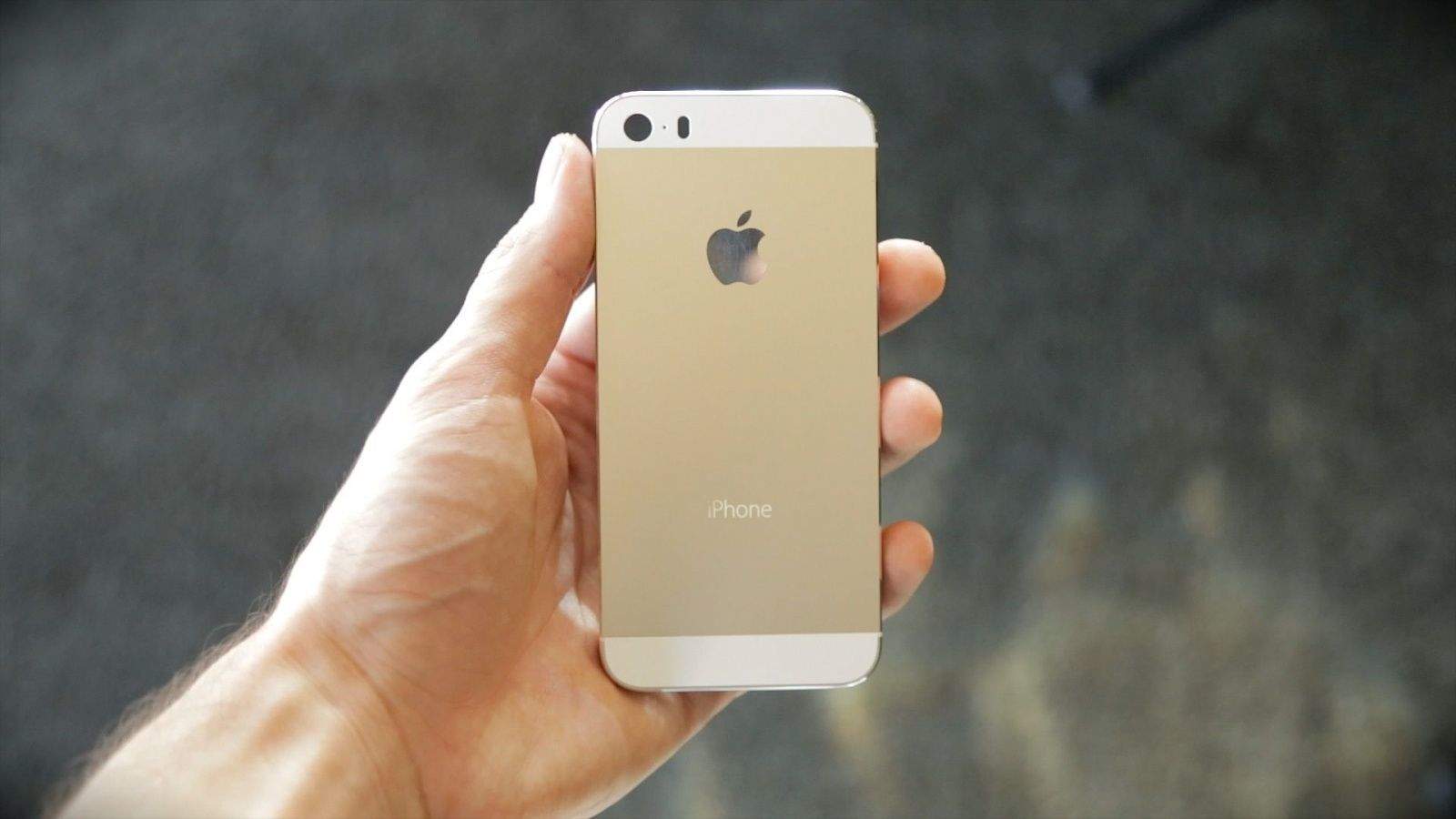
Gold Champagne iPhone 5S from TLDToday

This article first appeared in Cult of Mac’s weekly Newsstand magazine. Check it out here.

Apple takes color very seriously. You might say the Cupertino company is obsessed with it. Sir Jonathan Ive, the head of industrial design, is most famous for his restrained approach to color.

After the first iPod in 2001, most of Apple’s products come in plain colors: black, white or silvery aluminum. But behind the scenes, his design department has long created prototypes in a dizzying array of hues, including hot pink. Some prototypes are mocked up in up to 64 different shades.

“You can imagine a Crayola box with 64 colors in it,” Gautum Baksi, a former Apple engineer who worked closely with Jony Ive’s industrial design group (IDg), told Cult of Mac. “They’ll go through the gamut of making prototypes of all 64 to iterate until they find the ones that they want.”

Reuters: Apple CEO Tim Cook May Be Kinder, Gentler, But Can Still Skewer Employees With A Sentence

By

Tim-Cook-D11

In a new profile of Apple CEO Tim Cook, Reuters spends time painting the two-year veteran of Cupertino’s top spot as deft, methodical, and tough. While he has earned a reputation as more of a delegator and less of a diva than Jobs was, the sources in the article say that he is still a focused CEO who expects results.

A person familiar with Tim Cook’s meeting style said “He could skewer you with a sentence. He would say something along the lines of ‘I don’t think that’s good enough’ and that would be the end of it and you would just want to crawl into a hole and die.”

Not bad for a CEO whose own board is deeply concerned.

Jobs Movie Buzz Plus We Pitch Our Fave Apps And Tech On Our All-New CultCast

By

new-cultcast-site-promo-pic-heath.jpg

Never heard of the British Oreo? You will on this week’s CultCast! Of course we’ll also cover the week’s best Apple stories, including what’s new in iOS 7 beta 5; our own Leander Kahney’s new book about Jony Ive; the strange new buzz around the upcoming Jobs movie; plus we pitch our favorite tech and apps in a little segment we call Faves ‘N Raves.

Have a few chortles whilst getting caught up on this week’s best Apple stories. Stream or download new and past episodes of The CultCast now on your Mac or iDevice by subscribing on iTunes, or hit play below and let the audio adventure begin.

Show notes up next!

Cultcast 85 post player image

This Hysterical Video Reveals Jony Ive’s Real iOS 7 Inspiration [Video]

By

Screen Shot 2013-08-08 at 6.48.32 AM

Where does Jony Ive get his inspiration? We’ve been asking that question for years, and while genius plays a part in it, like the best designers, Ive is profoundly influenced by the world around him.

The same is true with iOS 7. Ive’s new design might look radical with its bright colors and palette of pastels, but it is inspired by a color pattern that naturally occurs in the environs of Cupertino, and likely inside your own home. What is this inspiration? It might surprise you.

How Jony Ive’s iOS 7 Icon Grid Matches Up Against Real Apple Products [Image]

By

gqVkI26

With iOS 7, Jony Ive designed an icon grid that was meant to give developers some guidance on how to proportion their icons so they would look “harmonious” on the new iOS 7 homescreen.

As you can see above, though, Jony Ive has been using a similar mental grid to design Apple’s physical products for a long time. As Reddit user Kepano notes, however, Ive has probably not used this grid as a precise guide to design in the past.

“In my opinion as an industrial designer this image suggests that there are some intuitive similarities between all of Ive’s designs but that the iOS7 icon grid is probably the first time he’s defined those proportions so strictly. The fact that certain shapes match so closely (e.g. the width of the donut shape on the iPod) is probably not a coincidence but a matter of taste. What the image doesn’t show is that these products have radically different dimensions which is why the corner radii are very different from one another.”

Source: Reddit

This Aluminum Apple II Looks Like It Was Designed By Jony Ive Back In 1977 [Gallery]

By

Apple2

The original Apple II was a huge breakthrough for Apple when it went on sale in 1977. And even though the 8-bit computer made Steve Jobs and Woz legends, you’ve got to wonder what Apple’s first big hit would have looked like if Jony Ive got his hands all over it.

A true Jony Ive edition Apple II will probably never see the light of day, but this customized aluminum Apple II some redditor bought off eBay might be the next closest thing. It’s simple, sleek and aluminum – everything Jony loves.

Take a look:

How Jony Ive & iOS 7 Helped People Stop Hating The Purple Yahoo! Weather Icon

By

1672967-inline-750-yahoo

In late April, Yahoo released a gorgeously designed new Weather app for iOS. Pretty much everyone loved the new Yahoo! Weather app, except for one thing: the purple logo.

“Officially the ugliest icon ever,” said one Twitter user in response to the app’s announcement. “Its icon isn’t home page worthy,” said another. Some used their available Twitter character counts to criticize the icon with even more ruthless efficiency: “That icon is ass.”

The icon was such a bust that less than a month later, Yahoo made the extraordinary move of replacing the logo with one that was even uglier. Despite this, the new mark was widely hailed as an improvement. Yet just last week, Yahoo updated its official Weather app again, and surprise! The original logo is back, with not a whiff of controversy.

Here’s why everyone hated the Yahoo! Weather app icon… and why Jony Ive and iOS 7 might have helped the design eventually get accepted by iPhone users at large.

READ THE ENTIRE ARTICLE AT FAST COMPANY HERE.

Did Motorola Take Ideas From Jony Ive When Designing Their New Logo?

By

Screen Shot 2013-06-26 at 12.33.42 PM

Motorola Mobility, Google’s gadget making sub-company, has just unveiled a new logo that embraces flat design elements: the Motorola badge has been surrounded by a ring of colors, and there’s a new proclamation of Motorola being “A Google company” underneath everything.

Killian thinks it looks a bit like Motorola was aping Jony Ive’s iOS 7 redesign, but I have to say, between the busy-ness of the design, the atrocious font choice, and Motorola’s existing (terrible) logo, I think he’d do a spit-take looking at this. What do you think?

Jony Ive More Popular At WWDC Than Tim Cook, According To Social Media

By

socialmedia-Jony-Ive


Jony Ive didn’t even make an appearance at the WWDC keynote last week, but that didn’t stop his name from spreading all over Twitter and Facebook, thanks to his influence on iOS 7’s new parallax UI.

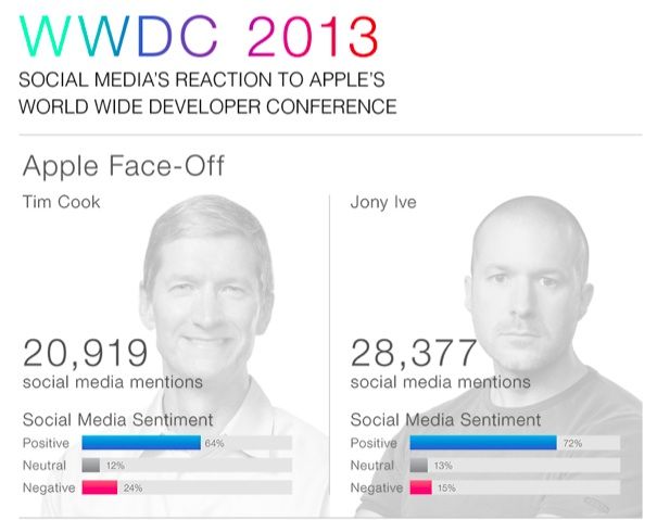
A report from the people at ViralHeat shows that Jony Ive had the most social media mentions of anyone at Apple, including CEO Tim Cook. Sir Jony Ive had 28,377 mentions across Facebook, Twitter, and Pinterest, while Tim cook was mentioned 20,919 times.

Not only did Jony get more attention on social media, the comments about him trended more positively than those about Cook (72% positive for Ive, 64% positive for Cook)

Here are the full social media stats about WWDC:

Why Steve Jobs Loved Winnie The Pooh

By

Steve Jobs at Apple iPad Event
Photo: Wikimedia Commons

Eddy Cue is at the Daniel Patrick Moynihan United States Courthouse in lower Manhattan testifying in the Department of Justice’s e-books antitrust case, and he’s been sharing more information on the work that went into developing iBooks prior to its launch in 2010.

Cue reveled that Steve Jobs, then Apple’s CEO, chose to give away a free copy of Winnie-the-Pooh not just because he liked the book, but because its colorful illustrations showcased the capabilities of digital e-books in the iBooks app.

Jony Ive Has A New Job Title At Apple (Hint: It’s Still Not CEO)

By

Screen Shot 2013-06-18 at 9.16.54 AM

In October of last year, Apple underwent an executive shake-up that saw Scott Forstall’s head rolling down the Cupertino aisles and Jony Ive being put in charge of both software and hardware design in Apple… but his title, Senior Vice President of Industrial Design, never changed.

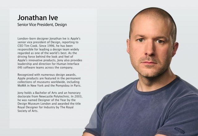
Now that iOS 7 and OS X Mavericks have been unveiled, Apple has apparently formalized Jony Ive’s new role, giving him a new title, Senior Vice President, Design. The smouldering look on Jony’s pretty face is the same as it ever was, though.

Thanks: Rachel C.

iOS 7’s Design Still “A Work In Progress”

By

iOS-7-in-hand

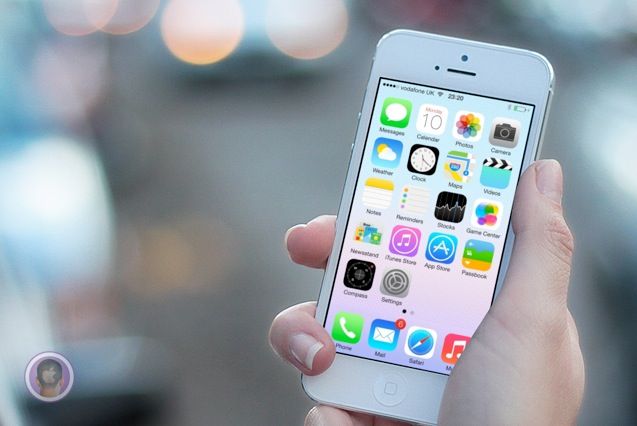
“Apple made this?” That’s the first thing I asked myself when iOS 7 was unveiled to the world at WWDC on Monday. It’s so different from anything Apple has ever done design wise that it’s hard to wrap your head around as a longtime fan of the company.

If you’re still in shock at the randomness and general weirdness of iOS 7 like I am, this tidbit of info helps clear things up: Apple’s own designers weren’t in charge of creating the OS’s icons. A new report reveals the disjointed process that Jony Ive led behind the scenes to create iOS 7 at Apple.

What OS X 10.10 Will Look Like After Jony Ive Brings It In Line With iOS 7

By

os_x_mavericks__desktop_by_ohsneezeme-d68l41f

One thing’s for sure: once you have iOS 7 installed, OS X Mavericks sticks out like a sore thumb. iOS 7 is where Apple’s software design is headed, and OS X Mavericks is what Apple’s software design aesthetic is fleeing from.

Clearly, OS X Mavericks was left alone this year because Apple couldn’t concentrate on two design overhauls at once. Instead, Ive & Co. simply satisfied themselves with stripping out some of OS X’s more Forstallian flourishes, like the Corinthian leather and gray linen textures.

But what about next year? What would OS X 10.10 look like if brought in line with the design of iOS 7? DeviantArt user Ohsneezeme‘s concept, while not perfect — he hasn’t touched the icons or the dock — is a strong guess.

I like it. What about you?

Jony Ive Is So Obsessive He Gave iOS 7 Icons The Same Rounded Corners As The iMac

By

iOS7iCons

As the new Director of Human Interface, Jony Ive has gone from making beautifully beveled Macs, to redesigning iOS into a multi-layered Parallax operating system. By drawing from his deep well of hardware design brilliance, Jony brought a lot of his hardware philosophies to iOS, and the Messages app icon shows just how insanely detailed Jony can get.

As discovered by Brad Ellis, Jony made sure that the Messages icon’s corners have the same tapered edges which can be found on the iMac and other Apple products.

The difference is just a small number of pixels that most users would probably never notice, so Brad created his awesome comparison GIF so you can actually see the changes: 

Here’s What Would Happen If We Let Jony Ive Redesign EVERYTHING [Humor]

By

windowsive

Jony Ive’s vision for iOS has received quiet a bit of heat over the last 24 hours thanks to his heavy use of flat icons, huge areas of white space and whimsical neon color gradients.

A few designers have already sought to ‘fix’ some of the uglier quirks of iOS 7, but what would happen if we let Sir Jonathan Ive redesign everything? Well, thanks to a hilarious new Tumblr called  ‘Jony Ive Redesigns Things,’ we have an answer, and it’s not pretty. Take a look:

iOS 7 Passbook Ditches Forstall’s Dumb Paper Shredder Animation

By

Passbook Delete


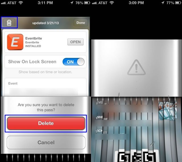
Passbook’s virtual ticket-shredder was one of the little touches in iOS 6 that wreaked of ugly skeuomorphisism. Now that Jony Ive has declared war against all of Scott Forstall’s tacky skeuomorphic UI elements, the Passbook ticket-shredder is now a thing of the past.

When you delete a card in Passbook now it just zaps away into the digital ether, rather than sending your virtual card through a virtual paper shredder that virtually obliviates your ticket so you know it’s deleted and no one can rummage through your virtual trash and piece together all the shreddings to steal your identity.

Here’s a GIF of the new iOS 7 animation in action: