Take one look at any screenshot from a pre-iOS 7 iPhone, and you’ll wonder how we ever used such a hideous interface for so many years. The skeumorphic design language included so much fake wood, glossy plastic and gray gradient that there’s almost nowhere to put the actual contents of the app.
iOS 7 went way too far in the opposite direction, with flat white pages and skinny text. Is that a button? Is it just a label? Can I press it? Who knows? We’re still suffering from this UI ambiguity today, in iOS 13. Text got thicker, but it’s still hard to know what to press, and what is just there to be read.
Clearly, there’s a space between these two extremes. Something as clean as iOS 7 and, at the same time, as obvious and usable as iOS 6 and previous versions. But what would that look like? I know what I want it to look like. It’s called “neumorphism,” and it looks fantastic.
Neumorphism
Neumorphism is an emerging design trend. The word is an amalgam of neu (or “new”) and skeuomorphism.
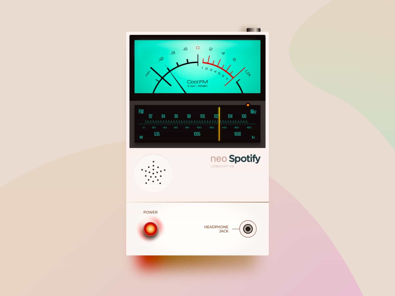
Photo: David Ofiare/Dribbble
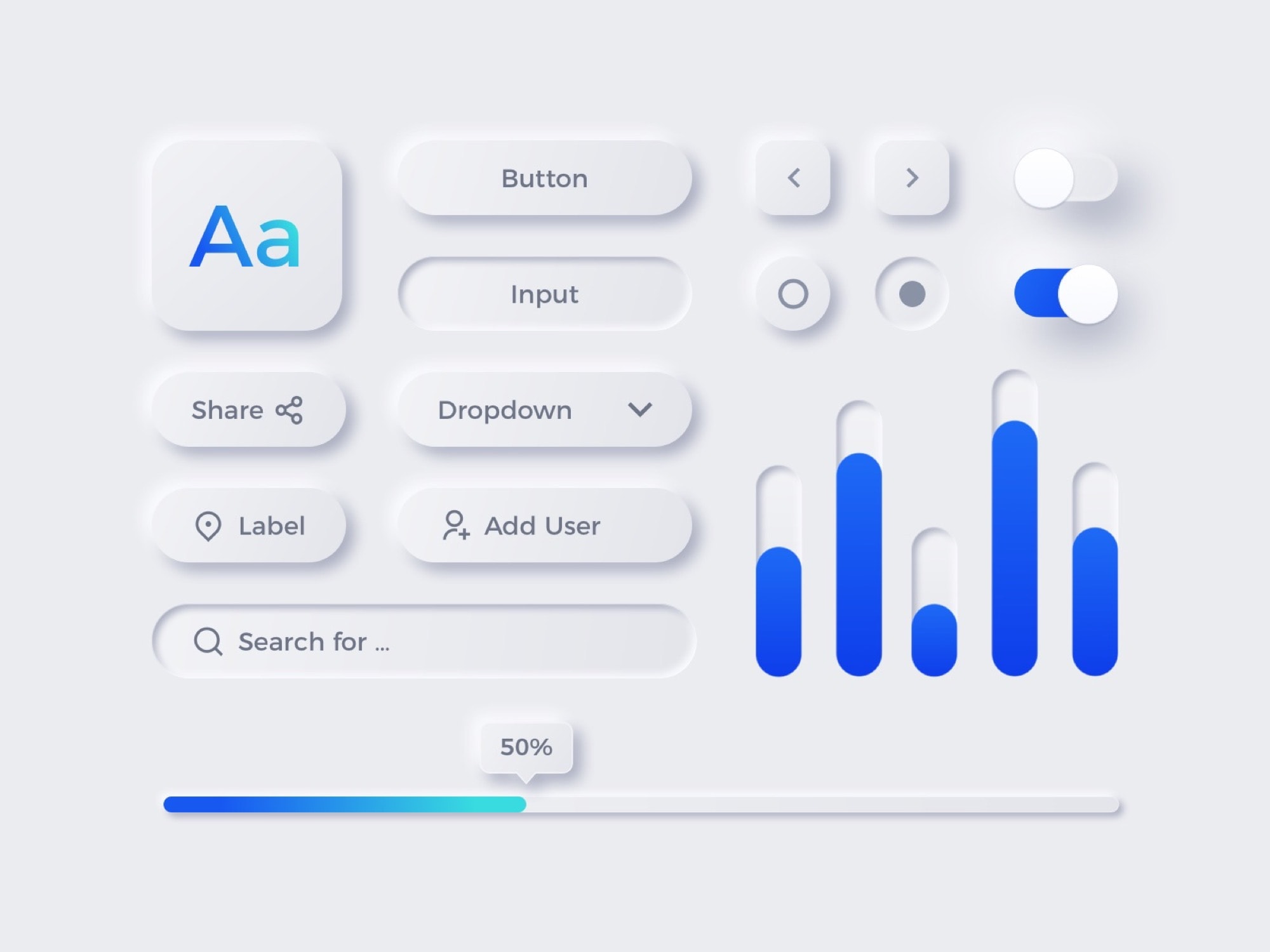
Unlike skeuomorphism, which mimics the physical world to an absurd, hyper-real degree, neumorphism adds a physical element to today’s flat UI paradigm. One look at the images in this post will tell you all about it. Subtle light effects, or shading, add texture and depth to a flat plane. Color is used sparingly, and judiciously, to make navigation easier. Never again will you look at a gray, label-like “button” and wonder whether it is on or off. You’ll know instantly, because it will be raised (or not) or colored (or not).
Compare the other screenshots here to this one of my iPad as I write this article:
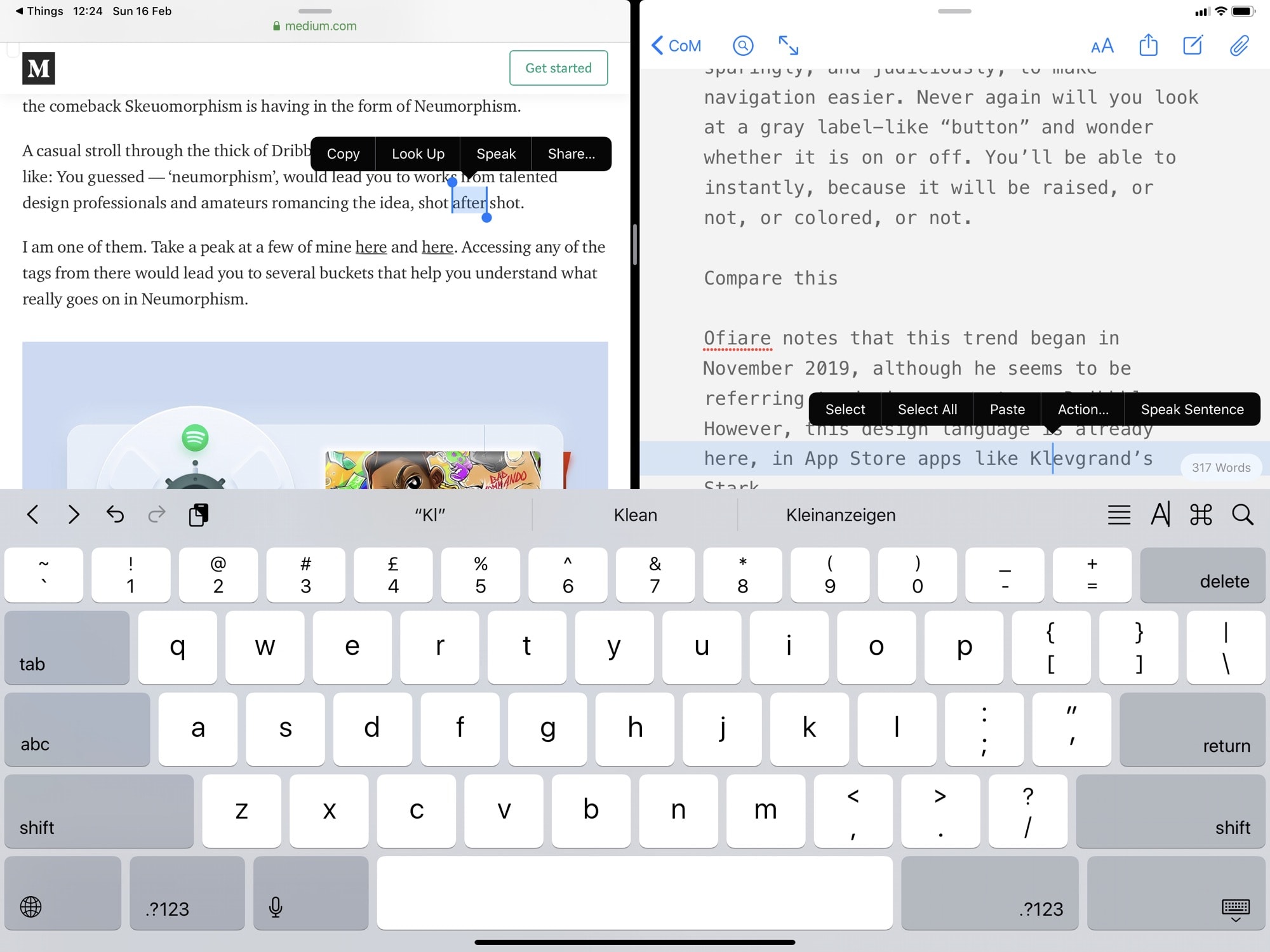
Photo: Cult of Mac
This screenshot shows Ulysses running next to Safari. Which of these apps currently has focus? When I type, will letters appear in Ulysses or not? I don’t know, and I’m actually writing this article now. Imagine if, instead, one window was raised slightly, or if the active window had 3D buttons, while the inactive window’s buttons stayed flat.
Neumorphism is already here
Designer David Ofiare notes that this trend began in November 2019, although he seems to be referring to design concepts on Dribbble. However, this design language is already here, in App Store apps like Klevgrand’s Stark amp simulator.

Photo: Klevgrand
That one’s a little flat, but it uses color to show state. I love it. Now check out Hillman, a vintage synth app from the same developer. It’s a textbook example of neumorphism.

Photo: Klevgrand
And these apps are available right now, on your iPad or Mac.
Why Dark Mode is confusing
One recent UI trend, embraced by Apple, actually makes clear UI design harder. Dark Mode, available on macOS and iOS, makes it impossible to use shadows, because how do you see a shadow on black? It makes little difference in iOS, because the mobile OS offers no depth cues. But on the Mac, where subtle drop-shadows show the stacking level of windows, Dark Mode makes it hard to see what’s on top. Neumorphism may help, because its subtle 3-D shading uses highlights as well as shadows.
Will Apple embrace neumorphism?
I’m a big fan of this neumorphism trend. It’s easy on the eyes, while still being visually rich and able to convey a lot of information about state. And that’s because it uses real-world cues. We humans are amazing at making subtle distinctions about the real world, and this design language — whether you call it neumorphism, soft UI or otherwise — uses those same subtle, real-world cues. It’s clean and easy, because we have to make almost no effort to decipher it.
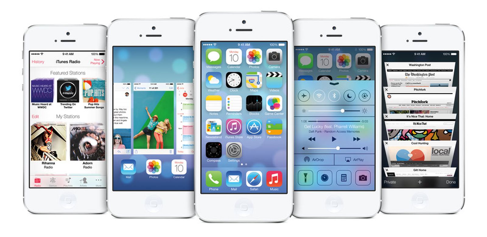
Photo: Apple
This kind of real-world/cartoony hybrid may end up looking as dated as Game Center’s green baize background, or GarageBand’s wooden cheeks. But right now, it’s a huge improvement over what we have, both aesthetically and usability-wise.
Apple seems happy with the current iOS design language, though, so we may have to subsist on app developers who go it alone. Then again, the first signs are showing. Designer Michael Malewicz, one of whose website commenters coined the term neumorphism, points out Apple’s own iOS 13 markup tools:
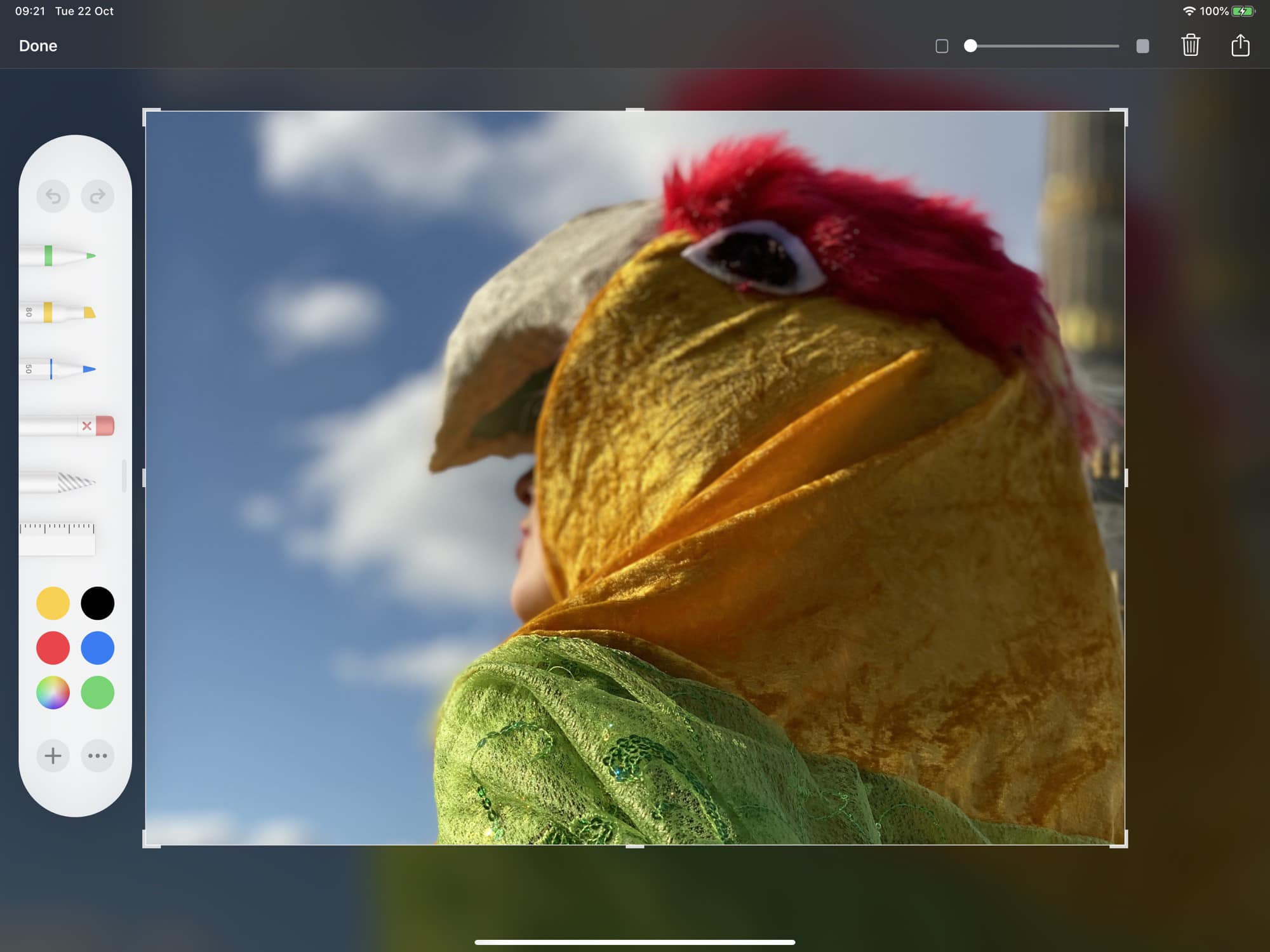
Photo: Andrea Nepori
If Apple did switch up iOS or macOS to look like this, pretty much every good developer would follow along. And imagine how it would look if your entire iPhone or iPad looked and worked this way. Just add menus, and fix multitasking, and the iPad would be almost solved. A neumorphic approach also could help with accessibility, making the iPhone and iPad easier to use for everyone.
Will neumorphism stick? Who knows. But I hope it really takes off.
