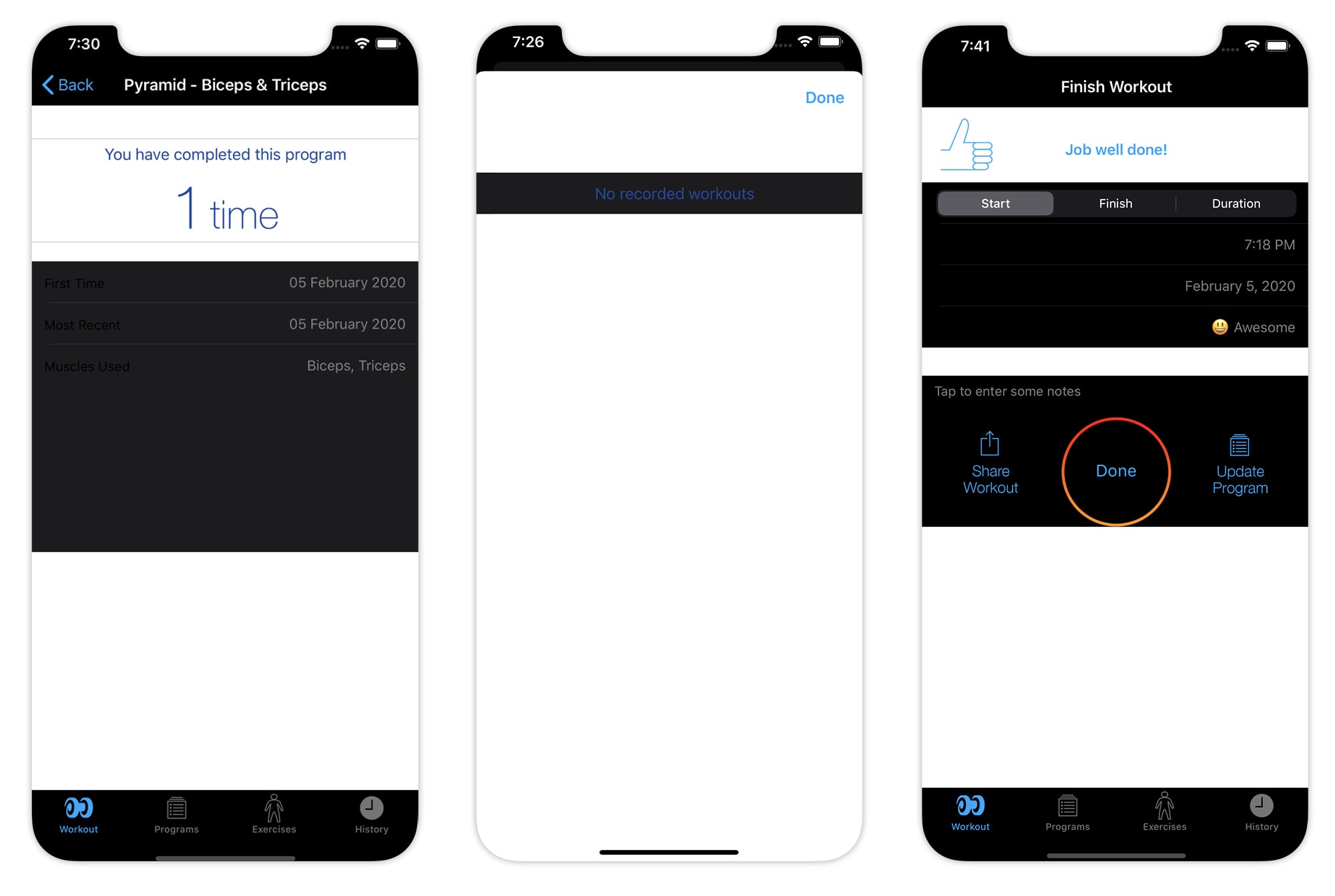
This week, I finally got around to adding Dark Mode support to Reps & Sets, the iPhone bodybuilding app I develop as a side hustle. That’s almost a year after Apple first announced the feature at its Worldwide Developers Conference.
What took me so long? Supporting Dark Mode is not as simple as it seems. It’s not just indie devs like me who have struggled with it, either. WhatsApp only recently added Dark Mode support, and Facebook is still beta-testing it.
So if you’re waiting for your favorite app to switch to the dark side, here’s why it might be taking so long.
Dark Mode: it’s not as simple as turning out the lights
As a developer, when you first enable Dark Mode in Xcode, it doesn’t look pretty. (See screenshots below.) Your app looks like a Frankenstein’s monster, patched together with an odd and jarring combination of light and dark elements.
The problem is that while some parts of your user interface — like the background — automatically switch to dark, others do not. Some text becomes unreadable because it’s black-on-black. Headers with white backgrounds look too bright and annoying. Illustrations and icons designed for a light background look terrible.
Yes, if the app had been built using Apple’s default buttons and styles, maybe it wouldn’t have looked so bad. But in reality, life is never that simple. Even Apple’s built-in apps often deviate from the default user interface elements these days.
When I first saw what a mess my app looked like in Dark Mode, my heart sank. Reps & Sets is a big and complicated app with many different views (developer jargon for different screen designs). I knew updating all of them was going to take a huge amount of work. Every view would require careful design consideration to make sure all the elements looked good.
This was further complicated by the fact that my app is no spring chicken. It was originally developed nine years ago for iOS 6. A lot has changed since then, so now there’s plenty of legacy code (a developer’s euphemism for crud). As a result, whenever you touch the code, you usually end up having to update it.

Photo: Graham Bower/Cult of Mac
Dark Mode turns assets into a liabilities
Updating views is just the start of the problems when you’re trying to add Dark Mode support, though. Most apps also include assets like icons, logos and illustrations that will require changes.
Apple helps with this by letting you apply a different tint color to your assets in Dark Mode. For simple, flat icons, this approach works well. But it doesn’t help with animations or multicolored graphics.
You might be surprised by just how many assets some apps have. In Reps & Sets, for example, I had to amend more than 100 icons and 300 illustrations. This task alone took me 40 hours of solid work to complete.
Don’t forget Light Mode
A further complication is that every change you make to support Dark Mode has to work in Light Mode as well. So now you’re designing two user interfaces instead of one.
Even once you finish implementing Dark Mode, the work doesn’t stop there. It’s an ongoing commitment. From now on, every time you release an update, you’ll need to test it in Dark Mode as well as light. And that’s time-consuming work. Previously, I tested Reps & Sets in eight different combinations of OS and hardware. Dark Mode doubles that to 16 versions.
Dark Mode might not be on brand
Before you get started on implementing Dark Mode, there’s a more fundamental problem to consider: brand identity.
A famous brand like Facebook is a priceless asset that requires careful management to preserve its integrity. Its brand identity should be consistent across all platforms, so it’s always immediately recognizable. Dark Mode complicates this. Not all logos and color schemes look good on black. Brand guidelines may need to be revised to address this.
Even for my lil’ old app, that required some thought. For example, the Reps & Sets brand color is dark blue. It works great on a white background but it’s not legible on black. So I had to add a light blue to my brand color palette for Dark Mode.
That’s an easy change for me to make, because I’m a one-man band. But for a big company like Facebook with many stakeholders involved, changing the brand guidelines is usually a complex, time-consuming process. It could have implications that extend way beyond the app itself — like the design of the website or the look of signage and exhibition stands, for example.
No wonder so many big organizations simply decided to ignore Dark Mode altogether.

Photo: Graham Bower/Cult of Mac
I thought the dark side was supposed to be more tempting
Reps & Sets is a freemium app. The basic download is free, and then there’s an in-app purchase option for a premium subscription to access extra features. But it’s not possible to restrict Dark Mode support to premium users. So all users get the benefit of all this work at no cost.
From a purely commercial perspective, there was no incentive for me to implement Dark Mode. But I’m not just in it for the money. If I was, I would have given up years ago. The reason I chose to do it was because I thought it was cool and I knew it would look good. Plus, I use the app myself and I use Dark Mode. It was jarring to keep launching Reps & Sets and get bombarded with light.
That’s why I chose to toil away for endless evenings and weekends, redrawing hundreds of assets. I did it for the love, not the money. And love is not a currency well understood by big mega-corps. Ultimately, I think that’s why big companies, with far greater resources than I could ever dream of, are taking even longer to support Dark Mode than I did.


