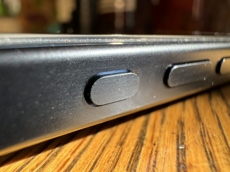
I’ve been using my new iPhone 15 Pro for a couple of weeks now, but I still haven’t gotten used to the new Action button.
The Action button can be configured to give easy, one-button access to a range of functions, from launching the flashlight to opening a Tesla car door.
I have mine set up to open the Camera app and then act as the shutter button. But it’s kinda useless for two reasons.
How Apple should reimagine the iPhone 15 Pro Action button

Photo: Leander Kahney/Cult of Mac
The biggest problem with the Action button is that, like the Nazis in Raiders of the Lost Ark, it’s in the wrong place.
Apple decided to put the Action button on the left-hand side, above the volume buttons, in place of the old mute switch it replaces.
But as a right-hander, I think it should be on the right-hand side next to the Power button. The current position is great for lefties, but not for the remaining 90% of us who are right-handed.
As it is, I can reach the Action button with my right index finger, but it’s awkward and unnatural. Instead, I find myself activating it with my left hand. And I’m using an iPhone 15 Pro, the smaller of the two new handsets. If you have an iPhone 15 Pro Max, you’re gonna need finger extensions.
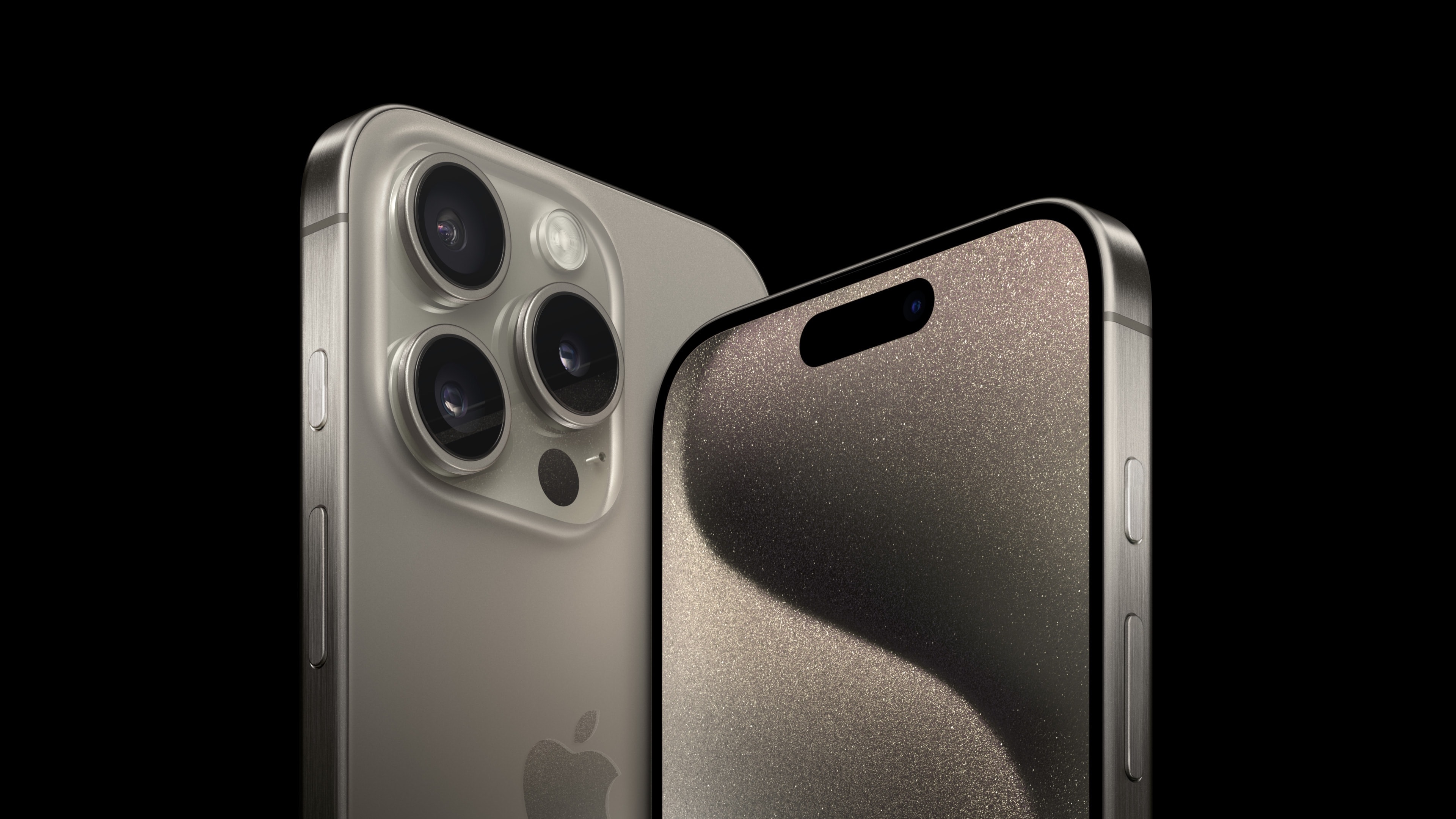
The Action button should be on the right

Photo: Apple/D. Griffin Jones/Cult of Mac
It would be far easier to press the Action button with my right thumb. When I’m holding the phone, my thumb is right there — it’s right there! Right next to where the Action button should be! What could be easier?
Try it out yourself: See how easy it is to press the Power button with your thumb? Versus craning your fingers around the back of the device to reach the left-hand side? Now imagine the Action button is above or below the Power button: It’d be waaaay easier to click.
The Action button isn’t even in a good position to act as a camera shutter button. Again, it’s on the wrong side! If you use it as a shutter button, you have to be in landscape mode with the iPhone’s camera lenses on the bottom! Who holds their iPhone like that? That’s why never got used to to the volume button as a shutter button. It’s all wrong.
Why is the Action button where it is?
I’m sure there was a big debate inside Apple’s hallowed Industrial Design studio about the best place for the Action button. Such decisions are not made lightly. The design team likely made hundreds, if not thousands, of exacting prototypes, testing every possible location until they decided to put it in exactly the same place as the switch it replaces.
Why? I can think of three reasons:
- Muscle memory. Because it’s replacing another button, perhaps Apple didn’t want to mess with people’s muscle memory, especially because a lot of people do use the volume button as a camera shutter.
- Tooling and manufacturing. It’s gotta be far easier from a production standpoint to put a new button where an old button already resides.
- Accidental power off. This is the most likely reason: to prevent confusion with the Power button. There’s the distinct likelihood that you’d accidentally press the Power button — turning your iPhone’s screen off — just as you’re about to capture the perfect shot. That would very quickly drive people mad.
Apple already designed the perfect button

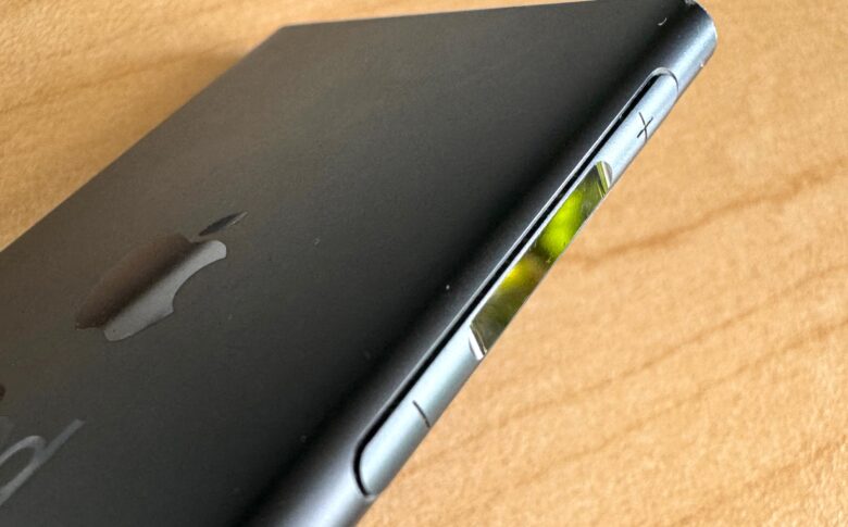
Photo: Leander Kahney/Cult of Mac
The other issue with the Action button is that it isn’t much of a button. It can currently be configured to do only one thing at a time — be it launch the Camera app or set a Focus mode (though there are clever workarounds using Shortcuts). It’s the iPhone equivalent of the one-button mouse.
But it could do so much more. Apple designed the perfect button for mobile devices more than 10 years ago — the rocker switch on the seventh-generation iPod nano. It’s a great switch. The ends are rocker buttons for volume up and volume down, while the middle of the switch controls play, pause and skip.
Imagine it as the iPhone Action button, placed where it should be: on the right-hand side. That way you’d have easy access to both the Action button and volume controls. You’re more likely to use volume controls and the Action button throughout the day than the Power button, which should be moved to the left side.
The rocker switch could be set up for double-clicks, or maybe even triple-clicks, giving it a far wider range of uses.
And how about using the volume controls for different functions, depending on context? In the Camera app, for example, volume up and down might be used for zooming in and out. A double-click could put the camera in RAW mode, or turn Live Photos on and off.
It looks like Apple is already preparing yet another button for next year’s iPhone 16: a new capacitive Capture button that would go next to the Power button on the right. Given its position and name, it sounds like a solid-state shutter button, and maybe that’s just for starters.
Lights, camera, Action button!
Apple’s institutional instincts are to remove buttons, not add more. But as the iPhone takes on ever more functions, it seems wise to have buttons dedicated to critical or popular tasks. After all, that’s why Apple configured the Power button to not just turn your handset on and off, but also to launch contactless payments.
Adding or moving buttons is not something Apple should do casually, but I reckon the Action and volume buttons should be reconfigured as a rocker switch and moved to the right-hand side. You’re welcome, Tim Cook.


