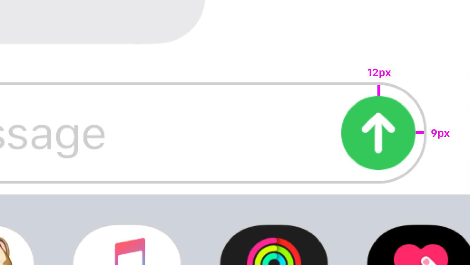
The send message button on the iPhone is misaligned and for most of us, a 3-pixel discrepancy won’t cause heartburn.
But a few designers are reaching for the antacids this week after one of their own pointed out the misalignment on Twitter.
Apple sets the gold standard for product and interface design but being even 1 pixel off is seen as tarnish in the exacting eyes of the design community.
Anh Nguyen, an interface designer based in Hanoi, Vietnam, stirred up the chatter when he posted the proof with the message, “Have a great Tuesday everyone!”
The send button is flush right in the message field, which starts out as an elongated, skinny oval before typing a message. The gap at the top of the button is 12 pixels while the gap on the right is 9 pixels.
The response from colleagues was sarcastic disbelief.
— Matthieu Souteyrand (@Nazermatt) October 15, 2019
— Amine Hannan (@aminehannan) October 15, 2019
This unmade my day :(
— Aycan Doganlar ? (@pinquitte) October 15, 2019
You act like this won’t affect me for months… maybe years. Guaranteed that I’ll be 60 years old typing a text and remember this
— Josh Jennings (@jenningscreate) October 15, 2019
One designer did not seem to mind, observing the send icon remained “visually” balanced when zoomed out.
Are you bothered by the send button’s placement and would you like to see Apple mind the gap?
Source: designTAXI


