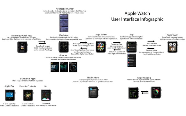
Here’s a chart that explains the Apple Watch user interface so well, you’ll have the UI memorized by the time your smartwatch comes in the mail.
Since I’ve yet to do so much as go into an Apple Store to see an Apple Watch in person, I’ve found myself a bit confused, trying to understand the Watch’s UI. How do you switch apps? How do you access the home screen? And so on.
Apparently, I’m not the only one confused by the Apple Watch UI. In response to tech reviewers and other people online complaining that the smartwatch’s UI is “too complicated”, reddit user Macamacamac put together a handy flowchart showing how it works in action.

Some users on reddit are complaining that the chart is too complicated, and honestly, it’s not the best infographic work I’ve ever seen. But as a simple chart showing the flow of the Apple Watch, I think this gives a good overview, as well as shows just how fluid the Apple Watch UI can be when you get used to it.
Source: reddit


