It must surely be a sign of the impending apocalypse that Microsoft’s operating systems have “more taste” than Apple’s.
I’m referring, of course, to Apple’s inexplicable use of skeuomorphic design in iOS and OS X apps, and contrasting that with Microsoft’s stark avoidance of such cheesy gimmickry in the Windows 8 and Windows Phone user interfaces.
A skeuomorphic design in software is one that “decorates” the interface with fake reality — say, analog knobs or torn paper.
The problem is worse than it sounds.
Apple’s Bad Taste
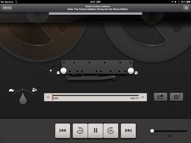
Apple’s most recent skeuomorph is one of the worst. The company’s Podcasts app, released in June, actually shows a reel-to-reel tape playing while the podcast is running. Do people under the age of 30 even know what a reel-to-reel tape player is?
The Calendar app for the iPad has torn paper, suggesting that previous months have been ripped from a physical calendar. Gimme a break.
The iPhoto app for iOS has big, fugly brushes for “Red Eye” repair and “desaturate,” as if there’s anything in the real world you can desaturate with a paint brush.
Both the iOS iBooks and Newsstand apps show a wood-grained book shelf where your content unnaturally sits.
There are many other examples on Apple’s desktop and mobile user interfaces.
Making matters worse (i.e. more tasteless) is that the skeuomorph idea is neither universal among apps, nor applied in a visually consistent way across the apps that have been give a skeuomorphic design treatment.
Apple’s application of skeuomorphs is arbitrary and inconsistent, which is yet another point of bad taste.
The Importance of Taste
In the 1996 TV documentary, Triumph of the Nerds: The Rise of Accidental Empires, Steve Jobs is quoted famously as saying: “The only problem with Microsoft is they just have no taste.”
He went on: “They have absolutely no taste… I don’t mean that in a small way. I mean it in a big way. In the sense that they don’t think of original ideas. And they don’t bring much culture into their product… Why is that important? Proportionally-spaced fonts come from typesetting and beautiful books. That’s where one gets the idea.”
It’s this idea of good taste that has set Apple apart from competitors, both in software and especially in hardware design.
That’s why Apple’s embrace of skeuomorphic design is so bizarre.
Why Skeuomorphic Design Is Cheesy
In the quote above, Jobs pointed out that proportionally spaced fonts “come from typesetting and beautiful books.” The idea is that Apple’s early and aggressive use of proportionally spaced fonts indicates taste, because the idea came from a traditional craft, from a cultural tradition of beauty.
So where does the skeuomorphic design idea come from?
Traditionally, skeuomorphic design has been used to make cheap things look like their more expensive alternatives.
The Wikipedia entry on “skeuomorph” has some great examples, such as plastic objects that mimic wooden or metal counterparts; cigarettes that have paper around the filter that looks like cork; and window shutters that don’t shut.
Skeuomorphic design is mostly about trickery and fakery to make unsophisticated people feel like the cheap thing they’re getting is the better thing they really want.
More recently, skeuomorphic design has been used to make digital things look like physical counterparts, which is, for the most part, how Apple uses it. But not always.
For example, the Find My Friends App is designed to look like a roughly sewn leather “thing.”
There is no analog or traditional equivalent to an app that uses GPS to locate other people. Apple is just willy nilly deciding that this functionality should be encased in leather.
Here we have one of the most incredible technologies ever made available to consumers — one that communicates with multiple Earth-orbiting satellites, and it’s decorated to look like a wallet made at summer camp.
Apple Hardware Design is the Opposite of Skeuomorphic
Apple is supposed to be the company that makes “integrated” products — the hardware, software and services. The idea is that because one company makes it all, everything goes together better.
But that idea doesn’t exist with Apple products from a design point of view. Apple’s famous hardware design is all about stark, functional minimalism — the epitome of good taste.
Just as proportionally-spaced fonts come from typesetting and beautiful books, Apple’s current industrial hardware design comes from somewhere specific, too.
It comes from the same place as the Bauhaus design movement, which combines functionality with minimalism and eliminates extraneous decorative elements.
Bauhaus design is the exact polar opposite of skeuomorphic design. One is about the total absence of decoration, the other is about the addition of decoration designed to make you think of something other than the object you’re using.
Apple’s industrial design is the apex of good taste. Apple’s skeuomorphic designs are the nadir.
I can’t make it any plainer than this: Apple’s skeuomorphic designs totally clash with Apple’s industrial hardware design.
If Apple is attempting “integration” from a design point of view, they have failed completely.
If Apple wanted interface design with taste, and design that’s consistent with its own hardware design, it would create software designs that come from the same European minimalism.
You know, like Windows 8.
Why Microsoft’s OSes Have More “Taste” Than Apple’s
While Apple’s skeuomorphic designs are based on crass consumer hucksterism, Microsoft’s Metro UI is based on Swiss graphic design. In fact, the entire philosophy of the Metro UI is based on the primacy of typography over pictures.
And not just any typography, but specifically the typography of Swiss rail travel, which uses the Helvetica face (also invented in Switzerland).
The design sensibility of the Metro UI is identical to Apple industrial design, which is a radical emphasis on minimalism, clarity, function and an absence of superfluous decoration.
Please note that I’m not asserting that Microsoft is better than Apple, or that Windows is better than iOS or OS X.
And I’m not saying that Microsoft in general has more taste than Apple. I still believe Apple excels at the taste thing, in hardware design, in Apple Stores, on its web site and even in software.
And that’s why it’s so confusing and unexpected that Apple arbitrarily — almost randomly — applies the cheesy, crass, gimmicky concept of skeuomorphic design to many of its apps and operating system interfaces.
It’s as confusing and unexpected as Microsoft’s good taste in the Metro UI.


