Up next in 10


Watch full episodes of the CultCast at http://watch.thecultcast.com and catch the live show Thursdays around 11:45am PST.
Search "The CultCast" in your favorite podcast player for full audio episodes.
Show More Show Less View Video Transcript
0:00
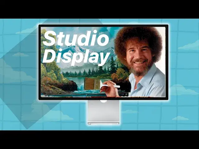
Adam, I said great to have you on. You did a video on Apple Studio Display and I was
0:07
thinking that maybe you could just run us through why you bought it, why you love it
0:13
because I think inherent in that conversation, you're going to highlight a lot of stuff that
0:18
I think I didn't really think of when I was looking at the Studio Display and I think
0:23
that's because I wasn't looking at why the Studio Display is useful. I was just looking
0:28
at the spec sheets and the spec sheets are kind of disappointing for the price
0:33
Yeah, they are subjectively, subjectively like, yeah, you can kind of get the equivalent
0:40
for a ton cheaper. Now I personally have, I've worked with many different types of displays
0:45
for artists and stuff like that and the thing that really drew me in was the experiences
0:52
I had had with many other displays that were really good for certain types of visual production
0:57
like photography and stuff like that or people who are involved in print. But my biggest
1:03
gripe and I work on like a $4,500 pen display right over here, like I work with expensive
1:09
displays and stuff like that all the time. Calibration has always been my rub. It's always
1:15
been my really big fuss and every two weeks I'm recalibrating because I'm doing fine tuning
1:20
colors and fine tuned values and things like that and details as well. And, you know, I'd
1:27
spend a couple of weeks working on a painting and then I go and I look at it on my phone
1:31
and I go, that's not what I painted. The values are off, the colors have shifted, warmer
1:37
cooler, there's a lot more, usually the contrast would be, the blacks would be too black and
1:41
I'd lose a lot of the details and the lower values. So I'd end up having to kind of bluff
1:46
it by going back into Photoshop or going back into a video production, a video app
1:51
or whatever and tweaking it and then going back and forth and saving it and checking
1:57
to see if I could get the colors to work properly. And however, I loved the colors that I would
2:03
get on my iPad, for instance, you know, but I hated painting on an iPad. I'm not a big
2:09
fan of doing artwork on the iPad, but I love the colors. And I always thought to myself
2:14
if I could get a display, an Apple display, where I get perfectly matched colors between
2:18
my iPad, my iPhone, my desktop display and everything like that or my MacBook or whatever
2:25
that would be the ideal situation. But of course, then the Pro Display came out. And
2:29
I went, oh! A display by Apple! And then the price tag came out and I went, screw this
2:35
I flipped my desk and I walked out of the room and I just got frustrated with that fact and I went, okay, well forget it, you know, there's no way I'm going to spend that kind
2:41
of money on it. And despite it being really pretty and blah, blah, blah, I really didn't
2:46
feel it was for, you know, maybe like the high-end graphic design studios might be able
2:50
to afford something like that. But it wasn't a consumer product in that regard. So when
2:55
the studio displays came out, for the price that they did, and you know, people would
3:01
spit out their coffee when they'd see a price tag that's over $2,000 Canadian, right? I'm
3:06
based in Canada, so I'm kind of thinking of Canadian prices. And a lot of people would spit their coffee out and I'm sitting there going, oh, okay, now we're talking! You know
3:13
a 5K display, 27 inches, which is the perfect size, especially if you want to use dual displays
3:18
32 is something I always felt was too big for two displays. I would either go with an
3:22
ultra-wide, I prefer an ultra-wide, or to go with two 27s. I think that really hits
3:27
the sweet spot there. It's 5K, cool, that's a bonus. I'm perfectly fine with 4K. But it's
3:34
the colour representation, it's the contrast, the brightness. And being able to work on
3:40
a painting on my studio display and then take it and look at it on my phone and go, that's
3:44
exactly what I painted. And have the confidence that when I'm posting my art on YouTube, that
3:49
people are getting what I intended. Because you'd be surprised how many times I'd post
3:52
a video on YouTube because I didn't double-check it somewhere else. I'd post it and then I'm
3:57
like, I just published a public video where people can barely tell what I painted halfway
4:03
through it because it was too dark. Because I do a lot of very dark, dark souls-ian type
4:07
of inspired art. And it was very frustrating for me. So since then, despite having a $4,500
4:12
plus display here, not including the stand, for all of you people who freak out over the
4:18
cost of the Pro Display prices, or the studio display stand prices, I end up working on
4:27
a cheaper desktop tablet just so I can take advantage of the studio display and paint
4:31
on that. I'd say the last 3 or 4 painting videos that I've done, I've done 80% of my
4:37
painting process on my studio display, despite having this over here, which I prefer drawing
4:41
on, physically. So that in and of itself, that has made it worth the purchase for me
4:48
because one of the displays I tested out that I love too, for what it's worth, is the BenQ
4:54
the SW321C. And it's 32-inch, 4K, big matte boxes and everything like that, very impressive
5:03
looking thing. And I can't paint on it. It's not good for digital paint. It's great for
5:09
print, but it sucks for digital painting because my art is digital. What you see is what I
5:14
see on my screen. I'm not handing you a print, I'm presenting you something on my screen
5:20
So I want to make sure I'm being faithful to that image, not the printed image. So for
5:26
the BenQ, as beautiful as it is, is no good for digital painting. So this one I really
5:32
feel is, when they called it the studio display, I felt as an artist, they're marketing this
5:38
to me. This is a product for an artist. And well, I believe in that because I've been
5:46
working on it since I got it and I absolutely love working on this thing. It's a blessing
5:50
This is what I mean, Lewis. Like all of this, you hear, he's like, this studio display
5:57
it fits into my workflow. And it makes sense for me because the thing that I heard you
6:02
say that really resonated with me is you need consistency across your displays. You need
6:06
them to look the same. And as a creator myself, that's important because you want the thing
6:12
that people see to be the thing that you see on your screen when you're creating it. And
6:16
that's the one thing that I never really considered. And you mentioned in your video
6:20
that if you wanted to pair a second monitor with your iMac, for instance, you couldn't
6:27
really ever get them to match. And so it's not really useful. But with the studio display
6:32
every display looks exactly the same. And you know that when you create something on
6:36
the studio display, it's going to look the same on an iPad. It's going to look the same on an iPhone and on a MacBook Pro. And so you know exactly what your consumer is going
6:45
to see. And that is the selling point that I really didn't ever consider, because I just
6:51
considered the price and I looked at the specs and I'm like it gets 1600 nits brightness
6:55
like that's cool. But 5k, it's the same as the iMac. You know, it has the same PPI as
7:02
the iMac. It looks like they literally just pulled the display out of the iMac and raised
7:06
the price and made a little bit bigger. And for me, that makes it not worth it. So I felt
7:12
kind of got a raw deal because the value wasn't there. But then hearing you describe it, I'm like
7:16
this actually does make a lot of sense if you need consistency. And now..
7:20
And one monitor and dual monitors. You can't do that with an iMac in an elegant way. Yeah. Right? Yeah
7:29
Because you don't have an equivalent Apple monitor to do that with. Yeah, that's to me
7:33
the big one of the biggest deals. Next to the calibration is the fact that I can work with
7:37
more than one screen, for sure. Yeah. And to your point, there's a lot of great monitors out there, but most of them are 4k
7:43
for instance. And then your Mac has to scale the OS to 4k instead of just doubling the resolution
7:49
to 5k, which is what it does with the 5k studio display monitor. So it really taxes your GPO
7:56
And I've heard people say it slows my system way down. So that's not great. And the OS isn't meant
8:00
for 4k. So your text gets blurry and weird. It does. Yeah
8:05
Right? Which is also another thing. And then the brightness isn't there. So like a lot of monitors, like you said, like that really great BenQ monitor, it's meant for print. But a lot of
8:13
print work, you have to have really low brightness. Am I right? Like 100 or 200 nits even, which is
8:18
really low. Yeah, like 200 nits max. And you want 200 nits max, and you want to make sure you're not getting
8:23
this... You want your contrasts to be very, very... You want a nice flat contrast. You don't want your
8:28
colors to be too embellished. Because if you ever take artwork, you produce artwork, and then you
8:33
want to print it out, you can waste 50 bucks worth of high quality paper trying to get the bloody
8:39
print to look good, because it comes out, the colors are completely off. So the whole getting
8:44
you know, printing proofs and getting the colors to match, and then you do like a spreadsheet with
8:49
all the different colors you got to work with, and you go, Okay, I guess that one's the closest, and that one's the closest. So when you have a print display, like the BenQ, it's even got a
8:57
print preview mode on it, which is really, really cool, because then I can, I really get a fairly
9:02
faithful idea on what that print is going to look like, because I'm probably selling them for what
9:08
it's worth, you know, if that's the type of business that I do. So I'm looking at it going, Okay, I know what's going to print, I make a couple of tweaks, it comes out of the printer
9:15
it looks great, when I don't have to reprint anything. And that printing paper is not cheap
9:20
right? You know, especially if you're doing like a big 13 by 19 print or something like that
9:23
So in that particular case, it's made for that. And a printer can never keep up with a digital
9:30
image, it just can't. The contrast ratio, the brightness, the saturation, all that kind of stuff is definitely much stronger on a display for sure
#Painting
#Consumer Electronics
#Consumer Electronics
#Skins, Themes & Wallpapers
#Science
#Event & Studio Photography