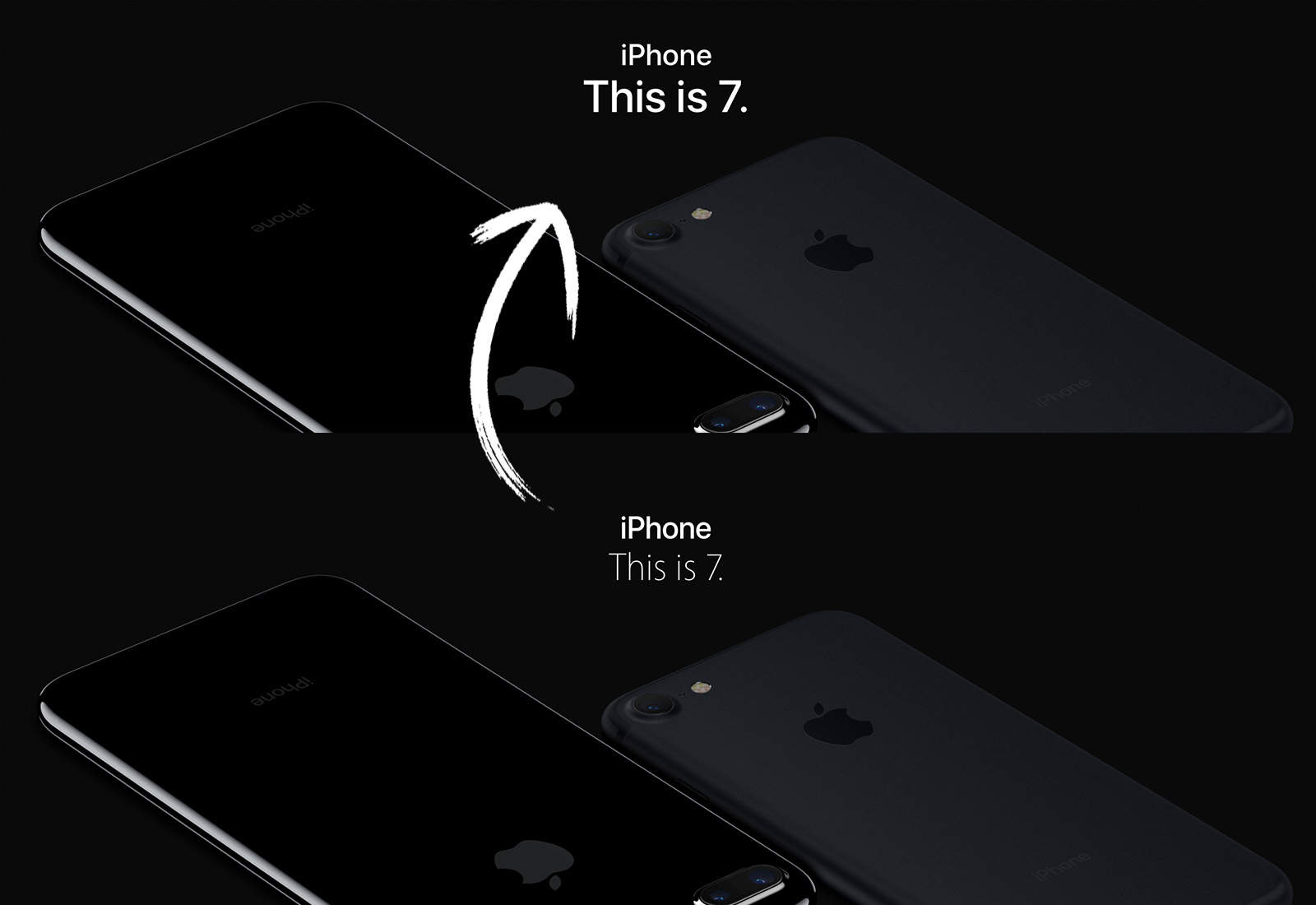
As part of its ongoing attempt to unify its platforms, Apple has switched the font for its official Apple.com website to the blockier San Francisco typeface.
Prior to this, Apple used a lighter Myriad font, which first debuted in 2001 as a replacement for the the company’s Apple Garamond typeface.
San Francisco was first debuted with the Apple Watch in 2014. The strength of San Francisco is that it condenses at larger sizes to take up less space, and becomes easier to read at smaller sizes. By contrast, Apple occasionally had to space out Myriad to stop it saying naughty NSFW things.
The change doesn’t simply bring another part of Apple’s branding in line with watchOS and iOS, but also reflects the way that users increasingly use the internet from mobile, instead of desktop, devices — due in no small part to the iPhone revolution.
Personally, I liked Myriad, although I was also sad when Apple ditched the long-running Apple Garamond around the time the first iPod shipped. Maybe I just have a problem with change…
What do you think of the San Francisco typeface? Leave your comments below.
Via: Apple Insider


