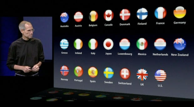
Think visually. Apple presentations are strikingly simple and visual. For example, there is very little text on a Steve Jobs slide. While the average PowerPoint slide has 40 words, there were far fewer than forty words in the first dozen slides of last week’s event. When Jobs talked about the popularity of iTunes around the world, his slide showed 23 flags of different countries instead of country names. When he said the iPhone app store was celebrating its first anniversary, a slide appeared with a birthday cake holding one candle. When he talked about lower iPod prices, the new price was accompanied by photos of the iPods. Psychologists call this picture superiority: Ideas are more easily recalled when presented with text and images instead of text alone.


