When the Yosemite posters first went up in Moscone Center ahead of WWDC, a thought lodged in my brain that continued to tumble around all weekend: Apple drew inspiration for the name of the new OS from David Hockney.
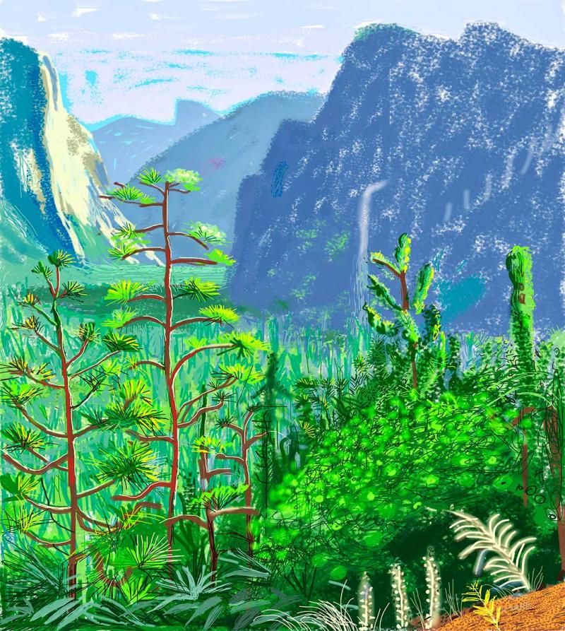
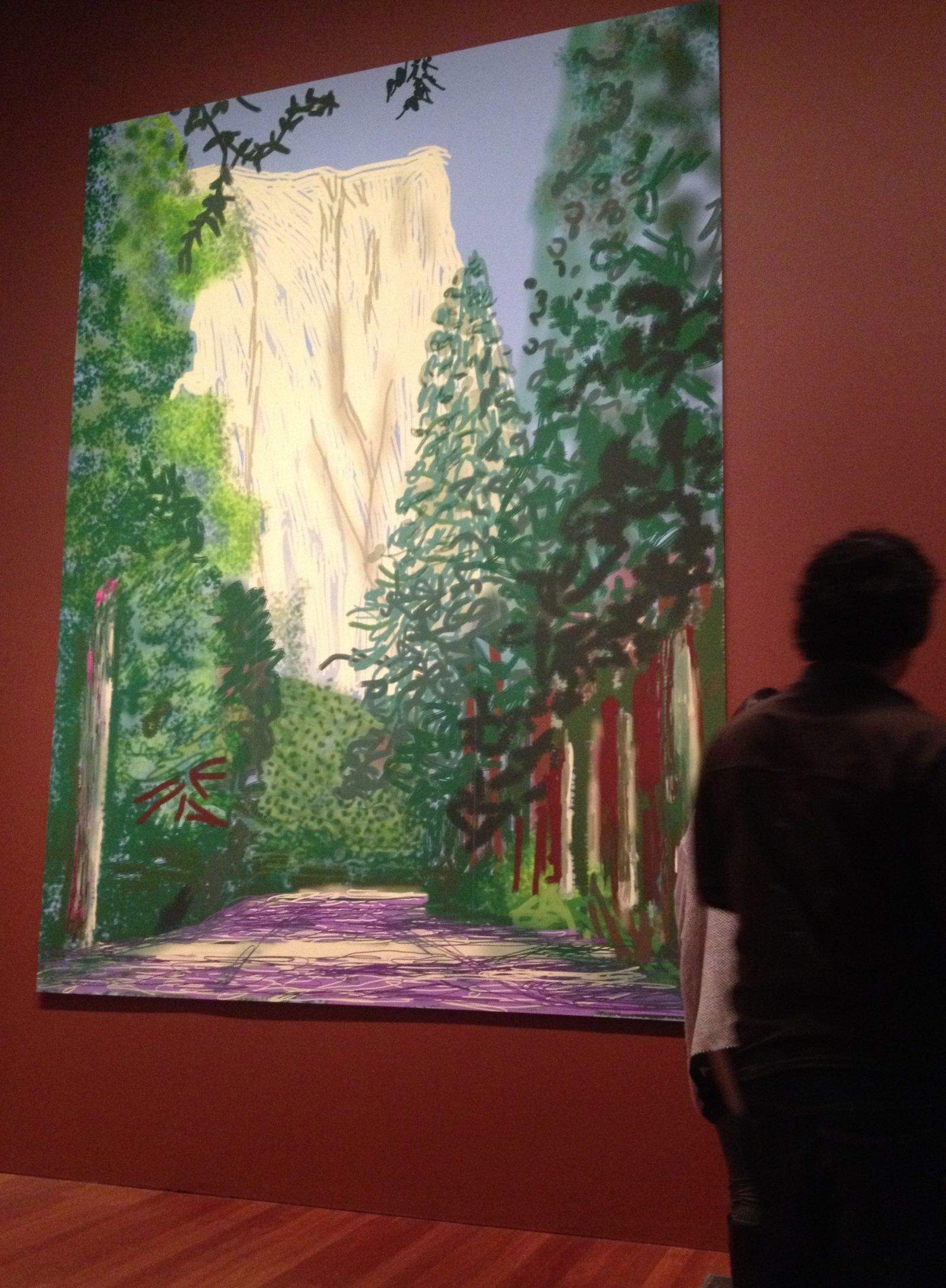
It’s not as much of a stretch as it sounds. After all, Hockney recently had a major show at San Francisco’s de Young Museum, where he debuted a series of 12-foot-high tributes to Yosemite National Park made with an iPad. The big, bold, bright works with clear blues and greens were absolute show-stealers.
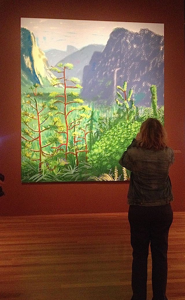
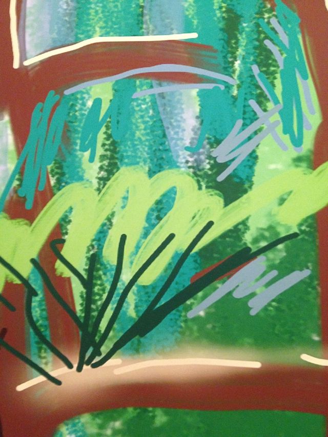
Yosemite I, October 16th 2011. Photo: Nicole Martinelli/Cult of Mac
They towered over visitors and dominated the room, challenging onlookers to find them less worthy than more traditional artworks. “Surface is illusion and so is depth,” Hockney told journalists. Here the illusion is so complete that the Ansel Adams remark about Yosemite Valley as a “glitter of green and golden wonder in a vast edifice of stone and space” never rang more true.
Hockney and Apple have kind of an unrequited love story. Hockney’s iPad made it into his artistic toolkit in 2010 because it happened to fit into the specially made pocket he has sewn into all his jackets – for sketchbooks. The venerable pop artist has been using Apple devices to send daily sketches to friends since 2009. Apple has approached him for one of its feature stories, but Hockney has reportedly demurred.
It’s all speculation, of course.
Personally, I like to think the Yosemite name was more inspired by the rugged California landscape as it was captured by boundary-pushing art (like the Picasso poster or the Mac “Matisse” graphics) than the silly road trip Craig Federighi outlined with his crowd-pleasing jokes about “Weed, California” that sounded like they came from an ’80s sitcom.
