With a new iPhone all but guaranteed to be announced Monday, there’s never been a better time to perform a quick post-mortem on the existing multi-touch devices from Apple. Though the iPhone has been talked nearly to death, one topic that has gone relatively unexplored over the 18 months since the unveiling of the iPhone is the strategy behind its design. People have talked plenty about its design, of course, from the loved-or-hated chrome bezel to the iconic but somewhat-too slippery back edge to the software and the revolutionary touchscreen interface. That’s all fine, but those are all aesthetic and functional choices. At a more fundamental level, the iPhone constituted a strategic move by Apple into the mobile phone market. And it’s here where the look, feel, and positioning of the iPhone are most fascinating. The iPhone was explicitly designed to rapidly drive the adoption of technologies that most people had never even contemplated before, and it’s been an overwhelming success. To learn why and to hear what this might mean for the second iPhone, click through!
Truly visionary leaders know how to shape the courses of their business through the products and services that they choose to offer. Instead of relying on ads or clever marketing lines, they bake everything that matters into the substance of their business, not the gloss. This is one of Apple’s great strengths — the original iPod was always its own best advertising. If a friend let you play with their iPod, you just had to get one, and the same has been true of many Apple products over the years.
So what is actually delivering through its commitment to design? I would argue, more than anything else, that the company’s strength is in taking nascent or non-mainstream technologies and making them essential and buzzworthy, from the microprocessor to the graphical user interface to the laptop computer to preemptive multitasking and even video editing. Half of Apple’s strength here is through great interface design. From the mouse to the visual interface of the Mac OS to the iPod wheel and multi-touch, Apple pays very close attention to the way that people make direct contact with technology. The other half, though, is a very savvy assessment of Apple’s own skills, interests and commitments. Apple cares about maintaining a premium brand — they never want to be cheapest, which requires them to put the focus on new features and product categories instead of on driving the cost out of their existing lines.
And, after three paragraphs of exposition, this is the challenge that Apple faces and overcomes year after year through the design of its products: how to demonstrate the benefits of new technology to a public that is, at best, indifferent towards new technology. Countless great inventions have never gone anywhere because people just didn’t understand what they should be used for. Apple’s greatest genius is in using the actual physical design of its products to educate and explain. They follow design for adoption.
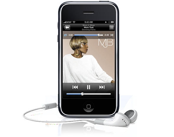
Take the iPhone itself. It contained some very well-established and successful technologies (iPod audio and video, phone calls), one long-standing but failed technology (mobile Web access), and one essentially new-to-the-world technology (multi-touch). Apple used the form factor of the iPhone to put all attention on the one totally weird idea. Though many consumers and companies might have been initially uncomfortable with a phone that had no physical keypad or keyboard whatsoever, Apple decided to make multi-touch the number-one selling point of the device. Everything about the iPhone’s look puts emphasis on touching its screen. The one button on its face is small and recessed. The chrome bezel encourages the eye to look within its bounds. Any buttons on the edges aren’t visible from head on.
The initial ad campaign for the iPhone showed this strategy in action perfectly. Every single spot is just an iPhone and fingers touching it to achieve wonderful things. Over and over again, Apple showed in its promotion and in the product itself, how this product should be used, and why it was a good idea. This is what we call at my day job a Curate design strategy, and it’s ideally suited to Apple’s greatest strength, which is taking something new from obscurity to the earliest part of the mainstream.

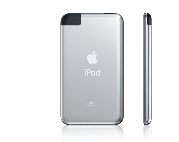
Curation is all about focusing on one feature, one model, one method of activity, usually in a closed system. That’s why it’s only in the next week that third-party applications will appear for the iPhone platform — Apple wanted things to work perfectly out of the gate, so they only allowed their own work onto the device for the first year of the product’s life. Another example of curation is seen on the iPod touch, which from the back looks just like an iPod classic — except for the little black cut-out at the upper-left corner. That’s Apple’s deign cue to indicate that the touch has more to offer than media capabilities. It’s actually an Internet browsing tablet, and the black cut-out is the design signal of built-in WiFi. When people in public see one in use, even just from the back, it’s clear that something new has happened in the iPod product line. Again. Two years ago, no one would ever have envisioned web browsing on an mp3 player as a good idea. Today, it’s commonplace, thanks to Apple’s strategy of using design to carefully showcase and explain new features and technologies.
Which sets up the question that I’ve been puzzling over the most lately: which new features of the iPhone 2 will Apple need to curate, and how will the physical design of the device support that effort, if at all? Would GPS mandate a cut-out akin to the back of the touch? Would a viceo-conferencing camera on the front of the iPhone mandate the elimination of the chrome so that all eyes are on the LED next to the lens? Does 3G call for the iPhone 2 to be slimmer, lighter, and more streamlined, as suggested in the rumor mill? Only Steve Jobs knows. But of this much, we can be sure: the next iPhone will have powerful new hardware features, and the device’s design will find communicate the best way to use them. It’s just the way Apple gets things done.
(As mentioned in the previous post, you can read more about designing for adoption in this article that I co-authored back in January. This piece owes all of its background thinking to that paper.)


4 responses to “A Retroactive Look at the Design Strategy of the iPhone and iPod touch”
Excellent piece. fully Enjoied readind it. It explain many things that for a laymam like me would be impossible to formulate so clearly.
Thanks
Ah, this really does a good job of explaining the “curation” technique. It seems that the iphone hacking crowd is indignant that Apple’s been on training wheels with the platform for a year, but we’ll likely all be better off now that the public is comfortable with multi-touch.
I tried to write something similar, but all I ended up concluding was that if the new hardware is actually chunkier, it’ll have to have enormously superior power and features: http://primitivemachine.net/po…