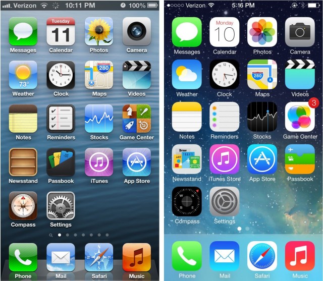
In a 92-character shot heard around the web, graphic designer, blogger and former design director for The New York Times Khoi Vinh weighed in on Twitter about the new operating system: “If iOS 7 is revenge on Forstall, Forstall’s revenge may be that it’s kind of not that great.”
Now that he’s had a chance to play with it for a few months, Cult of Mac asked Vinh what the best (and worst) parts are of Apple’s new operating system. His first impression that iOS 7 is a mixed bag hasn’t changed – but he’s grown to appreciate the lighter side of the new OS as well as dread switching his mom’s iPhone over.
The good
The new iOS is beautiful
Lighter fonts, clear colors. And no more green felt in the Game Center! The clean lines of the new system are definitely easy on the eyes. Also, it’s the unbeige answer to the ho-hum design everyone else is doing. With a little more polish, Apple might really have something, he says.
“The overall look of it is really beautiful. And the fact that they’re willing to take this chance is commendable…they’ve built some really slick things,” he said.
Vinh finds the new mutlitasking feature irksome, but admits even that has some upsides. “They made zooming much more consistent throughout the operating system and not just on the home screen but throughout the apps too. So when you tap on an app you actually are zooming into the app tile and then you see that in the calendar app, too. When go out to a month, you zoom out to a month rather than just switching to a different view. And I think that stuff is really nice.”
You will find everything
“It’s really not that different, it’s a question of perspective. I think you could argue convincingly that the majority of the changes are cosmetic, that the underlying interaction models are consistent: you still have this concept of the home screen, there are apps that you launch and so forth.”
Your kids will love it
“I’m not concerned at all about three-year-olds understanding this,” he said. “Every time they inherit a device like this or an operating system like this they’re fully prepared to learn from square one and do so very rapidly.”
It opens up a whole new world for developers
The sleek new look of the OS makes everything that came before it look like knee-length bloomers at a Victoria’s Secret fashion show. And that may create an opportunity for indie developers to crash the scene by getting up to speed with the new UI and making the competitors look like last year’s news.
“One interesting thing of what they’ve done is they’ve created this artificial sort of disruption in the continuum of like an app’s lifecycle, and they’ve kind of created an opportunity for new players to come in and quickly gain favor. ”
The Bad
The new “back” button
Vinh feels so strongly about the former back button that he wrote a requiem for it, calling the it the best back button of all time.
“The original back button is just a really marvelous sort of piece of work. It does all those jobs at once and nobody ever has problems with visually understanding what’s there. And the new one sort of introduced this problem where there was no problem before. It was solved before. So I’m sad to see the old one go.”
Expect hell when you get stuck upgrading your favorite baby boomer’s phone
Boomers are a slow-growing but important segment of smartphone owners and they’re not always the quickest to adapt. Those of the rock n’ roll generation will probably skip the needle when they see iOS 7, given how different it looks. Expect squinting at skinny, high-fashion Helvetica Neue fonts and some senior moments over the interaction, too.
“It’s going to be kind of confusing for them. I’m kind of wary of the day I have to upgrade my mother’s iPhone,” Vinh said. “In the long run it might be just fine, but just the very fact that so much is changing, even if Apple can pull off the feat of making the net result neutral, why should someone have to muddle through it to that extent?”
The gestures are not as nicely in synch with the UI, as they were on the old operating system, he says. “There were stylistic changes that don’t necessarily break the feature, but they create like a half second of disorientation.”
The Meh
It’s pretty, but it’s not that much of an improvement on the previous version
“I haven’t seen anything that makes me believe that it’s better…I’m hoping that maybe something gets pulled out of the hat at the last minute. I also feel like we might have our minds changed a bit by new hardware,” he says, recalling that it makes sense to visually overhaul the device when what’s under the hood changes too. “Otherwise, the redesign is often just a failure.”
Then again, he added, “Maybe there’s just so much glare from the gold of the new phone that you can’t even see the UI anymore.”


