Gather ’round, children. And let me tell you of a time before the consumer Internet. Before the iPod. And, if you can believe it, even before the iPhone. Yes, I speak of 1984. When the original Mac was the state of the art, and my favorite TV show was Sesame Street (not that this has changed).
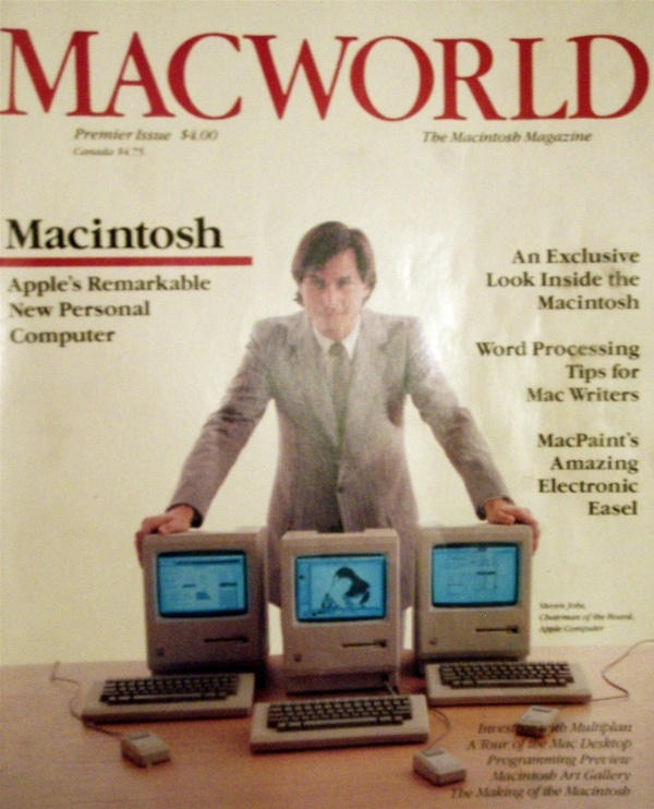
I recently managed to acquire the very first issue of MacWorld magazine, published in February 1984. Though it sells on eBay for up to $100 a copy, I’ll be bringing you hilarious content from Mac fandom past for free. It features many wonders, including an art gallery of MacPaint creations, an interview with Bill Gates where he calls the Mac a classic, and even a feature on the incredible WYSIWIG technology that will allow print-outs on the Apple ImageWriter to look just like the screen output (you must see that one to believe it).
But before I start to dive too far into the issue (which will show up over the course of several days and posts), I will start with the most horrifying ad in MacIntosh history. Click through — if you dare!
Technorati Tags: ad, humor, macworld

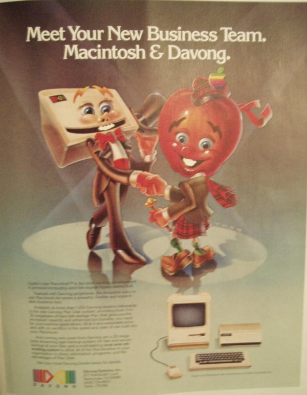
You are feasting your eyes on a reproduction of the first inside back cover of MacWorld #1, purchased by Davong Systems and advertising the first external hard drive for the Mac. If you haven’t heard of Davong, don’t worry about it. So far as I know, they’re way out of business, but they’re an old-school storage provider, specializing in tape drives, which they also made.
But that’s the boring stuff. The gold here is the illustration, by the wisely anonymous artist “THON.” At right, we have a personification of the Macintosh, playing up the unfortunate Scottish associations and the Apple associations. Yes, when I think about my Macs, the first thing I visualize is a nightmarish mutated Apple warrior from an incredibly unfortunate Highlander spin-off, “There Can Be Only One Friendly Apple-Man!”
Still more baffling is the fellow on the left, who, near as I can tell is the personification of…a hard drive. In coat and tails. Because when I think personality, grace, humor and charm? Totally thinking about an 8″ platter inside a huge beige box. The artist was clever to incorporate the actual design element of the black line on the front into a smile, but why not make the Mac design into a person, too? I mean, the Mac has a face! But no, we get Mr. Personality the Hard Drive (‘Cause he’s so ugly!) and Apple-Man McGee. Business partners for life.
Only, you know, without Davong so much.


34 responses to “State of the 1984 Art: Tales from the Original MacWorld”
is it me or this ad looks like it was made by 3d software which was not availible at that time?
Even more bizarrely, he has a Red Delicious apple for a head!
No, it’s all hand made: you should see what comic artists were up to even back in the 1920’s too.
Of course: that may explain why there’s no recognisable Mac in this ad. Such illustrations took longer to produce, Apple have such a reputation for secrecy, and it may have been more than tricky to get them to sign off an artist to get to see a Mac in the first place before having to draw one!
Think about it: the Mac was the biggest thing ever to come out of Cupertino. It certainly seemed like it in 1984. Why spoil the intro by leaking to non essential 3rd parties? Apple very likely said no and so our hapless artist was told to ink “something friendly called Apple’s ‘Macintosh’ and this here ‘hard drive’ … no further explanations!”
The smaller picture at the bottom with an actual Mac in it could well have been added at the last minute … and would certainly have been a better choice. Oh well, it was 1984 after all.
Beleive it or not, back then we had an ancient technique known as ‘drawing’ where a person would use pens and pencils (it’s archaic, I know) to make images on paper. It’s almost unimaginable.
It’s just you, King.
To make things even worse, that’s not even a MacIntosh apple. It looks like a Red Delicious.
uh… Are they going on a date or something? And since Mac is wearing the skirt…. well.. nevermind.
LOL…3D software….ya know, they did at one time actually draw things by hand….
Just an illusion, actually. THON is an OK artist, so he does a lot with perspective, but the shadow cast by crazy Mac guy doesn’t have the scarf he’s wearing.
I may still have this issue (my wife made me throw out so many old MacWorld’s). It came for free when I bought my 128K Mac in January 1984. I must have read this issue 50 times to see if I could find out just one more thing about my new little wunderbox. Ah, the memories. I can almost feel a cramp in my right hand from swapping 3.5″ disks while doing large MacPaint documents. ;->
Give THON a break. That’s only a kilt shadow!
Looking forward to more scans, Pete! :D
These don’t look like scans. Why are they so blurred?
I still have the original copy of that issue in pristine condition – what am I bid?
Looks like MacGirl
You know, I didn’t pick up the Scottish vibe here at all. My first thought was that this was a sleazy old man picking up on a school girl. Which impression I still hold: the Mac is certainly shorter than one would expect were it to represent a Scottish male, and the face is definitely feminine.
In either case, though, this is a seriously disturbing ad.
Also, note that the shadows are all wrong. The sleazy guy’s spotlight appears to be coming in from the right, so his shadow should fall to the left, not the right. Photoshop fake! Er, I mean …