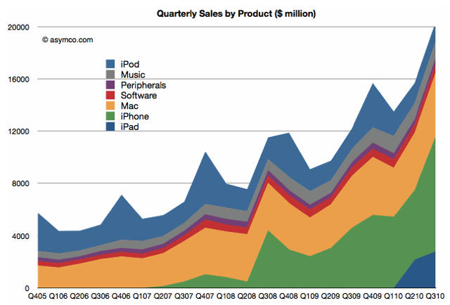
This chart tracks the dizzying rise of new products in Apple’s sales mix. Currently about 60% of Apple’s sales come from products that the Cupertino company launched in the last three years.
“This last quarter is not a holiday quarter. Now imagine what next quarter will look like on this chart,” writes Horace Dediu, who charted Apple’s sales in the graph for Asymco. “Think back to 2001 before the iPod. The orange band was all that Apple had.”
Source: Asymco


