live_tv
Livestream Starting Soon
00
Hours
:
00
Minutes
:
00
Seconds
Up next in 10


Apple gave its new #LiquidGlass design a more frosted look in #iOS26 beta 3 to improve readability. But this also made the design feel less liquid-y. The latest #iOS 26 beta changes this and adds more transparency to UI elements.
More Apple news: http://www.cultofmac.com
Produced by Extra Ordinary for Cult of Mac
Follow us!
Threads: https://www.threads.net/@cultofmac
Mastodon: https://mastodon.social/@cultofmac
Instagram: https://instagram.com/cultofmac/
X: https://x.com/cultofmac
Facebook: https://www.facebook.com/cultofmac
Show More Show Less View Video Transcript
0:00
[Music]
0:01
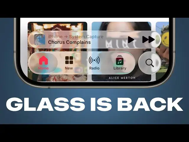
iOS 26 beta 4, Apple has quite a number
0:04
of changes. Uh, most notably, they've
0:08
gone back on liquid glass again. So,
0:13
it's death was greatly exaggerated.
0:15
Yeah. Yeah. So, you look at the bottom
0:17
toolbar in an app like music and sure
0:20
enough, they've uh
0:21
you can't see anything.
0:22
Made the glass much more transparent
0:24
again.
0:28
Yeah,
0:28
it's exactly back to where it was,
0:30
wasn't it? Completely unintelligible
0:35
in in a media app like music, uh, you
0:38
know, Apple always says it's about it's
0:39
about emphasizing the content. And it is
0:43
so emphasized because you can no longer
0:45
see the music you're playing, but you
0:46
can see about, you know, 60 more points
0:50
of pixels vertically in the content
0:53
behind it. So, I can't see what music
0:55
I'm playing, but I can see, you know, a
0:58
little bit of the album artwork behind
0:59
the video player, behind the music
1:01
player at the bottom. Uh, so, you know,
1:04
that's that's interesting. It begs the
1:06
question why they changed it in the
1:07
first place and why they then changed it
1:09
back. A theory that I heard is that
1:12
because this is going to be the first
1:13
public beta again, like you know, Apple
1:16
used the first three betas to get the
1:17
impression and you know, all the
1:19
feedback from developers, people who
1:20
tried it first,
1:21
but because the public beta is going to
1:23
be more open, they're like, "Okay, well,
1:24
let's switch it back to how it was when
1:25
we introduced it and see what the public
1:27
thinks. Are we going to get the same
1:28
reaction when we add, you know, five
1:30
times more people to the beta program?"
1:32
That's an interesting theory. Yeah,
1:33
that's that's
1:35
Or it could be enough people complained
1:36
on X and so now they're just going to
1:38
make it cool again.
1:40
Yeah, it's just internal battle like
1:41
people are tugging it one way or the
1:43
other and like I want it transparent and
1:45
I want it frosted.
1:46
Yeah, it's like
1:47
because I will say this does look much
1:48
cooler than before like you know you
1:50
watch the especially in music and
1:52
podcast like you can see the warping
1:53
effect if you have like really detailed
1:55
album art and it looks cool. You just
1:57
can't read what it's saying. Well,
1:59
there's the strange thing with the with
2:00
what you have on screen there in the in
2:03
the music app is it looks like they've
2:05
disabled the edge blur effect like so
2:08
when you scroll up like it it's not
2:10
blurring the the content behind uh the
2:13
status bar which is a bit strange.
2:15
The edge blur is there when you scroll
2:16
to the very top but then as soon as you
2:18
start scrolling the edge blur disappears
2:20
and so you don't have that lighter
2:22
background anymore. But if you I mean if
2:24
you look at that like the clock becomes
2:25
unreadable. The time becomes unreadable
2:27
when when you kind of start scrolling.
2:30
The edge blur is broken on the top half
2:31
of the screen a lot. I like that happens
2:34
in Safari all the time as well. Yeah. So
2:36
this is a rather uh buggy release. I I
2:39
said last week, oh, you know, wait out
2:41
for beta 4. That'll probably be the
2:42
public beta and then you can probably go
2:44
ahead. I I take that back. Beta 4 is
2:46
just as buggy, if not buggier than beta
2:49
3 in a number of ways. Although I will
2:51
say battery life has marginally
2:52
improved. Um, a few other changes.
2:56
Another area of illegibility is the lock
2:58
screen and they've
3:01
uh tried to fix that by darkening the
3:04
lock screen when you have a notification
3:05
on screen. So you can see when I swipe
3:07
away the notification, it gets a little
3:08
brighter.
3:10
Yeah.
3:10
When I swipe down again,
3:11
it gets darker again. And that
3:13
gets darker. Yeah.
3:14
Helps a little bit. I don't think it
3:16
adds enough contrast. And the animation
3:17
is also kind of slow, but it does tell
3:20
you that they they heard the complaints
3:22
and they're trying to fix it.
3:24
Quite I think quite quite an elegant
3:26
solution. Quite a quite a clever way to
3:27
to fix it.
3:29
I feel like it's heading in the right
3:30
direction. But even there, if I some of
3:32
the words, particularly on the right
3:34
hand side, the the contrast between the
3:36
text and the background is still very
3:38
low contrast. It wouldn't uh it doesn't
3:41
pass muster in terms of accessibility.
3:43
Even the time, if you look at the time,
3:45
the the the number nine, which is sort
3:48
of white on cream, and that again is
3:51
like an accessibility nightmare. This is
3:54
this it's amazing that we're at this
3:56
late stage. Um, you know, with only a
3:59
month or so to go and this is this is
4:01
what we're looking at. I think they're
4:02
really going to ship it. And, um, it
4:04
boggles my mind.
4:06
The iPhone event is six weeks away. Let
4:08
that sink in.
4:10
Wow. following criticism for generating
4:12
incorrect AI summaries. I think in iOS
4:15
18.3, Apple turned off notification
4:18
summaries a while back. Uh but now
4:19
they've returned again. So when your
4:22
iPhone or iPad restarts after installing
4:24
the beta, it'll show you a prompt asking
4:27
you whether you want to enable them
4:29
again. Um I don't know what changes they
4:32
made in the back end to make them more
4:33
reliable this time, but they're bringing
4:35
them back apparently.
4:38
Well, apparent if you uh Googled Aussie
4:40
Osborne uh when was it yesterday or
4:42
something like that, is is a Osborne
4:43
dead? Google said their AI overview said
4:46
no, he's alive and well,
4:48
which
4:50
so there's a lot of thinking to be done
4:53
about AI summaries.
4:55
Mhm. They've tweaked the camera app in a
4:58
number of ways. First of all, it has a a
5:00
slightly tweaked icon where the lens in
5:02
the inside is a little bit bigger than
5:03
before. Um, they've also added a splash
5:06
screen when you first launch it that
5:08
explains the new design to you. But
5:11
there is one change that really bothers
5:14
me. You know, you open the camera app,
5:15
you can zoom in and out all before. And
5:17
you have like the new mode picker at the
5:18
bottom that's, you know, collapsed and
5:21
you can pick, you know, photo or video
5:23
and then when you hold your finger on
5:25
it, you see like the full selection of
5:27
modes. But the problem with this is that
5:31
it doesn't scroll the right way how you
5:34
would think. Like you see the you see
5:35
the list of modes on the bottom. You
5:37
swipe your finger one way and then the
5:39
mode picker scrolls the opposite way.
5:44
H
5:44
like you can see I'm moving my finger
5:45
left and all the items are scrolling
5:48
right. I move my finger to the right and
5:49
all the items scroll left.
5:51
Yeah. It's the only thing on iOS that
5:55
scrolls the opposite way compared to
5:57
everything else. I don't know why
5:59
they've done this. It wasn't like this
6:00
in the earlier betas.
6:02
I kind of get it, but I I I take your
6:05
point and it might be a mistake, but I
6:07
kind of get where they're coming from
6:08
with it.
6:10
Yeah, because doesn't it make it easier
6:11
to see the target?
6:13
Well, they could they could have they
6:14
could keep the mode switcher the same as
6:16
it is, but just have it scroll the way
6:17
you would normally expect.
6:18
But it's like which way do you expect
6:20
though? because I can sort of the logic
6:22
there is if I'm moving my finger to the
6:23
left and I know that there are choices
6:25
which are hidden to the left then I want
6:28
to get to those choices on the left.
6:30
The the fundamental thing about the
6:32
iPhone is that whichever direction you
6:33
swipe your finger in the stuff on the
6:35
screen below it moves in that direction
6:37
as if you're pushing the pixels with
6:39
your fingers.
6:40
Yeah.
6:40
And this inexplicably doesn't do that.
6:43
And it's the only thing that doesn't do
6:44
that.
6:44
You know what this you know what this is
6:46
reminiscent of? This is um exactly like
6:50
um in Mac OS 10 when the scroll bars
6:54
went in the wrong direction.
6:55
Yeah, it is.
6:56
Remember that?
6:57
Yeah.
6:58
Uh and there was a that was a huge huge
7:00
cont controversy. I remember that being
7:02
a massive massive outrage about that. Uh
7:04
but you know, like you said, it's
7:06
unintuitive. You you pull down and the
7:08
thing scrolls up and you or whatever. It
7:10
was the other other way round. Yeah. I
7:11
haven't experienced it. I'd have to see.
7:13
Is it how unintuitive is it, Griffin?
7:14
Does it totally throw you off? it it I
7:17
mean if you if you know like all the
7:19
photo options are to this side, all the
7:20
video options are to this side, I'm
7:22
going to scroll to this side because
7:23
those are where the photo options are
7:24
and I'm going to go there, then it it
7:26
throws you off. I mean, I imagine most
7:27
people are probably going to read the
7:28
labels anyway, but it's just jarring
7:31
that it's the only thing on the phone
7:33
that scrolls the opposite way because
7:35
again, the phone is like a more direct
7:37
interface. Like you're not you're not
7:39
moving a scroll bar, you're moving your
7:40
finger on the thing that you're trying
7:42
to move and it's the only thing that
7:44
scrolls opposite. But you say it's
7:45
nowhere else in in in iOS and I think
7:48
that's probably true at the moment, but
7:49
it's like a a segmented control which is
7:52
collapsed, right? And they could make
7:54
that now as a new component that you can
7:57
use in in other apps. Um because I think
7:59
the segmented control currently has to
8:01
show all of the options, but what
8:02
they've created
8:03
segmented controls function the the way
8:04
that other things do where like you
8:06
they do but this this is a collapsed
8:08
segmented control where you've got like
8:09
space constrained
8:11
and so I I can I can kind of see the
8:13
logic of it because a se segmented
8:15
control works great on Mac or iPad but
8:17
on iPhone when you're in extreme uh
8:20
compact portrait mode then a segmented
8:22
control often doesn't have enough space.
8:24
So they've created here a a solution to
8:26
that. And it could be something that
8:28
they
8:28
if I saw a very big segmented control
8:30
that like went off the left and right
8:32
side of the screen and I went to scroll
8:34
through the segmented control, I would
8:35
still expect it to scroll the direction
8:37
that my finger swipes it in.
8:38
Okay.
8:39
There there are other uh you know less
8:41
controversial changes here. They they've
8:44
changed the icons of external drives and
8:47
discs with a little lighter appearance
8:49
and remove some of like the perspective
8:51
from them. Another change that they that
8:54
they've introduced is they've brought
8:55
back the additional settings for call
8:57
screening. So you can set it to never so
9:00
that you just receive every phone call
9:02
you that that is dialed to you. You can
9:04
ask the reason for calling which is the
9:05
new smart AI feature. Or you can just
9:08
have all incoming calls silenced again.
9:10
That's my that's my kind of setting.
9:12
Yeah. Right there.
9:13
Exactly. Yeah. Yeah. So that that's what
9:15
I have my phone set to. think that
9:17
disappeared for the first few betas, but
9:19
now it's back and they explain what each
9:21
of these do in a much more intuitive
9:23
way. So, that's a that's a good change
9:24
that they've made. Uh, they've also
9:27
changed the default wallpaper. Again,
9:29
they've been introducing more features
9:31
to it as they've gone along, but now it
9:34
has a dynamic option, so it'll change
9:36
colors throughout the day. And when
9:38
you're editing your lock screen, it'll
9:40
preview them all for you. like it'll go
9:42
through dusk at night where it turns
9:44
bluer
9:44
and then black in the background and
9:46
then it lightens up again in the morning
9:49
and you know you can preview them all
9:50
there. It's pretty retractive. I I like
9:52
this wallpaper.
9:53
I'm not a default wallpaper sort of
9:55
person. Whenever I retire a device, I
9:57
set its wallpaper to be the default for
9:59
its operating system so that I can sort
10:01
of jog my memory as to which device it
10:03
is. But I think it's nice. What do you
10:05
think?
10:05
I like it. Yeah,
10:06
I
10:07
Yeah, those um the way it changes colors
10:10
is really attractive.
10:12
Mhm.
10:12
Though I I have uh my dog on my lock
10:15
screen and you know that feature where
10:17
Apple picks your best pet photos and
10:19
cuts them out and and like combines them
10:22
with the time and stuff and Oh yeah,
10:24
it works amazingly well. It just finds
10:26
all the best photos of my dog and
10:28
there's always like a nice surprise
10:29
every time I pick up my phone. It's
10:31
another picture of Lil. I've I've
10:33
switched to the photos watch face on my
10:36
Apple Watch for the first time just to
10:38
try it out because they made a number of
10:39
changes there and I I'm enjoying it. It
10:42
is it is harder to see the time because
10:44
the the time is now glass on the
10:47
background and it changes color and
10:48
position every time I look at it, which
10:51
isn't ideal for a watch, but I also
10:53
don't use my watch a lot anyways. So,
10:55
there a few a few regressions in beta 4,
10:58
but a few a few changes that are nice. I
11:00
hope they change the the the the uh
11:02
interface for the phone app. I think
11:03
that is the worst thing ever. The phone
11:05
app new interface is awful. I just find
11:09
it absolutely a an abomination.
11:13
They they did make one small change that
11:15
really bugged me before and that now
11:16
when you go to the search tab and type
11:18
in a contact name, it'll it'll show you
11:21
like, you know, the actual results of
11:22
that contact and not your call history
11:25
with that person, which was kind of
11:26
confusing, but they they made a number
11:28
of changes to that. Uh, but you can't
11:30
actually revert the phone app to the old
11:32
design.
11:33
You open the phone app and then I think
11:34
you tap the the more button.
11:36
Oh, you're right. In the upper right
11:37
top,
11:38
you can go back to the old one.
11:40
Oh, cool.
11:41
But it's growing on me. It's growing on
11:43
me.
11:43
Yeah, I think maybe I should force
11:45
myself to like it.
11:47
Like a good Stockholm syndrome.
11:49
Yeah, I suffer.
11:50
Doesn't it speak to Apple's lack of
11:52
confidence in the new UI that they
11:54
actually gave you a switch to turn back
11:56
to the old UI? Apple doesn't usually do
11:58
that. So, I think that there's, you
12:00
know, they kind of know there's a
12:01
problem with it.
12:02
I guess there are some things that are
12:03
pretty good. You I mean, like seeing the
12:05
call history rather than just a list of
12:06
your favorites is is actually kind of
12:08
useful,
12:09
especially for all those calls you
12:10
ignored,
12:11
especially because most people don't
12:12
have like, you know, 50 favorites. You
12:14
only have like three or four favorites.
12:16
I mean, I only have like three or four
12:17
people I ever call on the phone ever.
12:19
Yeah. Did you
12:20
just having those on the top? And
12:21
it made me realize how much the world
12:22
has changed that I don't really care
12:24
about the phone anymore. you know, I
12:26
hardly ever use it and the only time I
12:29
do use it is like when I get a spam call
12:31
and you know, apart from that like phone
12:34
is pretty much dead to me. So, it's like
12:37
I I I don't care what Apple does to the
12:39
phone app and like having the phone
12:41
having the phone app on the iPad and I
12:42
see the icon now and it just gives me
12:44
this feeling of depression. So, I hit it
12:46
because it's like I just find the whole
12:48
phone thing depressing now. It's just
12:50
spam and junk calls fish. Well, the one
12:52
thing you never want to do is is take
12:53
calls on you, you know, a ton of that
12:55
Wi-Fi calling on your on your iPhone or
12:56
your MacBook. Oh my god, that's just the
12:59
worst cuz then when your phone rings,
13:00
all your devices ring, and you really
13:02
can't get away from it.
13:04
Yeah, silence is definitely the best
13:06
option.
13:07
I mean, it's also nice in in the new
13:09
phone app because it when you when you
13:11
get spam calls, which are almost all the
13:13
calls you ever get, it hides them so you
13:15
don't even they don't even clutter up
13:16
your recents list anymore, which is
13:18
great.
13:18
Yeah. That might make the phone use
13:20
usable again. Yeah, but that's iOS 26
13:24
beta 4. It's scarily close to being iOS
13:27
26, the released version for everybody.
13:29
It really is. But
13:30
well, what's the the public beta?
13:32
Because that was supposed to be released
13:34
Well, I mean, everyone is supposed to be
13:35
everyone was expecting it to be released
13:37
um this week on Tuesday, right?
13:39
Yeah, because Apple did say it was going
13:41
to be released sometime in July. My
13:43
theory now that it hasn't been released
13:45
yet. I mean, maybe it's been released in
13:46
the 30 minutes we've been doing this
13:48
phone call, but real time follow-up
13:51
The public beta is out right now.
13:53
Oh, it's out right now.
13:54
Yep. Yep. They just released the public
13:56
beta.
13:57
Oh, okay.
13:58
Wow. That was very pressy interview. You
14:00
anticipated that.
14:02
You manifested that.
14:04
Oh, no. Can I unmanifest it?
14:08
There's some other There's plenty of
14:10
other things I'd rather manifest than a
14:12
public beta of iOS 26. I think
14:15
it's going to be really interesting
14:16
because I guess that a whole bunch more
14:18
people are prepared to use a public beta
14:20
than a developer beta. So, a lot of
14:22
people now are going to be seeing Liquid
14:24
Glass for the first time. And I'm really
14:25
interested to see
14:26
what the reaction will be.
14:28
Mhm.
14:29
Well, the the developer reaction was it
14:30
was like, "Oh god, this is horrible.
14:32
It's absolutely awful." And then the
14:33
following week, it was this is the best
14:35
thing ever.
14:35
Yeah.
14:36
Uh followed by the week after that was
14:38
back to its awful. And then when Apple
14:39
changed, you know, tried to get rid of
14:40
it. Now that everyone missed it, they
14:43
were like, "Oh god, you know, we I we
14:45
liked it. Please bring it back." And so
14:47
now they have brought it back. I mean, I
14:49
wonder how they the developer, they must
14:50
be driven crazy inside Apple like
14:52
looking at Twitter. It's just so skitso.
14:54
Well, I I I to I feel both ways about it
14:57
because I actually really want to like
14:58
liquid glass. I love the lensing effect
15:00
and I think it's really cool, but at the
15:02
same time, there are these legibility
15:04
issues. So, I guess I want it, but I
15:06
want them to somehow magically solve all
15:09
the problems with it. And uh you know I
15:12
some of the problems yeah are maybe
15:13
subjective but I do think some of some
15:16
of the legibility problems we even saw
15:17
in Griffin's demo are not subjective
15:20
they are just issues and uh so I really
15:25
hope that Apple can find a way to give
15:26
us the best of both worlds because I do
15:28
really like it. Um and I but I would I I
15:32
just feel it needs a little bit more
15:34
TLC.
15:35
Mhm.
15:36
What about, you know, like everyone's
15:37
saying a slider to to add more frosted
15:39
glass,
15:41
uh, a simple setting, you know, in the
15:43
accessibility section of, uh, settings
15:46
somewhere, you know, where you can dial
15:47
it up or down.
15:48
They do have that. I and but I think
15:50
it's it's a shame to have to do that
15:53
because then again you're losing
15:55
you know and also
15:58
I like to see the way that the designer
16:00
intended for it to be unless the way
16:02
that the designer intended it to be was
16:04
completely illegible. Um, it's it, you
16:07
know, I think the accessibility features
16:09
should be there for people that have
16:11
accessibility needs, but I feel like you
16:13
shouldn't it shouldn't be a situation
16:15
where almost everyone has to turn it on
16:17
because then it's not really an
16:18
accessibility feature. It's a uh it's
16:21
it's just what you need to do in order
16:23
to use the phone.
16:25
The one thing you never want to happen
16:26
is for there to be like a bunch of viral
16:28
Tik Toks that it's like, "Oh, you need
16:30
to change this setting to fix your
16:31
phone." Because that's what happened
16:32
with like the photos app. was like, "Oh,
16:34
no. Don't update your phone to iOS 18.
16:36
Don't update your phone." And because
16:38
your photos app will be ruined, and that
16:41
information just spreads around instead
16:43
of, "Oh, you know, when you update to
16:44
iOS 18, you can customize the photos app
16:46
to make it however you want." Like the
16:48
the worst thing you want is for, you
16:51
know, masses of people to be afraid of
16:54
your phone rather than know how to fix
16:56
it.
16:56
Yeah. I mean that that if you which is
16:59
exactly what Apple will expose
17:00
themselves to if they can't find a way
17:03
to address those
17:05
the most serious accessibility issues. I
17:08
think I think it's okay for there to be
17:09
the occasional problem but there are
17:11
just a few too many right now.
17:14
I was just looking for that setting you
17:15
were talking about. Isn't is there just
17:17
literally one setting for
17:18
in accessibility settings you can under
17:21
like visual I think you can turn on
17:23
reduce transparency and what that does
17:25
is it turns all of the glass material
17:28
into like the iOS 18 solid blurred
17:30
material.
17:31
I just had it here and it looked like
17:32
there was a bunch of different ones you
17:34
could you could change like four or five
17:36
different things. You can reduce
17:38
transparency does that. And then there's
17:39
also increase contrast. And what that'll
17:42
do is it'll like make the buttons
17:43
brighter and it'll give them like a big
17:46
white outline around all of them. And
17:49
Right. And this is under uh display and
17:51
text size. Reduce increase contrast.
17:55
Uh and then a bunch of other different
17:57
settings too.
17:58
Yeah. Yeah.
17:58
Wow. There's a lot of stuff, isn't
18:00
there? Actually, if if you've ever go
18:01
digging around in settings app, it's
18:03
just absolutely mindboggling, isn't it?
18:04
You go like menu after menu after menu
18:07
with all these things that you can act
18:09
turn on and I mean in fact you know
18:12
Griffin this has been a source of your
18:13
employment for several years
18:16
basically
18:17
turn a whole 800word article out of
18:19
every setting and you've got a job for
18:21
three