| Cult of Mac

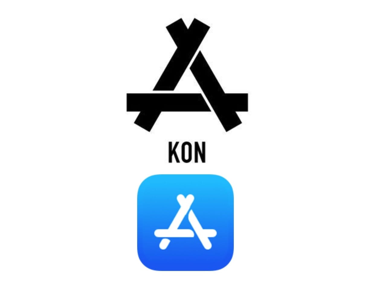
Chinese clothing company sues Apple over App Store logo

By

Kon vs. Apple
Spot the difference?
Photo illustration: Kon/Apple

Apple is facing a lawsuit in China from a local clothing brand, which argues that Apple is infringing on its design trademark with its logo for App Store.

Apple changed the icon for the App Store in August this year — jettisoning the previous image showing a ruler, pencil and paintbrush crossing over to form an “A” shape, in favor of a simplified version of the same image. Unfortunately, clothing brand Kon has been using a similar image dating back to 2009, supposed to show skeletons bones symbolizing triumph over death.
Only 1 in 5 people can accurately draw the Apple logo

By

logo
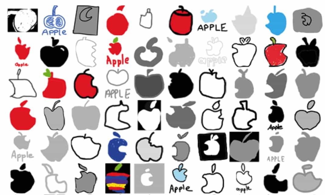
That's a whole lot of logo fails.
Photo: Branded in Memory

As the world’s most valuable company, with one of the most recognizable logos in corporate history, you’d think that most people would be capable of drawing the Apple symbol with some degree of accuracy. Especially since it appears on the devices that millions of us carry in our pockets every day.

In fact, a new survey called Branded in Memory shows that more people get the Apple logo wrong than get it right when sketching it out. Check out the most common mistakes below.

Face ID logo resurrects a classic Macintosh icon

By

FaceID
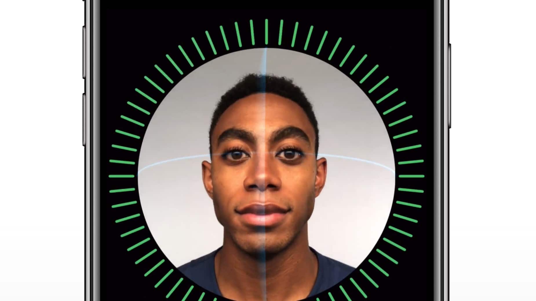
The iPhone X's FaceID feature looks impressive.
Photo: Apple

For a company that insists it doesn’t like to look to the past, Apple’s new Face ID logo will certainly feel familiar to longtime Mac users.

Apple debuted the new logo during its iPhone X keynote yesterday to show off the phones facial scanning features. It features a simple smiling face that looks three dimensional, but it’s actually just a repurposed version of the classic Happy Mac icon originally created by Susan Kare for the original Macintosh.

Check out the similarities:

Instagram’s gorgeous new logo comes with revamped iPhone app

By

download (1)
It's about time!
Photo: Instagram

Instagram is rolling out a brand new user interface on iPhone that ditches bright colors to make your photos look even prettier… but no one really cares about that. The real news is the brand new logo that comes with it.

Filled with beautifully bright colors like a sweet acid trip, it’s the first new logo Instagram has had since it launched five years ago, and it replaces the familiar retro camera, which was starting to look a little long in the tooth.

Uber’s new logo sure is a bit bizarre

By

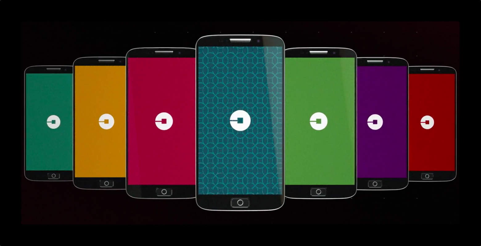
uber-new-logo-app-icon
Uber's new app icon is already getting insults.
Photo: Uber

Uber dropped a surprise announcement today that it has completely changed its logo and branding. The new logo is only slightly modified, featuring an altered font with letters that are closer together. The bigger news is the new app icon reflecting a total branding change. People already aren’t thrilled with it.

The picture you see above is indeed using the new Uber icon. It’s supposed to represent very small, simple forms of matter and technology coming together: atoms and bits.

Google forgot to search for ‘sophisticated logo design’

By

google-forgot-to-search-for-sophisticated-logo-design-image-cultofandroidcomwp-contentuploads201509google-gif
The new Google logo is simpler than ever. Photo: Google

Google revealed it’s getting a new logo today that ditches its rough edges for a more simplified (some would say childish) design. The change comes just a month after the company announced it was being restructured with Sundar Pichai taking the CEO reigns of the company now owned by Alphabet.

The new logo was introduced this morning on a blog post from Google’s VP of product management, Tamar Yehoshua, and UX director Bobby Nath, who justified their kiddie logo, saying it’s supposed to reflect the many platforms users interact with Google on throughout the day.

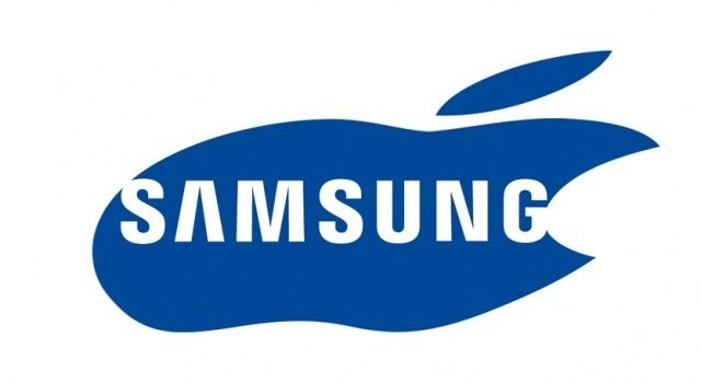
The True Origin Of Samsung’s Logo [Humor]

By

iphoneorigins


Apple and Samsung are headed back to court today for round two of their billion dollar patent lawsuit that will see the two companies pointing fingers and slamming down arguments on who copied whose patents.

We’ve seen enough evidence to have our own opinion on Samsung’s copying ways and now thanks to this Thai cartoon it all becomes perfectly clear why Samsung just can’t help itself.

Image: Killua51
Thanks: Grahame

This Dead 21-Year-Old Programmer Has An Apple Logo On His Tombstone

By

61316793

Romanian Apple fan Andrei was a straight-A student and promising C++ programmer whose 21-year life was tragically cut short before he could fulfill his dream of working for Cupertino, and possibly, if he was good enough, becoming Steve Jobs.

His passion for Apple was so much that when he died, his parents erected a tombstone with his honor, featuring the Apple logo on it. The message on the stone from his parents reads: “Our son, our hope, you are with us in every moment, and we are with you every moment. You are the champion!”

Source: Cancan.ro
Thanks: Victor!