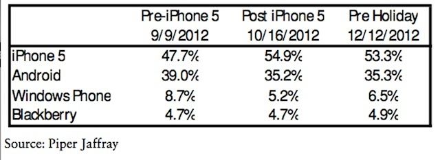
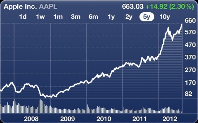
Earlier this week, The Wall Street Journal reported that Apple has cut its iPhone 5 component orders by as much as half following “weaker-than-expected” demand for device. The news sent Apple’s stock price plummeting, but according to some analysts, there’s nothing to worry about. iPhone 5 demand is doing just fine, according to Sterne Agee’s Shaw Wu, and the component cuts are in no way related to poor demand.
iPhone 5 Demand Is Doing Just Fine, Don’t Worry About The Supply Cuts [Analyst]
![IPhone 5 Demand Is Doing Just Fine, Don’t Worry About The Supply Cuts [Analyst] cn_image.size.s-iphone-new-5-release](https://www.cultofmac.com/wp-content/uploads/2012/12/cn_image.size_.s-iphone-new-5-release.jpg)
![Apple Cuts iPhone 5 Component Orders As Sales Fail To Meet Expectations [Report] Heading](https://www.cultofmac.com/wp-content/uploads/2012/12/DSC_0362_610x392-e1356022893450.jpg)
![Apple Must Reduce iPhone Profit Margins Before Market Share Starts Falling [Analyst] iphone5](https://www.cultofmac.com/wp-content/uploads/2012/09/iphone56.jpg)


![IPad Estimates Lowered Due To iPad Mini Cannibalization [Analyst] ipadandipadminicompete](https://www.cultofmac.com/wp-content/uploads/2012/12/ipadandipadminicompete.jpg)
![New iPad’s Biggest Threat Isn’t From Microsoft Or Google, It’s From The iPad Mini [Report] The iPad mini is winning.](https://www.cultofmac.com/wp-content/uploads/2012/11/Screen-Shot-2012-11-29-at-15.53.41.jpg)
![Munster: Apple Hasn’t Released A HDTV Yet Because Of Screen Problems [Analyst] Gene Munster, the guy who's been saying that Apple is making a TV for years.](https://www.cultofmac.com/wp-content/uploads/2012/11/Screen_Shot_2012-11-27_at_11-1.22.51_AM_610x435.jpg)
![Apple’s Live TV Service Is “Imminent” [Analyst] Until Apple can get the cable companies to play ball, its TV set will remain a rumor.](https://www.cultofmac.com/wp-content/uploads/2012/08/live-sports-on-apple-tv-e1345820380456.jpg)
![If Apple Doesn’t Sell 3 Million iPad Minis This Weekend, It’s A Failure [Analyst] The iPad mini lines have been nowhere near as big as expected.](https://www.cultofmac.com/wp-content/uploads/2012/11/61ba6_121102050055-tokyo-apple-mini-story-top.jpg)


![New iPhone Expected To Sell More Than 263 Million Units [Report] Apple's next iPhone will be huge.](https://www.cultofmac.com/wp-content/uploads/2012/08/iphone51.jpg)

![Increasing iPad Demand Could Cut Into Mac Sales [Report] iPad Mac](https://www.cultofmac.com/wp-content/uploads/2012/07/iPad-Mac.jpg)
![T-Mobile Predicted To Get The iPhone Next Year [Analyst] Tmobile](https://www.cultofmac.com/wp-content/uploads/2012/07/Tmobile.jpg)
