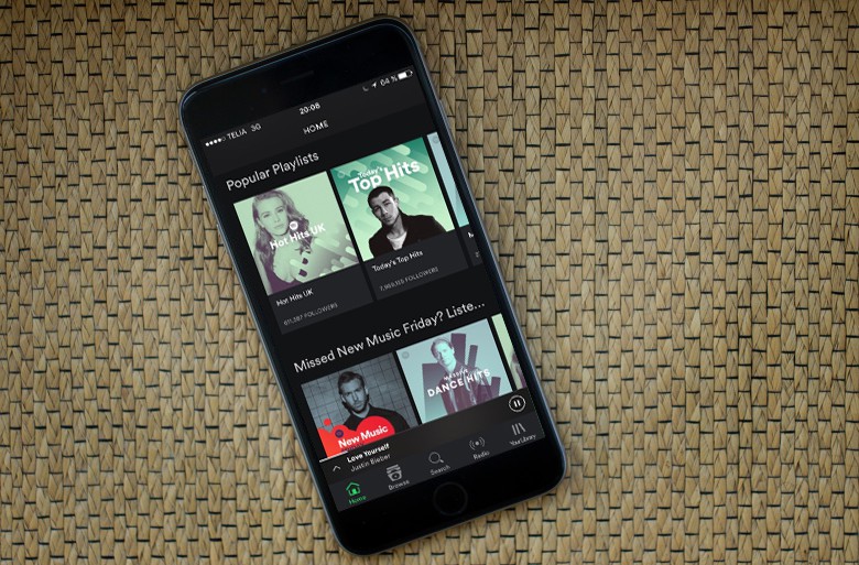
Spotify is ditching its hamburger button for a more familiar navigation bar on iOS, making it quicker and easier to access your music and features like Spotify Radio.
Users in some countries — including the U.S. — can enjoy the changes today.
For years, Spotify has employed a hamburger button — which looks like three lines stacked on top of one another — to provide a pop-out menu, which could be used to access different features and various sections of the app.
It’s a practice that’s traditionally more common on Android, but even Google is instructing developers to swap it for a navigation bar that puts common features front and center, rather than hiding them away.
When you open the Spotify app after installing the update, you’ll have one-touch access to the home screen, the Browse screen, search, Radio, and your music library, where you’ll find all the albums and playlists you’ve saved.
A navigation bar might not be the prettiest approach, but it’s certainly the most effective. You can get your hands on it today in the U.S., the U.K., Germany, Austria, and Sweden. The overhaul will rollout to more countries and Android in the “coming months.”


