In the past, when Apple has grown the screen of an iOS device — for example, with the transition from the iPhone 4s to the iPhone 5 — Apple has taken pains to keep the pixel density the same. The Retina Display on the iPhone 5 is 326 pixels per inch, just like the iPhone 4s. This makes it easier for developers and helps prevent the widespread fragmentation seen in the Android operating system.
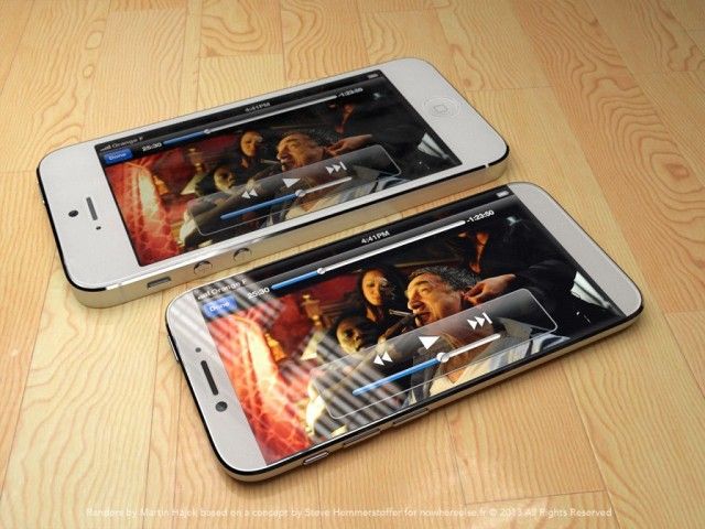
With many rumors pegging the forthcoming iPhone 6 as having a much bigger 4.7-inch display, a practical issue presents itself: what would that mean for resolution and pixel-density? If Apple increases the display size, will they increase the resolution to compete with the likes of HTC and Samsung’s 1080p Android smartphones? And if so, what does that mean for app developers?
Over on the Verge’s Apple forums, a user has a pretty good theory on what will happen if Apple releases a 4.7-inch iPhone 6. Citing a report by reputable analyst Ming Chi Kuo that says the iPhone 6’s 4.7-inch display will boast a 1,334 x 750 pixel display, the theory is this: even though it will have a bigger screen, Apple will keep the iPhone 6’s resolution exactly the same as the iPhone 5.
Noting that in the transition to the iPhone 5, Apple has been pushing developers to use iOS’s auto-layout tools, Verge user Pi is exactly 3 notes:
Even though it’s technically a marketing term, Apple has stated their “rules” for what kind of display they consider retina. For the iPhone being held 10-12″ away, 300ppi and higher is “retina”. Sticking to 326ppi on a bigger display, which would ideally be able to be held even further away, and thus require a lower pixel density, would also then meet the “retina requirements”.
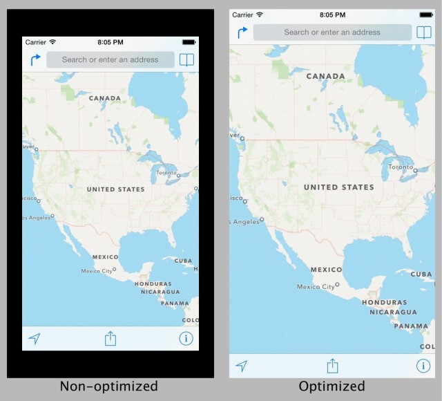
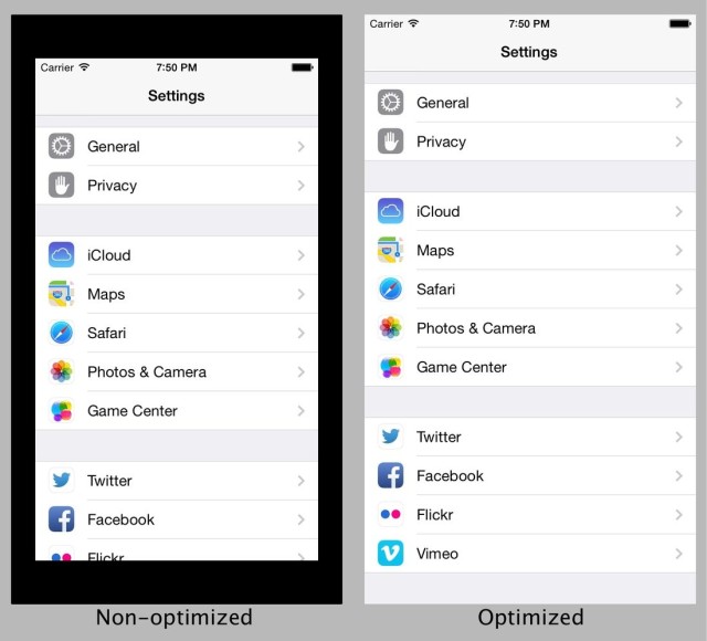
So, how Apple gets to 4.7″ is simple: add pixels to each side of the display, and keep the pixel density the same. Non-updated apps get letter-boxed on all 4 sides (instead of 2 like the 4″ screen), and developers are further pushed to use auto-layout to target all 3 display sizes. One of the big differences here compared to other theories is that, rather than everything just getting bigger, UI elements stay the same size, there’s just more room for additional content.
In this approach, Apple wouldn’t worry about increasing resolution, and instead “letterbox” apps that hadn’t been updated to support the iPhone 6, surround a 4-inch app with padded borders. This would be similar to handle the iPhone 5 and above handles apps that have not been optimized for a 4-inch display, or how the iPad works when running iPhone apps.
Here’s what apps would look like:
The biggest danger here is that Apple would look behind-the-times compared to the competition, many of whom are boasting displays that put the Apple’s Retina Display to shame, at least according to pixel count. But there are other, more important factors in determining a display’s quality than just pixels, and Apple might even be able to make a marketing weapon out of it, arguing that their competitors are wasting battery life to power screens with pixels people can’t see anyway.
Source: The Verge
