Given that it’s the most popular cross-platform messaging service on the planet, you might have thought that WhatsApp would have a new redesign ready to go when iOS 7 was made available to the public earlier this month, but as things stand, it’s still rocking its old look.
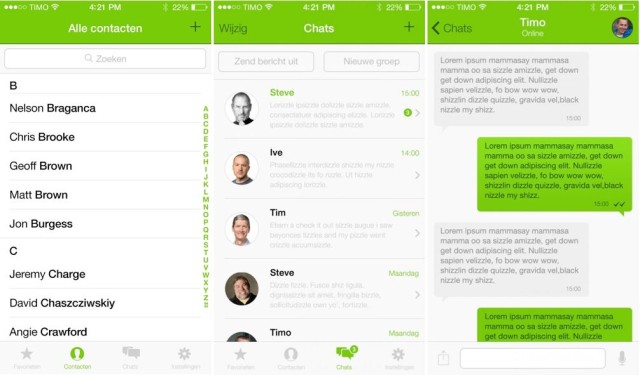
Presumably the team behind it are hard at work on the update as we speak, however, and hopefully we won’t have to wait too long for it. But in the meantime, check out these awesome WhatsApp for iOS 7 concept designs that give us a taster of what might be in store for our favorite messaging app.
As you can see, the new design — from web designer Timo Wever — follows iOS 7’s new design guidelines, and features thinner Helvetica fonts, words where there were previously buttons, and clean, minimalistic tabs and icons. It’s also much greener than the existing WhatsApp app — which sports blue navigation bars and black tabs — making it a better fit for the WhatsApp brand.
I don’t know about you, but I love this concept design, and I’ll be pretty disappointed if WhatsApp doesn’t come up with something similar. The existing design looks far too old and outdated now — especially now that iOS 7’s here — and this is a huge improvement.
What do you think of this WhatsApp concept?
Source: Timo Wever
Via: AppleSpot
![This Is How WhatsApp Should Look Under iOS 7 [Concept] WhatsApp-iOS-7-concept](https://www.cultofmac.com/wp-content/uploads/2013/09/BVU9UVjCcAEelYJ.jpg)


