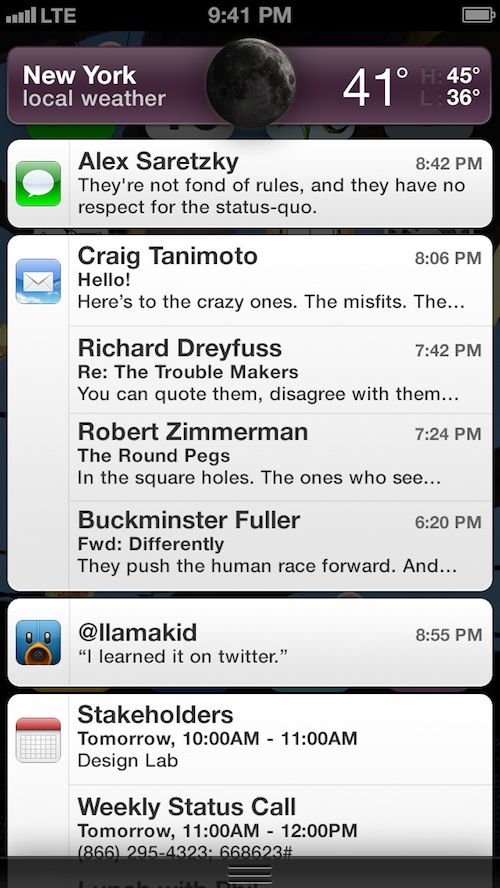
Notification Center in iOS and OS X is great in concept but kind of crappy in practice. First off there’s the linen background that doesn’t really make sense when you’re pulling down a curtain for notifications in iOS. There’s also those tiny little X buttons that you have to tap twice to close notifications, and a couple other annoyances that fill up the Notification Center page.
Alex Saretzky decided that Notification Center needs to be spruced up by simply applying Apple UI concepts that have been used in other apps. His new concept for the Notification Center isn’t a complete revision, but more like fine tuning, and it’s something that Apple should implement with iOS 7.
To start with, Alex advocates that Apple should ditch the linen background – something Jony Ive is sure to do. Replacing the linen is a “faithful representation of the notification banners – grouped by App, organized chronologically.”
The best part of Alex’s concept though is that rather than having to tap those tiny x buttons twice, users will be able to just swipe a banner to the right or left to clear it. The concept is similar to Google Now’s card system which honestly works a lot better than Notification Center. Alex also has a few different animations users could choose from to reveal Notification Center. You can see that full video over at his website.
Source: Saretzky


