Ripping off Apple’s hardware designs isn’t enough for Samsung, even though they lost a $1 billion lawsuit because of it. Sensing that they need to make some big changes in their design, Samsung is rumored to undergo a radical brand makeover in 2013.
If reports are to be believed, Samsung will announce the rebranding at CES 2013 in Las Vegas. The South-Korean based company has been working with a design team that has worked with Nike in the past and are rebranding Samsung’s image to be more like Apple’s.
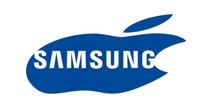
We’ve already seen what the Samsung logo would look like if they decide to just flat out copy the Apple logo, but maybe Samsung will surprise us with something unique for once. Supposedly, each product category will come with their own individual colors and be linked to the new Samsung logo.
Reports of the rebranding claim that Samsung’s advertising style is set to change as well to reflect more upon lifestyle activities similar to what Nikes does. Anticipating the rebranding to take effect in the next few months, senior Samsung staff members have been told to stop getting new business cards printed and wait until January.
What Samsung’s new logo will look like is anyone’s guess right now, but if we had to guess it will probably contain an circular element in the middle that closely resembles a pear with a bite taken out of the left-side, shaded in with the color black or white. Maybe they’ll get risky and use yellow instead. Who knows.
Source: Channel News


