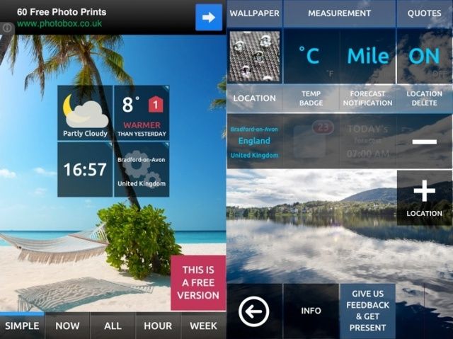
Weather On is a weather forecasting app for iOS that is remarkable for one thing: its very obvious nods to Microsoft’s mobile operating system.
Open it up, and you’ll see a selection of square and rectangular tiles that look and behave just like the tiles you’ve seen on the latest smartphones running Windows Phone.
The app is divided into a series of screens showing weather data for now, the coming week, or hour-by-hour. The controls are not particularly intuitive, but simple enough to work out. Much of what you see is animated – clouds waft sideways, a fan spins to show wind conditions. Background wallpaper images do a kind of Ken Burns-y thing.
The tiles are neat and the typography clear. Each page layout is smart and easy on the eye, and easy to take in once you’ve worked out what symbols are showing you what.
This app’s full name is “Weather On – Push Notifications”, and it’s called that for a reason. Again influenced by Windows Phone’s live tiles, it sends temperature updates to the app icon (they look like any other numbered notification), and push notifications of weather forecasts at you at a preset time each day.
The free app is somewhat naggy, with a persistant tile that flips endlessly, asking you to cough up $2 for the full app. I don’t begrudge free apps the right to ask that people upgrade, but this one does feel like it won’t take no for an answer.
The limitations are quite limiting. You can only have one preset location, and a choice of only two background wallpaper images. Even the 20 or so extra wallpapers available to purchasers of the premium version seemed a little over-the-top to me; beautiful images all, but none very representative of the grey, chilly English autumn that’s outside my window right now. It would be nice if you could take your own photos to use here. Also, the free version only gives you weather for today and tomorrow. If you want the week ahead, pay up.

Overall, Weather On has an odd feel about it. The tiles are unusual on iOS, and certainly give it a visual appeal. But they can also be confusing. Some tiles are interactive, and do stuff when tapped. Others merely show information. There’s no way of telling which is which without tapping first.
Do the tiles work? Hmm; yes and no. They give the app a unique look, but some features feel rather pointless. For example: there’s a digital clock tile that shows the time below all the forecasts. Tap it, and it swishes up into an analog clock on a screen of its own. There’s not a lot of point to it. It rather feels as if this feature was included just because it was possible, rather than because it’s actually useful.
Another example: upgrading to the premium version only gives you a total of three saved locations. Why just three? That’s not very many. It seems like it’s been kept at that number simply because that’s how the tiles stay looking their best, sacrificing functionality in favour of aesthetics. I’d love to be proved wrong in that assumption, but that’s how it feels when you’re using it.
The tiles are an interesting (some might say brave) attempt to make something different for iOS, but I’m not convinced that they’re really necessary. If you’ve not yet found a weather app that you really like, and you think you’d like something unusual, then perhaps this might be worth a try. But if you’ve already found a weather app you’re quite happy with, I’m not sure Weather On will pull you away.
Source: App Store
![This Weather App Makes iOS Look Like Windows Phone [Review] Looks quite a lot like Windows](https://www.cultofmac.com/wp-content/uploads/2012/10/weatheron1.jpg)

