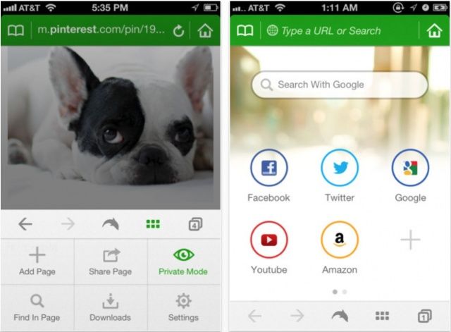
Dolphin is one of the best third-party browsers you’ll find on iOS, and it just got even better on the iPhone, thanks to a new design and user interface, new features, and lots of improvements in version 6.0.
In addition to its new look, Dolphin for iPhone now has better tab management, with all open tabs quickly accessible from the sidebar on the right-hand side of the screen. What’s more, while you’re scrolling through websites, the address bar will automatically hide to provide you with more screen space.
The URL bar has also been improved and now offers suggestions for searches and addresses as you type.
The full list of improvements in this release includes:
1. Spruced up design and interface
2. Tab management: Now see all open tabs on right sidebar
3. Menus and Settings: Access from moved from right panel to bottom
4. Full Screen Scroll: Address bar/bottom bar will automatically hide/show to utilize screen space
5. URL: As you type your search suggestion will automatically fill into the URL bar
6. Gesture & Sonar: Sleek new color and easier way to access
7. New Speed Dial: Check out those news buttons and wallpaper!
Dolphin has always been a great third-party browser, making its name on Android before taking the leap to iOS. And it gets better with every update. If you think mobile Safari doesn’t do enough and you’re not keen on Google Chrome, you should certainly take Dolphin for a spin.
Source: App Store


