In the world of iPhone apps, there are generally three categories of quality:
- Crapware that you throw away a few minutes after downloading
- Moderately useful software that you keep around but use a few times a week
- Daily tools that become a key part of your iPhone experience
With the release of Loren Brichter’s much-anticipated Tweetie 2 for iPhone, however, I think it’s time to establish a new category: “iPhone software better than anything Apple.” In fact, I’m willing to go so far as to claim it is the single-best app ever written for the platform. It’s incredibly useful, smooth as butter, innovative in design and features, and just works as you expect that it would. It’s as if it sprung, fully formed, from the skull of the iPhone, as if to say, “This is how it should work.” Not only has Tweetie 2 raised the bar for mobile Twitter clients, it’s raised the bar for mobile software.
I’ve been playing with it non-stop since its release yesterday, so there’s a lot of ground to cover. I’m going to break this review into three major categories: Interface, Features, and Magic. Hit the jump to see it all. There’s so much to talk about!
Jobs’s Own Interface
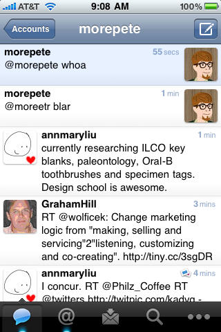 The first time you fire up Tweetie, you’ll notice that the user interface has been completely overhauled. Instead of speech bubbles in the time line, all comments are in a nice, streamlined column view. Though I was initially worried this might sap some character from the application, I’ve actually found it a lot easier on the eyes.
Generally speaking, it just feels like a refinement to what was already an excellent core function of what most people (Apple included) agreed was the best first-generation Twitter app for iPhone. But if you look closer, there’s a lot of new stuff to love.
First of all, rotate to the left. Full landscape support! And really nicely executed support, at that. It’s seamless, quick, and loses none of its functionality while on its side, as some apps (the previous version of this one included) must. Additionally, the app now uses glowing blue dots to indicate the presence of new messages in your timeline, new mentions of your name, and new direct messages. It’s quite slick, and will save you wasted time clicking over just to check. Search is also now a top-level panel, which is a great time-savings. It was really obnoxious to dig through the “More” menu in Tweetie 1 to get to the search page.
All told, it’s lovely, it just works, and it delivers the wow factor without being flashy.
More features to the ounce
If Tweetie 2 is remembered for anything, it should be for breaking the uncanny valley of pseudo-multitasking for iPhone. It is the first third-party app ever that you can leave and come back to later yet have it feel like it never shut down. Brichter calls this feature “Persistence.” No matter what you’re doing in the app, if you go to the home screen and do something in another app, when you relaunch Tweetie 2, it will pull up exactly what you were working on before. Incredibly, it’s really fast, too. In fact, it’s faster to get back in to action than Tweetie 1 was.
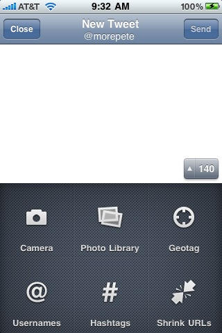 If Persistence were the only big new feature on Tweetie 2, it would be remarkable. But there’s a lot more going on, too. Most of it is visible in the brilliant new composition mode. In addition to being a bit cleaner, the app now uses the characters remaining counter as a button that rotates 180 degrees to hide the keyboard and reveal all kinds of neat stuff, including better camera integration (now with video support), direct access to the photo library, geotagging (with hooks for Twitter’s announced geo API), username look-up for mentions, recent hashtags, and URL shrinking. It’s insane. While I’m certain that there are probably other key features for composing the world’s best Tweets with ease, I can’t think of any. Maybe galactic coordinates?
But that’s not all. Tweetie scored points in the first version for its swipe-to-reveal options interaction. Basically, if you rub your finger over an individual Tweet, a few options would pop up. And now there are more. You can reply, deal with links (open, mail, repost, read later via Instapaper), go to user profile, favorite, or miscellaneous (retweet, quote, post link to tweet, mail, and translate). It’s everything you need, right where you need it.
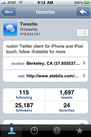 And there’s still more. The new user profile pages are rich with information. You can now quickly assess someone else’s volume of tweets, number of followers and people they’re following, and how often they favorite things, and even check their stats on TweetBlocker, Follow Cost, and Favstar.fm. Basically, you’ll get a clear sense of what it means to add this person to your timeline.
The app also offers integration with iPhone Contacts, so you can now associate their profile pics, home page, Twitter name, and other relevant data with their phone numbers and e-mail addresses. Oddly enough, this feature is the only scenario of use for Tweetie 2 where I noticed any lag at all, but it’s quite significant. I typically had to wait about 10 seconds to advance from the profile page to the Contacts integration screen on my 3GS. It’s not a show-stopper by any means, but it mainly stands out because everything else is so quick and so perfectly executed.
All that, and Tweetie 2 also offers robust offline support and simplified timeline search. It’s an embarrassment of riches.
Magic: The Twittering
I won’t spend too long on the unique magic of Tweetie that puts it head-an-shoulders above its competitors (and above all other iPhone apps), but it’s important to touch on. An app that did everything I’ve described above would be popular and well-liked. It wouldn’t be obsessed over the way that Tweetie is. Tweetie is beloved more because of how it does what it does instead of its design or functionality. It has so much character.
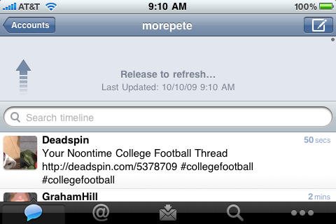
Though there are sprinkles of magic throughout the app, the one thing I want to talk about is how you refresh your various timelines to check for new content. In the previous version — and in virtually all Twitter and RSS apps for iPhone — you would hit a button that looks like an inwardly looping arrow to check for new stuff. Tweetie does things differently. You just pull down, and a little arrow says “Pull Down to Refresh.” As you pull further, it says “Release to Refresh.” You let go, and with a delightful clicking sound and a POP!, you have new tweets to read.
It’s so cool. And it’s actually a better interaction for doing this if you’re a true Tweet addict (as I’ve become) than moving your thumb to a corner to click a button.
What are you waiting for?
Tweetie 2 costs $3 (iTunes link) from the App Store for both new and existing users, and it’s worth every penny. Anyone whining about the price doesn’t care about quality and doesn’t deserve its beauty, anyway.
Seriously. Five-and-a-half stars out of four.

