Apple logo

Read Cult of Mac’s latest posts on Apple logo:

Today in Apple history: Apple II brings color computing to the masses

By

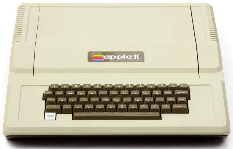
Apple II
The Apple II was groundbreaking for its day.
Photo: Computer History Museum

April 17: Today in Apple history: Apple II debuts at West Coast Computer Faire with color graphics April 17, 1977: The Apple II launch at the West Coast Computer Faire positions Apple at the forefront of the looming personal computer revolution.

The company’s first mass-market computer, the Apple II boasts an attractively machined case designed by Jerry Manock (who will later design the first Macintosh). It also packs a keyboard, BASIC compatibility and, most importantly, color graphics.

Fueled by some marketing savvy from Steve Jobs, the Apple II launch makes quite a splash at the San Francisco Bay Area’s first personal computer convention.
How to type the Apple logo

By

How to type the Apple logo
Show you're an expert by dropping the Apple logo into texts.
Graphic: Ed Hardy/Cult of Mac

Pro-tip-4You can use the Apple logo as an emoji … if you know how. Expressing your love for all things Apple looks a lot better if know how to type the .

It’s easy to do on a Mac, and I can show you how to add  to texts on iPhone and iPad, too.

Today in Apple history: Rainbow Apple logo gets a modern overhaul

By

Apple adds 5 new vice presidents to its executive lineup
On this day in 1999, Apple ditched its rainbow logo for something more subtle.
Photo: Lyle Kahney/Cult of Mac

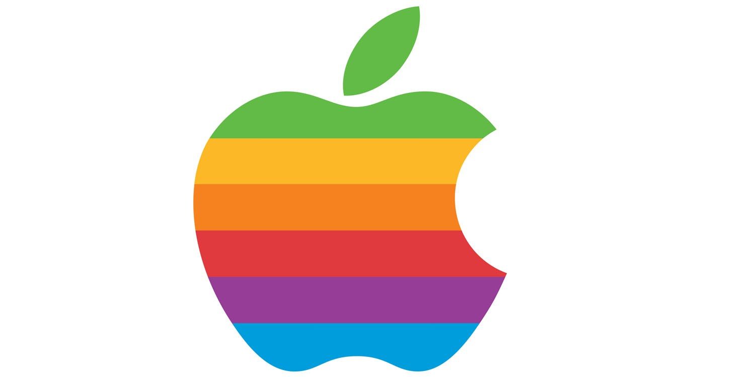
August 27: Today in Apple history: Rainbow Apple logo gets a modern overhaul August 27, 1999: Apple swaps out the striped, multicolored logo the company used since 1977 for a new single-color version.
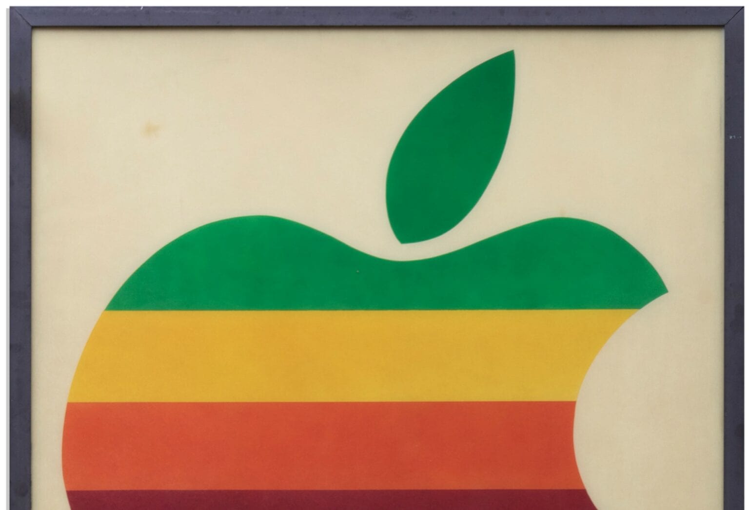
The replacement of the iconic Apple logo shocks many longtime fans. However, it is part of a sustained, company-wide overhaul led by Steve Jobs. The makeover includes new products, the “Think Different” ad campaign and, eventually, the removal of the word “Computer” from the company’s name.

Vintage 1978-era Apple signboard goes up for auction

By

Apple sign
What better centerpiece to your Apple collection?
Photo: Nate D. Sanders

Today, the Apple logo is up there with the Nike “swoosh” as one of the world’s most recognizable corporate icons. But, back in 1978, it was the just another logo belonging to an early stage startup that had recently released its first mass-market product, the Apple II computer.

Memorabilia from these early days of Apple is few and far between. However, if you want to get your hands on a piece, an early Apple Retail sign has just come up for auction. It’s not cheap, but it would certainly make a nice addition to any Apple collection.

iPhone 11’s Apple logo will shift for big new feature

By

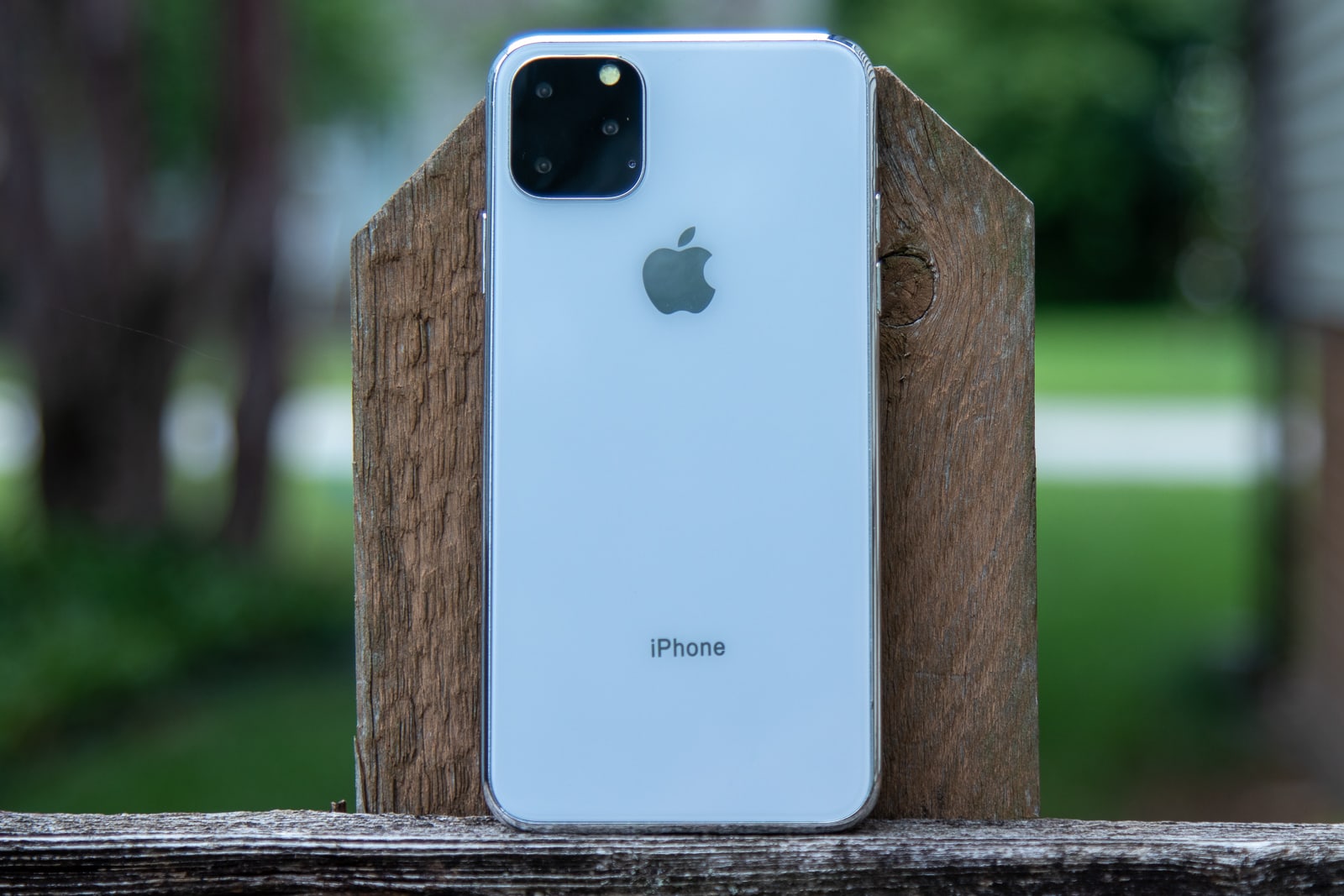
iPhone 11 Max leaning on fence post
No, it won't look like this.
Photo: Ian Fuchs/Cult of Mac

The Apple logo on the back of this year’s iPhone 11 lineup will shift to make way for a brand new feature, according to a new report.

The logo won’t disappear, but it will be perfectly centered for the first time in the iPhone’s history. The change will allow for a huge upgrade in wireless charging functionality.

What you need to know about that viral face-aging app you’ve been using, this week on The Cultcast

By

CultCast 397
Whoa there, buddy! We need to chat about that face-aging app...

This week on The CultCast: Why some say FaceApp, the mega-viral app that ages your face, might also be stealing your data. Plus, why your next iPhone or Mac may feature Apple’s rainbow logo; Apple might soon make a big move into original podcasts; and we’ll tell you about the wild lengths some Apple factory works go through to smuggle out top-secret tech.

Our thanks to Squarespace for supporting this episode. Easily create a beautiful website all by yourself, at Squarespace.com/cultcast. Use offer code CultCast at checkout to get 10% off your first purchase of a website or domain..

Bauhaus Apple logo looks like the Death Star

By

Bauhaus Apple logo
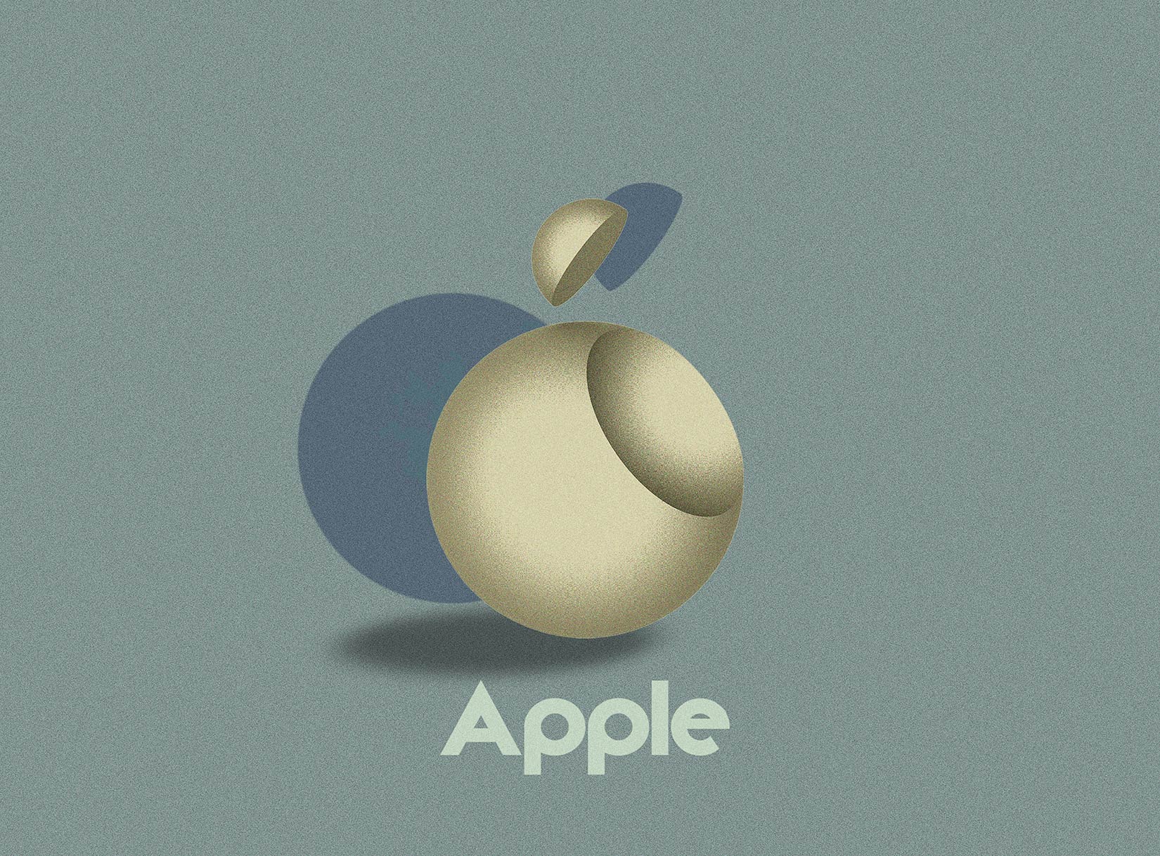
The Apple logo with a Bauhaus bite.
Illustration: Vladimir Nickolic

A company has to be nimble enough to change with the times. It can turnover leadership, recreate its work culture and overhaul its line of products. Just don’t mess with a brand’s logo.

But what if an icon like the Apple logo was reimagined with another iconic style?

Apple logo creator will share his design secrets at live event this month

By

Janoff
Rob Janoff was the designer of Apple's iconic corporate logo.
Photo: Fiverr

The Apple logo is among the most iconic corporate symbols in the world, and (with minor color-related tweaks over the years) has been used to represent Apple since 1977.

If you want to hear the story behind it, from original designer Rob Janoff, you’ll get your chance this month — when Janoff appears at an event in New York City, discussing all things design.

Apple updates its rainbow logo trademark, but don’t expect a comeback

By

retro
Would you like to see the return of Apple's classic rainbow icon?
Photo: ColorWare

Apple has filed to update the design trademark for its iconic multicolored Apple logo, last used by the company in 1999.

But despite one unlikely report claiming that Apple will be using for a new clothing line of “hats and caps,” we’d personally be surprised to see it make a return. Here’s why.

Only 1 in 5 people can accurately draw the Apple logo

By

logo
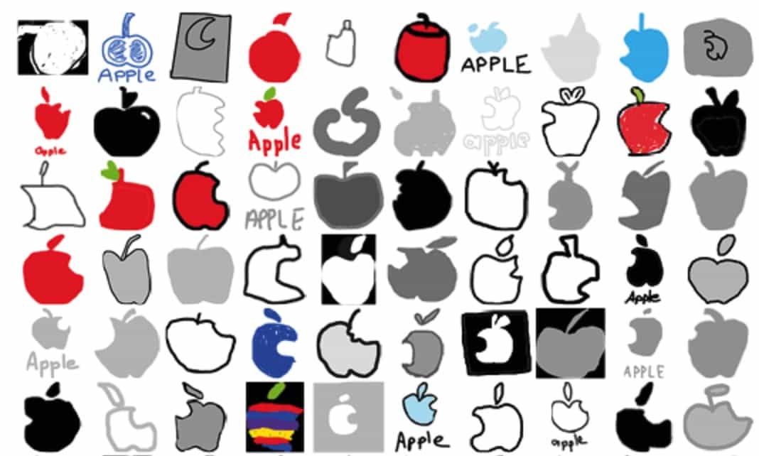
That's a whole lot of logo fails.
Photo: Branded in Memory

As the world’s most valuable company, with one of the most recognizable logos in corporate history, you’d think that most people would be capable of drawing the Apple symbol with some degree of accuracy. Especially since it appears on the devices that millions of us carry in our pockets every day.

In fact, a new survey called Branded in Memory shows that more people get the Apple logo wrong than get it right when sketching it out. Check out the most common mistakes below.

Touch ID moves to the back in new iPhone 8 renderings

By

iPhone 8 rear shell mockup.
Photo: Weibo

Apple may make the surprising move of relocating the Touch ID button to the back of the iPhone this year, but based on renderings of a leaked schematic, it wouldn’t look that bad.

Several renders, based on the supposed iPhone 8 schematic that hit the internet this week, show what the device’s rear shell might look like during production. It’s not a photo of the real iPhone shell, but for now this is as close to the real deal as we’re going to get.

Here’s another angle:

Today in Apple history: Apple Logo teaches kids to code

By

Apple-Logo-II-splash-screen
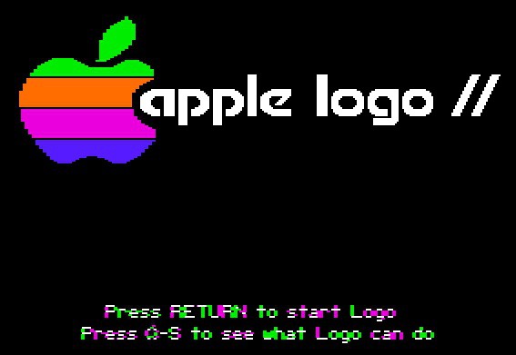
Apple Logo was Apple's first go at getting kids into coding.
Photo: Apple2history

tuesday14 Under Tim Cook’s leadership, Apple has been upping its focus on teaching kids to program — thanks to events such as its free “Hour of Code” classes at Apple Stores around the world.
But Apple’s been helping introduce young people to coding for far longer than that. In fact, years before Apple ushered in its Swift Playgrounds app as it did this week at WWDC, it helped popularize home programming thanks to Apple Logo, a basic coding language which found success on the Apple II.

How a viral Steve Jobs tribute sparked one designer’s career

By

Grieving Apple fans took comfort in this tribute to Steve Jobs and turned it into a viral phenomena.
Illustration: Jonathan Mak Long

Cult of Mac 2.0 bugApple fans felt a deep sense of mourning in 2011 when Apple founder Steve Jobs succumbed to cancer. With the fifth anniversary of his passing approaching, Cult of Mac looks at the artistic tributes that followed.

The Tumblr bio of Hong Kong graphic artist Jonathan Mak Long reads, “I try to do good work, and the world agrees on occasions.”

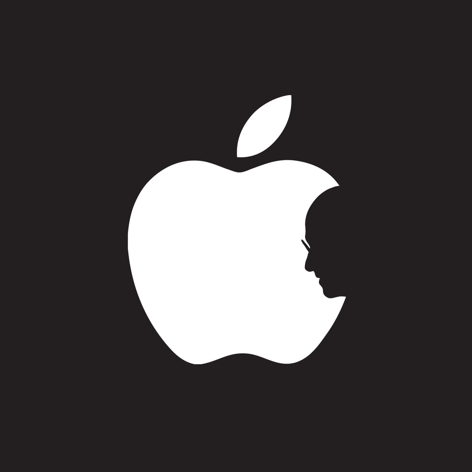
The death of Steve Jobs was one such occasion. Within hours of the news, grieving Apple fans across the world took comfort in an image created by the then-teenaged college student of a silhouetted Jobs in the bite of the Apple logo.

Apple Watch’s disappearing logo is tiniest mystery ever

By

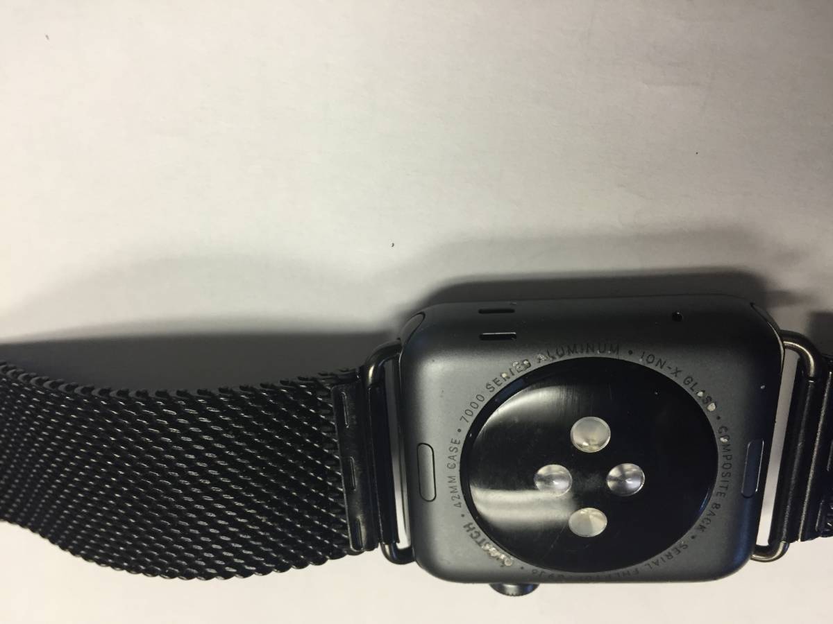
Some users are reporting a problem with the back of their Apple Watch.
Photo: dougie70w/Apple Discussions

Looks like we’ve got some wear issues on the Apple Watch, especially the Space Gray ones. There are posts on Reddit and the Apple Discussion Forums that show both the Apple logo and actual text etched into the back of the watches peeling off.

Apple Discussions user dougie70w says that he bought his Apple Watch at the beginning of June “and the band started to peel part so bad that I replaced it with an after market metal band that I purchaced on Amazon.”

He’s got an appointment at a local Apple Store today and hopes that having Apple Care will let him get a replacement.

People are shockingly bad at drawing the Apple logo from memory

By

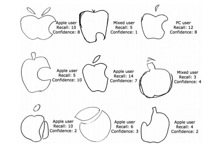
Student drawings of the Apple logo. Photo: Blake, et all 2015.

Apple has one of the most iconic logos in pop culture. Go into any coffee shop and you’ll be assaulted by an array of glowing MacBook lids and shiny iPhone screens, but it turns out that drawing the Apple logo from memory is shockingly hard.

A new study conducted by UCLA researchers found only one out of 85 undergraduate students could accurately draw the iconic logo from memory. If you’re think maybe they just weren’t familiar with the Apple logo, you haven’t been to a college campus in a while.

The difficulty of drawing Apple’s ubiquitous logo actually tells us something about human memory and how we form a ‘gist memory’ of objects and symbols we become too familiar with.

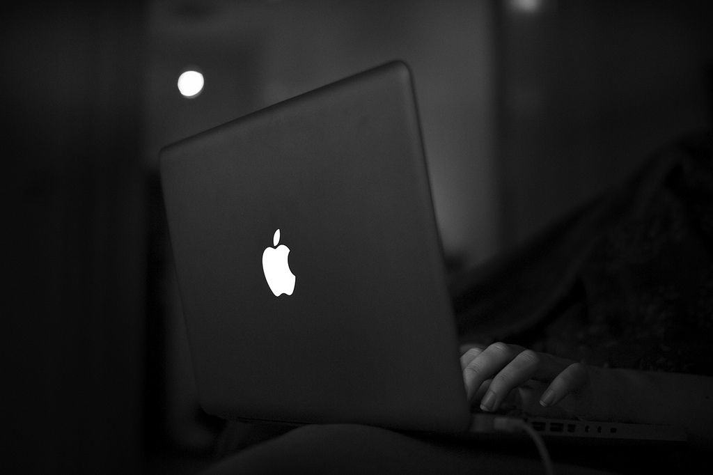
Apple quietly killed its glowing logo today

By

Photo: Linus Ekenstam/
Photo: Linus Ekenstam/Flickr CC

The new MacBook is gorgeous, insanely thin, revolutionary and pressure-sensitive. It’s also missing one killer feature: a glowing Apple logo.

The shining bit of trade dress has been a pop culture icon ever since Apple released the PowerBook G3 in May 1999. However, it looks like Jony Ive’s design team is ready to sacrifice the glowing Apple beacon in the name of thinness. You’ll still find a light-up logo on the MacBook Airs and MacBook Pros, but it was never meant to be on Apple’s new golden beauties.

Take a look at the back of the new 12-inch Retina MacBook:

Apple reportedly plans to debut 3-D logo for all future products

By

iPhone-6-Logo-011
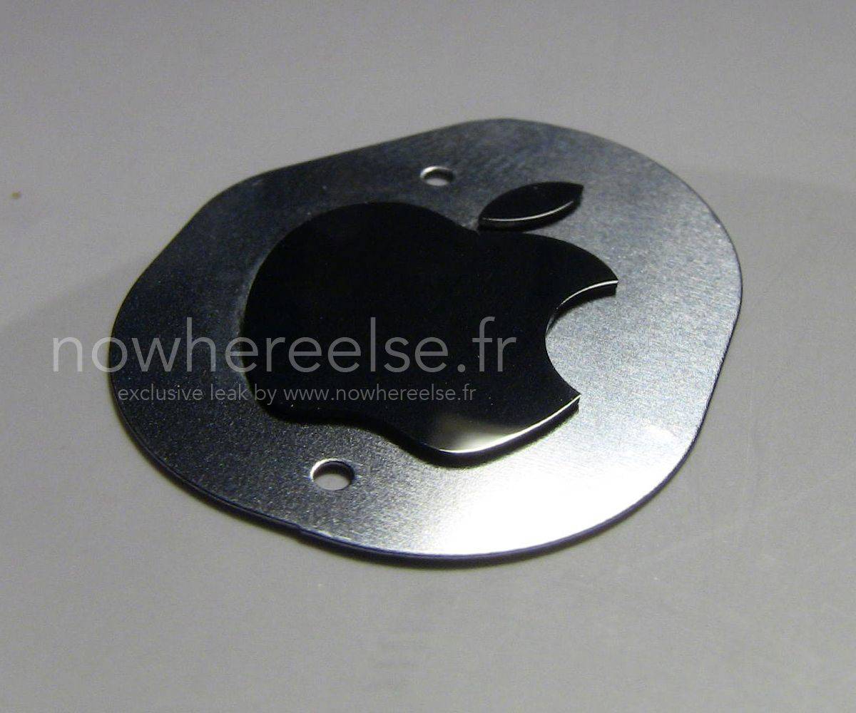
Photo: Nowhereelse.fr

Apple is reportedly upgrading the technologies used for printing its logo onto devices, using new laser-cutting and embedding technologies that will give the logo a 3-D appearance that will “shine at the edges.”

This logo is apparently set to feature on all new Apple products from next year, beginning with the the next-generation iMac.

The Complete Evolution Of The Apple Logo [GIF]

By

applelogo

Apple has become a master at taking a product and refining it to perfection. The iMac, the MacBook, and now the iPad and iPhone have all went through a series of small changes over their existence, but one product Apple hasn’t changed that much is its logo. After quickly dropping that Isaac Newton logo, the only refinements that have come to Apple’s logo are splashes of color and shadow.

Nick DiLallo  created a series of videos showing how some the logos of the biggest brands in the world have evolved since their original inception. Other than the Apple video – which you can see above in GIF form – Nick also made logo evolution videos for Starbucks, NBC, UPS, GAP and American Airlines, all of which are worth a watch and can be viewed over on his YouTube page.


Source: YouTube

Via: Gizmodo


What iOS 7 Should Borrow From iTunes 11: Colorful Album Views!

By

iossmartcolors

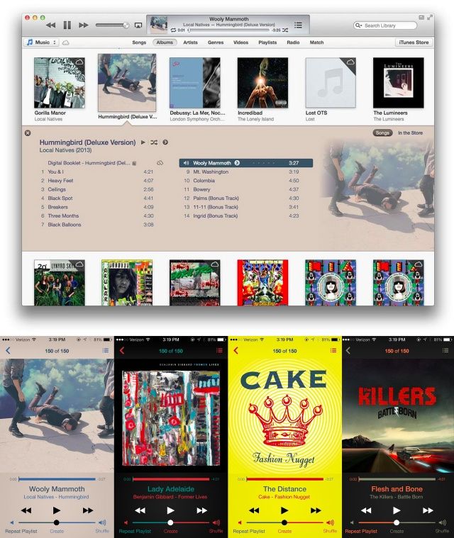
This is a fantastic idea. When Apple overhauled iTunes in the latest version, they did something pretty with Album View, so that the color of the Album View was matched to the dominant color in that album’s artwork.

It’s a nice effect, and as Reddit user Bostonlbi has shown, it looks even prettier on iOS 7, especially if you change the color of the rest of the interface elements with the second and third most dominant colors. Come on, Apple! It’s not too late to take this idea and run with it!